A newer version of this visualization is available.
NASA/JAXA GPM Satellite Eyes Eta Over Nicaragua
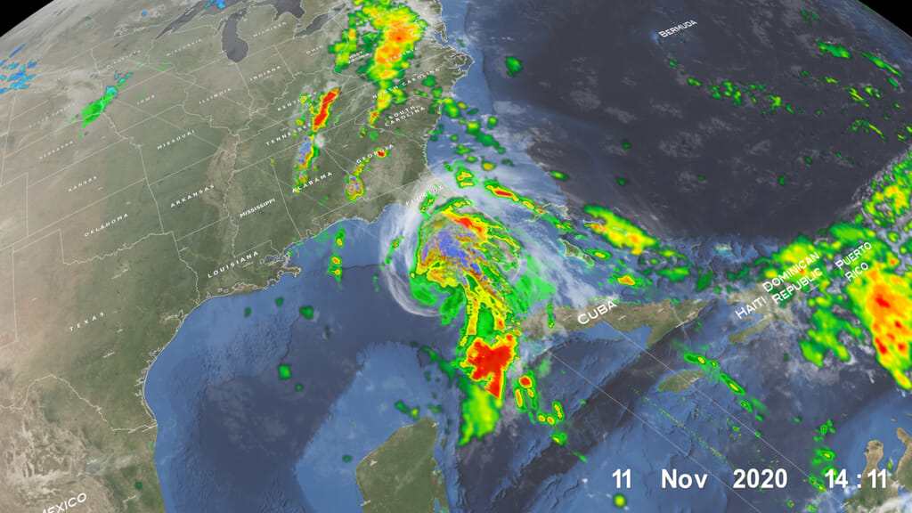
Hurricane Eta (a Category 1) over Nicaragua on 11/4/2020 at approximately 5:25Z. This visualization focuses on the high precipitation southwest of Eta's eye.
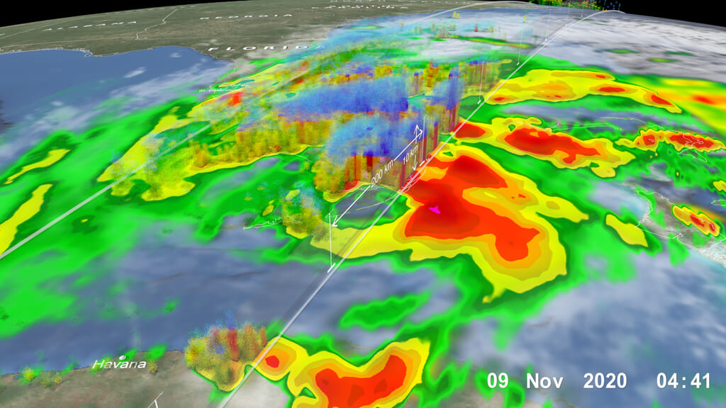
The Global Precipitation Measurement (GPM) Core Observatory satellite flew over Hurricane Eta at 11:41 p.m. CT on Tuesday, Nov. 3 (0541 UTC Wednesday, Nov. 4). GPM observed the storm’s rainfall with its two unique science instruments: the GPM Microwave Imager (GMI) and Dual-frequency Precipitation Radar (DPR). As the visualization shows, the instruments observed a large swath of heavy precipitation extending to the north and east of the hurricane’s center, which matched earlier forecasts that called for particularly heavy rainfall across the storm’s path.
These two- and three-dimensional observations of precipitation structure are the hallmark of the GPM mission – managed jointly by NASA and the Japan Aerospace Exploration Agency (JAXA) -- which aims improve our understanding of the water cycle and extreme weather events, and contributes to improved climate modeling and weather forecasting around the world.
These visualizations depict the GPM satellite pass about seven hours after Hurricane Eta made landfall on the coast of Nicaragua as a category 4 storm. Current NHC forecasts indicate Eta will move northwest over Central America then head northeast across the Caribbean Sea, threatening Cuba and Florida early next week.
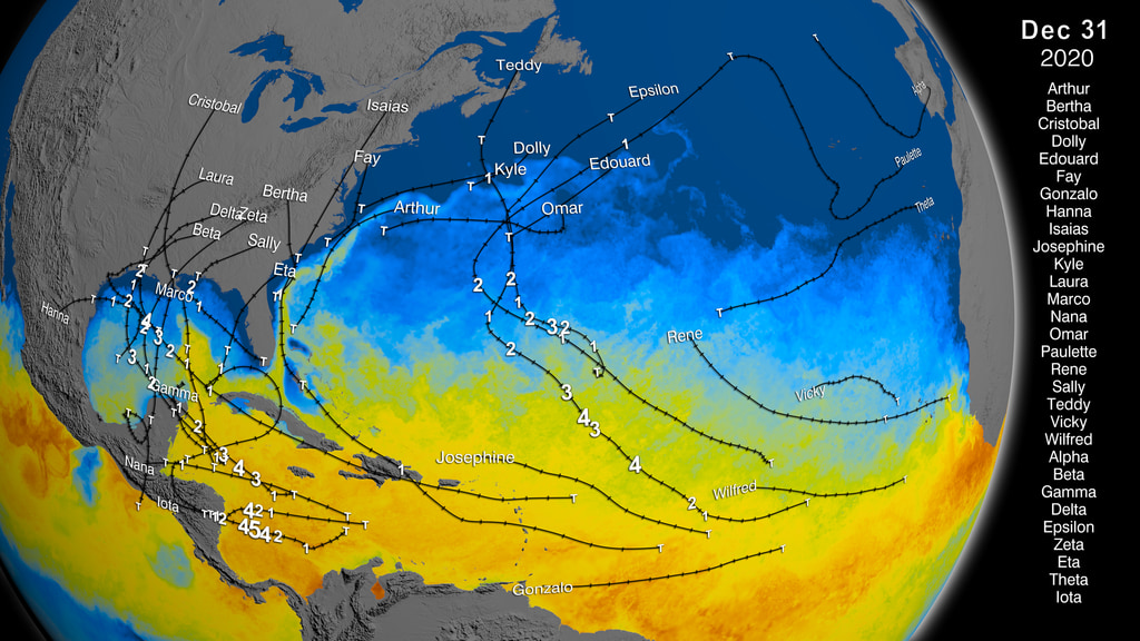
Eta is the 28th named storm of 2020 which beats the 2005 record for the most named storms in a single hurricane season. (See 27 Storms: Arlene to Zeta for a summary of the 2005 hurricane season).
GPM data is archived at https://pps.gsfc.nasa.gov/
Hurricane Eta (a Category 1) on 11/4/2020 at approximately 5:25Z. This visualization focuses on the disperse outer bands northeast of the eye.

Color bar for frozen precipitation rates (ie, snow rates). Shades of cyan represent low amounts of frozen precipitation, whereas shades of purple represent high amounts of precipitation.
Color bar for liquid precipitation rates (ie, rain rates). Shades of green represent low amounts of liquid precipitation, whereas shades of red represent high amounts of precipitation.
Credits
Please give credit for this item to:
NASA's Scientific Visualization Studio
-
Data visualizers
- Alex Kekesi (Global Science and Technology, Inc.)
- Greg Shirah (NASA/GSFC)
-
Scientists
- George Huffman (NASA/GSFC)
- Dalia B Kirschbaum (NASA/GSFC)
-
Producer
- Ryan Fitzgibbons (USRA)
Release date
This page was originally published on Wednesday, November 4, 2020.
This page was last updated on Wednesday, November 15, 2023 at 12:17 AM EST.
Missions
This visualization is related to the following missions:Series
This visualization can be found in the following series:Datasets used in this visualization
-
Rain Rates (Surface Precipitation) [GPM: GMI]
ID: 822Credit: Data provided by the joint NASA/JAXA GPM mission.
See all pages that use this dataset -
Volumetric Precipitation data (Ku) [GPM: DPR]
ID: 830Credit: Data provided by the joint NASA/JAXA GPM mission.
See all pages that use this dataset -
IMERG
ID: 863This dataset can be found at: http://pmm.nasa.gov/sites/default/files/document_files/IMERG_ATBD_V4.4.pdf
See all pages that use this dataset
Note: While we identify the data sets used in these visualizations, we do not store any further details, nor the data sets themselves on our site.
Related
- ID: 4884
 Visualization
 - ID: 10829
 Produced Video
Newer Versions
- ID: 4845
- ID: 4808
 Visualization