A newer version of this visualization is available.
2021 Hurricane Season through September
This data visualization shows hurricane tracks over clouds over precipitation over sea surface temperatures from May 1 through September 30th, 2021. This presentation was created for the COP 26 Conference.
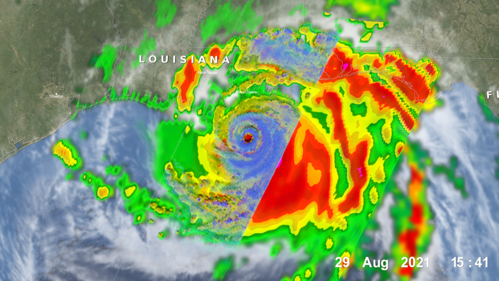
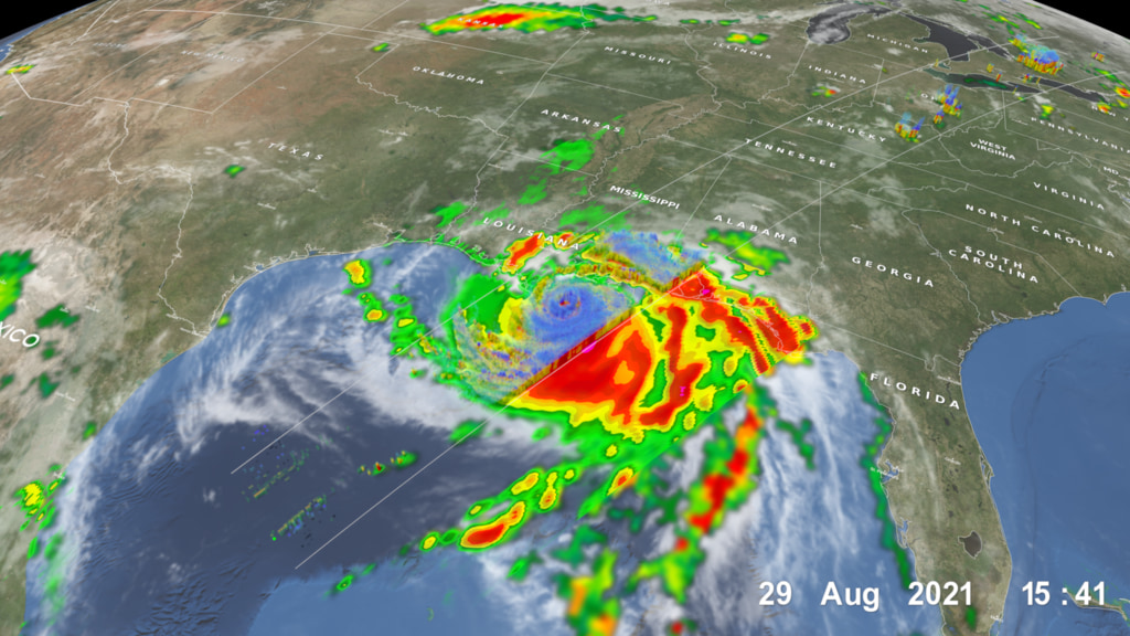
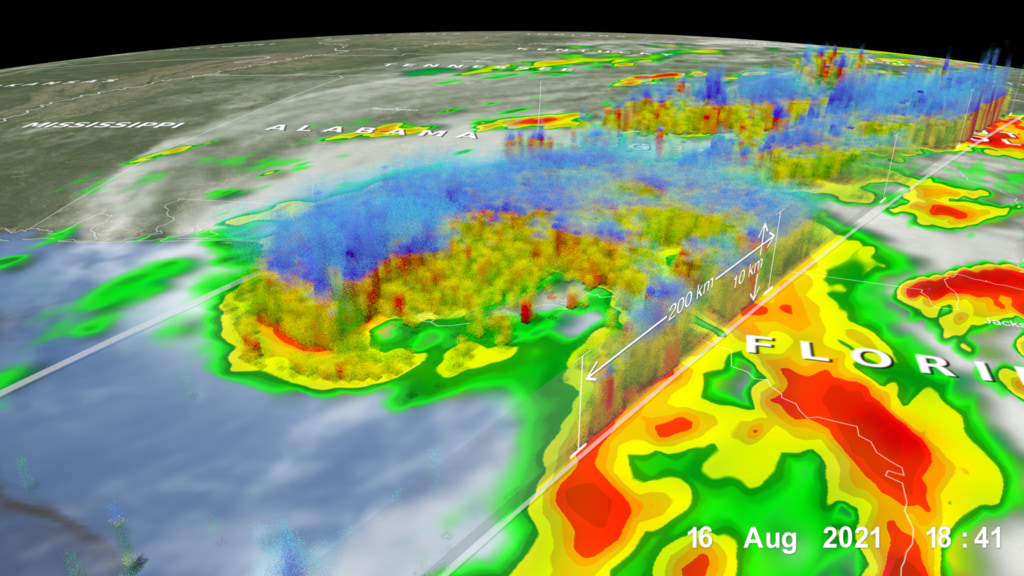
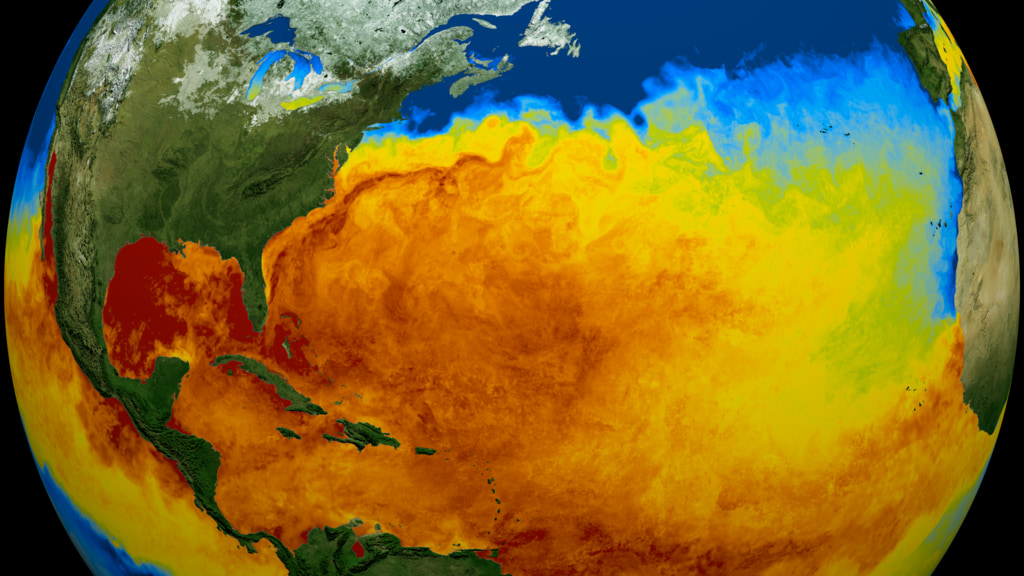
This visualization shows the hurricanes and tropical storms of 2021 as seen by NASA’s Integrated Multi-satellitE Retrievals for GPM (IMERG) - a data product combining precipitation observations from infrared and microwave satellite sensors united by the GPM Core Observatory. IMERG provides near real-time half-hourly precipitation estimates at ~10km resolution for the entire globe, helping researchers better understand Earth’s water cycle and extreme weather events, with applications for disaster management, tracking disease, resource management, energy production and food security. IMERG rain rates (in mm/hr) are laid under infrared cloud data from the NOAA Climate Prediction Center (CPC) Cloud Composite dataset together with storm tracks from the NOAA National Hurricane Center (NHC) Automated Tropical Cyclone Forecasting (ATCF) model. Sea surface temperatures (SST) are also shown over the oceans, derived from the NASA Multi-sensor Ultra-high Resolution (MUR) dataset, which combines data from multiple geostationary and orbiting satellites. Sea surface temperatures play an important role in hurricane formation and development, with warmer temperatures linked to more intense storms.
This data visualization was done for the United Nations Climate Change Conference - Conference of the Parties (COP) 26. The 2021 hurricane season officially ends November 30th. This data visualization will be periodically updated until that date.
Hurricane tracks for the 2021 season covering May 1 through September 30th.
Global Cloud Composite covering May 1 through September 30th, 2021.
Surface Precipitation from May 1 through September 30th, 2021.

Color bar for frozen precipitation rates (ie, snow rates). Shades of cyan represent low amounts of frozen precipitation, whereas shades of purple represent high amounts of precipitation.
Color bar for liquid precipitation rates (ie, rain rates). Shades of green represent low amounts of liquid precipitation, whereas shades of red represent high amounts of precipitation.
Sea Surface Temperatures from May 1 through September 30th, 2021.
Sea Surface Temperature colorbar focusing primarily on temperatures between 20 degrees Celsius to 30 Celsius.
Credits
Please give credit for this item to:
NASA/Goddard Space Flight Center Scientific Visualization Studio
Additional credits:
Storm tracks and strengths courtesy of NOAA's National Weather Service.
Blue Marble MODIS data composite courtesy of the MODIS Science Team NASA Goddard Space Flight Center and the NASA Earth Observatory.
Music created and produced by UniqueTracks. Fantasy (theme from Norma) - Vincenzo Bellini.
-
Animators
- Alex Kekesi (Global Science and Technology, Inc.)
- Greg Shirah (NASA/GSFC)
-
Data provider
- Horace Mitchell (NASA/GSFC)
-
Technical support
- Laurence Schuler (ADNET Systems, Inc.)
- Ian Jones (ADNET Systems, Inc.)
Release date
This page was originally published on Saturday, October 30, 2021.
This page was last updated on Sunday, January 14, 2024 at 12:29 AM EST.
Series
This visualization can be found in the following series:Datasets used in this visualization
-
CPC (Climate Prediction Center) Cloud Composite
ID: 600Global cloud cover from multiple satellites
See all pages that use this dataset -
MUR SST (Multi-scale Ultra-high Resolution (MUR) Sea Surface Temperature (SST) Analysis)
ID: 845 -
IMERG
ID: 863This dataset can be found at: http://pmm.nasa.gov/sites/default/files/document_files/IMERG_ATBD_V4.4.pdf
See all pages that use this dataset -
Hurricane Tracks (Automated Tropical Cyclone Forecast (ATCF) - Best Track)
ID: 1109Credit: NOAA
This dataset can be found at: https://ftp.nhc.noaa.gov/atcf/
See all pages that use this dataset
Note: While we identify the data sets used in these visualizations, we do not store any further details, nor the data sets themselves on our site.
Related
- ID: 14084

- ID: 4933
 Visualization
 - ID: 4932
- ID: 4926
Newer Versions
- ID: 4982
 Visualization
Used as a Source In
- ID: 31168
 Hyperwall Visual