Global Atmospheric Methane
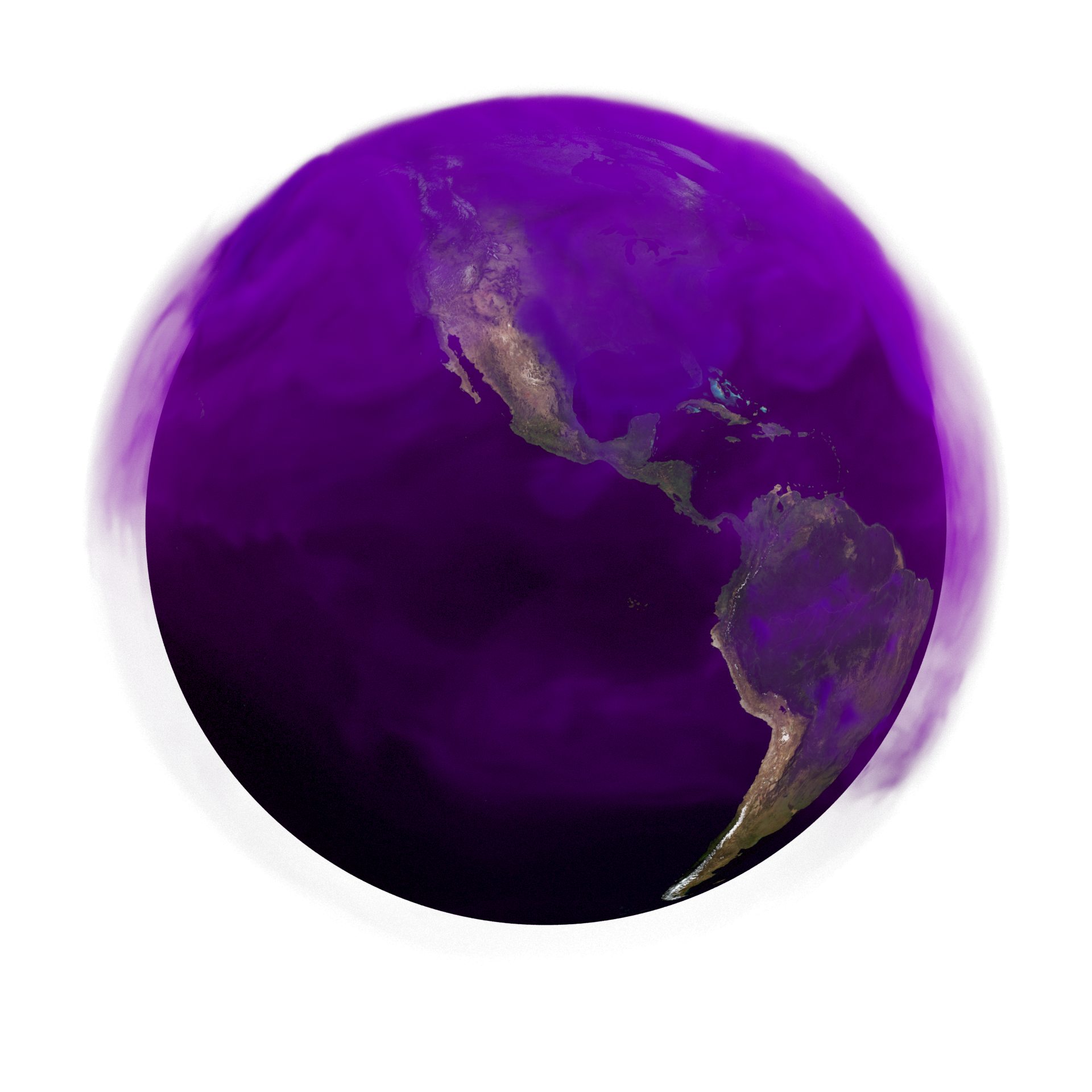
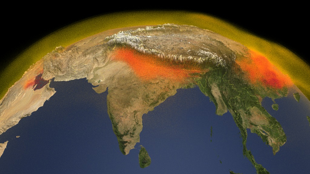
This first 3D volumetric visualization focuses on several continents showing the emission and transport of atmospheric methane around the globe between January 1, 2017 and November 30, 2018.
This video is also available on our YouTube channel.
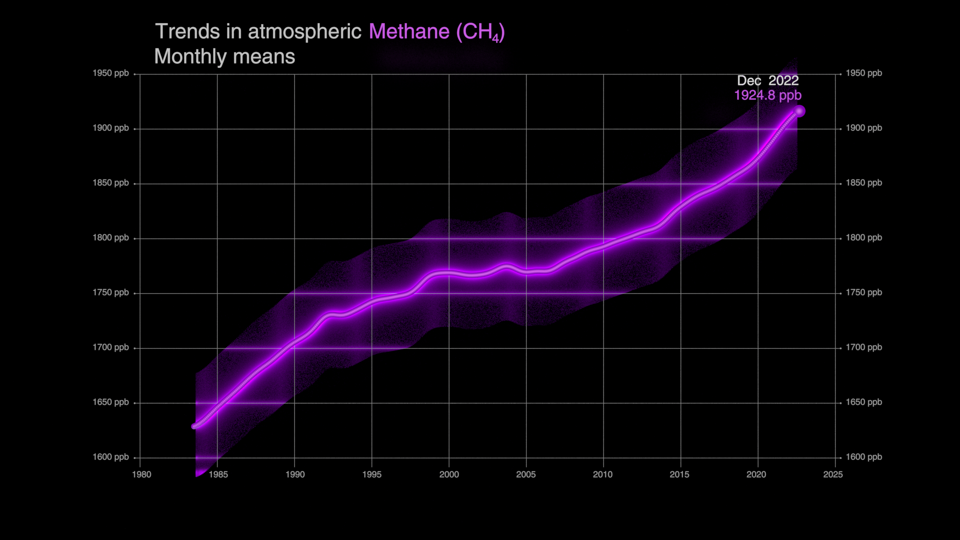
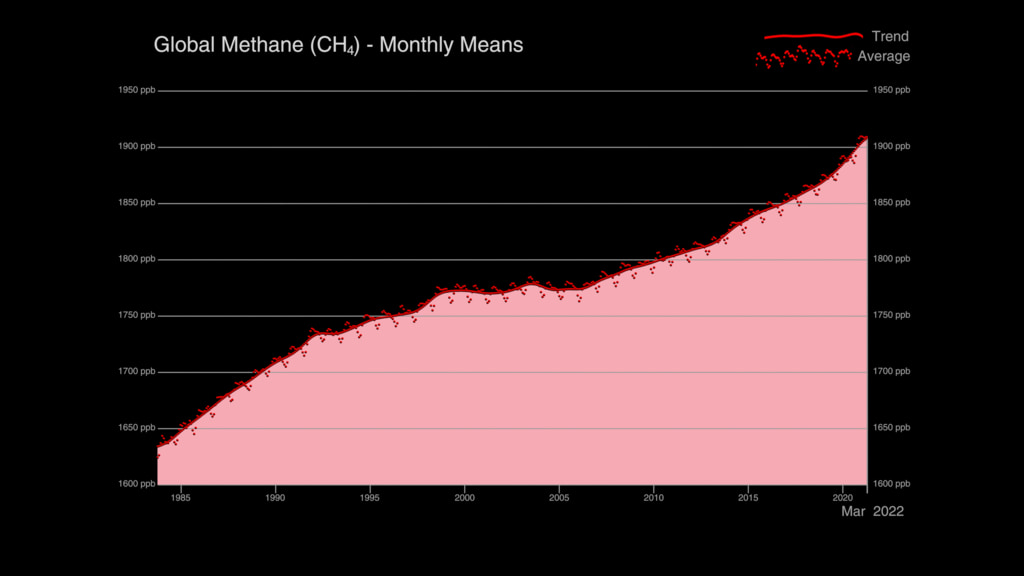
Methane is a powerful greenhouse gas that traps heat 28 times more effectively than carbon dioxide over a 100-year timescale. Concentrations of methane have increased by more than 150% since industrial activities and intensive agriculture began. After carbon dioxide, methane is responsible for about 20% of climate change in the twentieth century. Methane is produced under conditions where little to no oxygen is available. About 30% of methane emissions are produced by wetlands, including ponds, lakes and rivers. Another 20% is produced by agriculture, due to a combination of livestock, waste management and rice cultivation. Activities related to oil, gas, and coal extraction release an additional 30%. The remainder of methane emissions come from minor sources such as wildfire, biomass burning, permafrost, termites, dams, and the ocean. Scientists around the world are working to better understand the budget of methane with the ultimate goals of reducing greenhouse gas emissions and improving prediction of environmental change. For additional information, see the Global Methane Budget.
The NASA SVS visualization presented here shows the complex patterns of methane emissions produced around the globe and throughout the year from the different sources described above. The visualization was created using output from the Global Modeling and Assimilation Office, GMAO, GEOS modeling system, developed and maintained by scientists at NASA. Wetland emissions were estimated by the LPJ-wsl model, which simulates the temperature and moisture dependent methane emission processes using a variety of satellite data to determine what parts of the globe are covered by wetlands. Other methane emission sources come from inventories of human activity. The height of Earth’s atmosphere and topography have been vertically exaggerated and appear approximately 50-times higher than normal in order to show the complexity of the atmospheric flow.
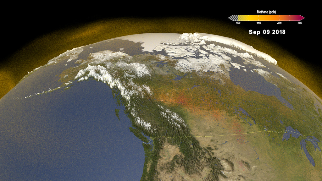
As the visualization progresses, outflow from different source regions is highlighted. For example, high methane concentrations over South America are driven by wetland emissions while over Asia, emissions reflect a mix of agricultural and industrial activities. Emissions are transported through the atmosphere as weather systems move and mix methane around the globe. In the atmosphere, methane is eventually removed by reactive gases that convert it to carbon dioxide. Understanding the three-dimensional distribution of methane is important for NASA scientists planning observations that sample the atmosphere in very different ways. Satellites like GeoCarb, a planned geostationary mission to observe both carbon dioxide and methane, look down from space and will estimate the total number of methane molecules in a column of air. Aircraft, like those launched during NASA’s Arctic Boreal Vulnerability Experiment (ABOVE) sample the atmosphere along very specific flight lines, providing additional details about the processes controlling methane emissions at high latitudes. Atmospheric models help place these different types of measurements in context so that scientists can refine estimates of sources and sinks, understand the processes controlling them and reduce uncertainty in future projections of carbon-climate feedbacks.
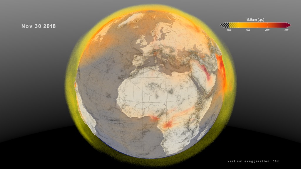
This second 3D volumetric visualization shows a global view of the methane emission and transport between December 1, 2017 and November 30, 2018. This visualizaion of the rotating global view is designed to be played in a continuous loop.
This video is also available on our YouTube channel.
This version of the first visualization shows the Earth and methane only. The date, colorbar and exaggeration are not displayed.
This version of the second visualization shows the Earth and methane only. The date, colorbar and exaggeration are not displayed.

A still image of the global atmospheric methane on December 25, 2017.

This layer of the first visualization includes the date, colorbar and exaggeration with transparency.

This layer of the second visualization includes the date, colorbar and exaggeration with transparency.
Credits
Please give credit for this item to:
NASA's Scientific Visualization Studio
-
Visualizer
- Cindy Starr (Global Science and Technology, Inc.)
-
Data visualizers
- Kel Elkins (USRA)
- Greg Shirah (NASA/GSFC)
- Trent L. Schindler (USRA)
-
Scientists
- Benjamin Poulter (NASA/GSFC)
- Abhishek Chatterjee (USRA)
- Lesley Ott (NASA/GSFC)
-
Producers
- Katie Jepson (USRA)
- Ellen T. Gray (ADNET Systems, Inc.)
-
Technical support
- Ian Jones (ADNET Systems, Inc.)
- Laurence Schuler (ADNET Systems, Inc.)
-
Project support
- Wei Hao (Global Science and Technology, Inc.)
- Eric Sokolowsky (Global Science and Technology, Inc.)
Release date
This page was originally published on Monday, March 23, 2020.
This page was last updated on Monday, November 27, 2023 at 12:13 AM EST.
Papers used in this visualization
Datasets used in this visualization
-
GMAO GEOS Atmospheric Methane (GMAO GEOS Atmospheric Methane)
ID: 1066
Note: While we identify the data sets used in these visualizations, we do not store any further details, nor the data sets themselves on our site.
Related
- ID: 5118
 Visualization
 - ID: 5116
 Visualization
 - ID: 5007
 Visualization
Alternate Versions
- ID: 5043
 Visualization
 - ID: 4799
 Visualization
 - ID: 4798
 Visualization
Used as a Source In
- ID: 14221
![Universal Production Music: Home To You by William Baxter Noon [PRS], Pluck Up Courage by John Griggs [PRS], Philip Michael Guyler [PRS], Wafer Thin by Adam Leslie Gock [APRA], Dinesh David Wicks [APRA], Mitchell Stewart [APRA], The Magpie's Pie by Quentin Bachelet [SACEM], Romain Sanson [SACEM], Ticking Tension by Quentin Bachelet [SACEM], Romain Sanson [SACEM], Reward Drawer by Ehren Ebbage [BMI] Additional images courtesy of Alaska Satellite Facility - University of Alaska FairbanksThis video can be freely shared and downloaded. While the video in its entirety can be shared without permission, some individual imagery provided by ASF is obtained through permission and may not be excised or remixed in other products. For more information on NASA’s media guidelines, visit https://www.nasa.gov/multimedia/guidelines/index.htmlComplete transcript available.](/vis/a010000/a014200/a014221/ABoVE_Title.jpg) Produced Video
Produced Video - ID: 13909
 Produced Video
 - ID: 13799
![Music: Organic Machine by Bernhard Hering [GEMA] and Matthias Kruger [GEMA]Complete transcript available.](/vis/a010000/a013700/a013799/2020Temp.png) Produced Video
Produced Video - ID: 13559
![Complete transcript available.Music: "Reported Missing" by Andrew Michael Britton [PRS] and David Stephen Goldsmith [PRS]This video can be freely shared and downloaded. While the video in its entirety can be shared without permission, some individual imagery provided by Artbeats is obtained through permission and may not be excised or remixed in other products. Specific details on stock footage may be found here. For more information on NASA’s media guidelines, visit https://www.nasa.gov/multimedia/guidelines/index.html.](/vis/a010000/a013500/a013559/Methane_Still.jpg) Produced Video
Produced Video