GPM Satellite observes powerful super Typhoon Yutu hitting Northern Marianas
GPM passed over Super Typhoon Yutu on October 24th at 11:07 a.m. EDT . As the camera moves in on the storm, DPR's volumetric view of the storm is revealed. A slicing plane moves across the volume to display precipitation rates throughout the storm. Shades of green to red represent liquid precipitation. Frozen precipitation is shown in cyan and purple.
This video is also available on our YouTube channel.
NASA's GPM Core observatory satellite captured an image of Super Typhoon Yutu when it flew over the powerful storm just as the center was striking the central Northern Mariana Islands north of Guam.
Early Thursday, Oct. 25 local time, Super Typhoon Yutu crossed over the U.S. commonwealth of the Northern Mariana Islands. It was the equivalent of a Category 5 hurricane. The National Weather Service in Guam said it was the strongest storm to hit any part of the U.S. this year.
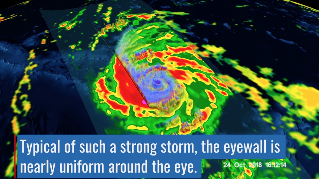
The Global Precipitation Measurement mission or GPM core satellite, which is managed by both NASA and the Japan Aerospace Exploration Agency, JAXA analyzed Yutu on Oct. 24 at 11:07 a.m. EDT (1507 UTC)/ 1:07 a.m. Guam Time, Oct. 25. GPM estimated rain rates within Super Typhoon Yutu fusing data from two instruments aboard: the GPM Dual-frequency Precipitation Radar or DPR, which covered the inner part of the storm, and the GPM Microwave Imager or GMI that analyzed the outer swath, just as the center was passing over the Island of Tinian.
GPM shows the inner eyewall as a near perfect ring of heavy to intense rain. Peak rain rates of up to 269 mm/hr. (~10.6 inches/hr.) were estimated within the DPR swath. The almost perfect symmetry of the inner wall is indicative of an extremely powerful storm. In fact, at the time this image was taken, Yutu's maximum sustained winds were estimated at 155 knots (~178 mph) by the Joint Typhoon Warning Center, making it the strongest typhoon on record to strike Saipan and Tinian.
GPM data is part of the toolbox of satellite data used by forecasters and scientists to understand how storms behave. GPM is a joint mission between NASA and the Japan Aerospace Exploration Agency. Current and future data sets are available with free registration to users from NASA Goddard's Precipitation Processing Center website.
In this version of the visualization, lower precipitation values fade away from the volumetric representation to reveal the inner structures of the storm.

Color bar for frozen precipitation rates (ie, snow rates). Shades of cyan represent low amounts of frozen precipitation, whereas shades of purple represent high amounts of precipitation.
Color bar for liquid precipitation rates (ie, rain rates). Shades of green represent low amounts of liquid precipitation, whereas shades of red represent high amounts of precipitation.
Credits
Please give credit for this item to:
NASA's Scientific Visualization Studio
-
Visualizers
- Kel Elkins (USRA)
- Greg Shirah (NASA/GSFC)
- Alex Kekesi (Global Science and Technology, Inc.)
-
Scientists
- George Huffman (NASA/GSFC)
- Dalia B Kirschbaum (NASA/GSFC)
- Owen Kelley (George Mason University)
- Stephen Lang (NASA/GSFC)
- Stephen J. Munchak (University of Maryland)
-
Science writer
- Rob Gutro (NASA/GSFC)
-
Technical support
- Laurence Schuler (ADNET Systems, Inc.)
- Ian Jones (ADNET Systems, Inc.)
-
Writer
- Hal Pierce (SSAI)
Release date
This page was originally published on Friday, October 26, 2018.
This page was last updated on Wednesday, November 15, 2023 at 12:12 AM EST.
Series
This visualization can be found in the following series:Datasets used in this visualization
-
[GOES]
ID: 22 -
Rain Rates (Surface Precipitation) [GPM: GMI]
ID: 822Credit: Data provided by the joint NASA/JAXA GPM mission.
See all pages that use this dataset -
Volumetric Precipitation data (Ku) [GPM: DPR]
ID: 830Credit: Data provided by the joint NASA/JAXA GPM mission.
See all pages that use this dataset -
IMERG
ID: 863This dataset can be found at: http://pmm.nasa.gov/sites/default/files/document_files/IMERG_ATBD_V4.4.pdf
See all pages that use this dataset
Note: While we identify the data sets used in these visualizations, we do not store any further details, nor the data sets themselves on our site.
Related
- ID: 13071
 Produced Video
Used as a Source In
- ID: 13101
 Produced Video