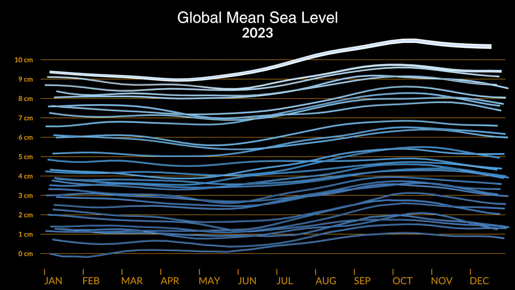
Slow Reveal Graphs: Global Mean Sea Level 1993-2023
Slow reveal graphs are an instructional routine using scaffolded visuals and discourse to help students (in K-12 and beyond) make sense of data. This is a slow reveal graph of the SVS visualization of rising Global Mean Sea Level.
Step 1: Just Lines
Before you play the video, ask students to quietly think about what they are going to see as they watch.
“What do you notice, what do you wonder?”
Play it again before they share. Play a third time!
Ask them – “Share with your partner/group what you notice and wonder.”
After they’ve discussed with partner/group, have them share with the whole class.
Accept all their notice/wonder comments.
Make a chart on the board with three columns, labeled “Too Low”/”Just right”/”Too High”
“In your pair/group, decide how many lines there are? What’s an answer that’s too low? Too high?
Record answers suggested by each pair/group.
“What’s a ‘just right’ estimate based on these too low/too high boundaries?” Record their estimates, allowing students to adjust their estimate boundaries or estimate as they entertain the input from other groups.
Step 2: Horizontal Lines & Months
Before you play it, ask “As you watch, see what’s different in this video?
Play the clip – “What’s new?”
They should notice the horizontal lines and the months at the bottom. If students think the original lines have changed, elicit a discussion from other students – do you agree that the white/blue lines have changed? (They haven’t!)
“How does the new information change what you know about all those lines?”
(The added information of the months should lead them to understand that each line is one year)
Using the horizontal orange lines:
“What can you tell me about the ‘journey’ of each line?”
“What patterns do you see?”
“What can you tell me about the start and end of each individual line?”
Without referring directly to the data you collected in the too low/too high chart in Step 1 ask:
“If each line represents a year, and without counting them, how many years do you think this data covers?”
“What’s an answer that’s too low? Too high? Do you want to adjust any of your estimates?
Step 3: Years
Before you play it, ask them to notice what additional information is added!
They should notice that the years for each line are now running at the top. Before you play it again, with the “2023” final year at the top, return to the data gathered estimating the number of lines in Steps 1 & 2 ask:
“What’s the first year this data was collected?”
Give students time to work in pairs/groups to determine their estimate for the start year. Record their solutions, adding a “Start Year” column to the chart. Ask them to justify their estimates – “how did you get this?”Once all estimates are recorded, play again, asking, “Notice the first year – pay attention!" (play it again if necessary!)
Record the “Start Date” and “End Date” on the board. Ask the class, “Can we confirm the number of lines now that we have this information?”
Step 4: Title & Line Count
Play the video for the class.
“What’s new now?”
They should notice the numbers on the vertical axis, along with the title of the graph.
Based on the title, what do these numbers on the vertical axis represent?
What’s a reasonable unit? Review units that measure length, if necessary!
Step 5: THE TWIST! – before you play this, tell them there’s a surprise at the end…
Play the video for the class.
“First, were we right about the units?”
“Yikes! What happened at the end?”
Before you play it again, have students discuss with pairs/groups and then share out what they saw happen in the graph at the end. Record their descriptions about what they see at the end and how it’s related to the prior screens. Play the video several times (or as many times as you think are needed) to support their theories of what they saw the first time.
If you had to describe the relationship between the two representations, what would you say?Which representation do you like more, and why?Which representation tells you more about what will happen in 2, 5, or even 10 years?Describe how your favorite representation would look with 10 MORE years of data?What does this data tell us about our planet and the rise of water levels?Why would it be important to understand the patterns in this data?")
STEP 6: Side by Side
Use this supplemental slide that shows the two representations side by side
Questions:
As you look at these two representations – what’s the same? What’s different? (record these as students list them)
If you had to describe the relationship between the two representations, what would you say?
Which representation do you like more, and why?
Which representation tells you more about what will happen in 2, 5, or even 10 years?
Describe how your favorite representation would look with 10 MORE years of data?
What does this data tell us about our planet and the rise of water levels?
Why would it be important to understand the patterns in this data?
About this graph
This animation shows the rise in global mean sea level from 1993 to 2023 based on data from a series of five international satellites. The relatively large jump in sea level from 2022 to 2023, a rise of about 0.3 inches (0.76 centimeters), is due mostly to a warming climate and the development of a strong El Niño. The 2022-2023 rise is equivalent to draining a quarter of Lake Superior into the ocean over the course of a year.
This NASA-led analysis is based on a sea level data set featuring more than 30 years of satellite observations, starting with the U.S.-French TOPEX/Poseidon mission, which launched in 1992. The Sentinel-6 Michael Freilich mission, which launched in November 2020, is the latest in the series of satellites that have contributed to this sea level record.
Credits
Please give credit for this item to:
NASA's Scientific Visualization Studio
Visualizer
- Mark SubbaRao (NASA/GSFC)
Scientist
- Benjamin Hamlington (NASA/JPL)
Producer
- Stacie Marvin (Maryland State Department of Education)
Release date
This page was originally published on Sunday, June 16, 2024.
This page was last updated on Sunday, June 16, 2024 at 6:32 PM EDT.
Datasets used in this visualization
SSHA (Sea Surface Height Anomaly) [OSTM/Jason-2: Poseidon-3]
ID: 891
Note: While we identify the data sets used in these visualizations, we do not store any further details, nor the data sets themselves on our site.
Sources
- ID: 5221
 Visualization