Two Decades of Changes in Nitrogen Dioxide and Fine Particulate Pollution in the U.S.
A data visualization of particulate matter 2.5 (PM2.5) data for the Washington DC region spanning 2000-2018 (annual averages). Higher values are represented with dark red and lower values are represented with bright yellow. This view uses the hybrid PM 2.5 color bar with a range of 5 to 20.
What we’re seeing: Air quality, as measured by both fine particle pollution and nitrogen dioxide, has improved overall in the past two decades.
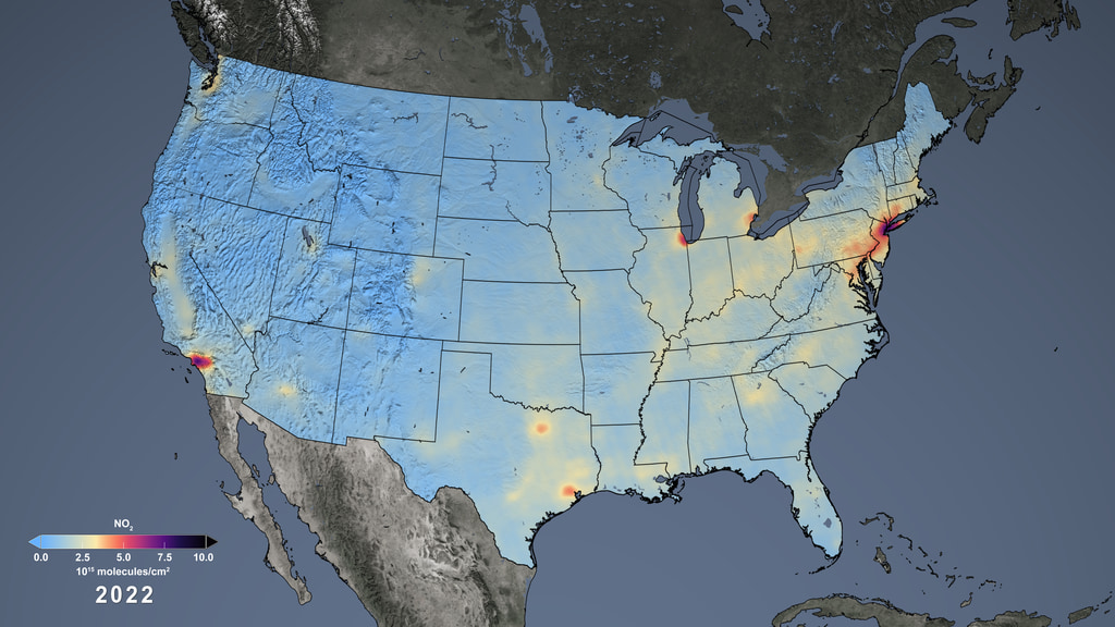
The top image is a data visualization of fine particulate matter, or PM2.5 in the Washington, DC, region from 2000 to 2018. The image below shows nitrogen dioxide, or NO2, for the same region from 2005 to 2020. In both, you can see an overall decrease in pollution levels over time.
Below that are maps showing the same pollutants, PM2.5 and nitrogen dioxide, during the same time periods across all of North America and the United States.
Where the data comes from: The MODIS instrument on NASA’s Aqua satellite, the MISR instrument on NASA’s Terra satellite, and the SeaWIFS instruments aboard the Seastar satellite all measured this pollution over the past two decades. The team that created the PM2.5 estimates was led by researchers at Washington University in St. Louis. The NO2 estimates were created using data from GOME-2, SCIAMACHY, and OMI, along with information on land use, roadways, power plants, and other emission sources. The team that created the NO2 estimates was led by researchers at the George Washington University. Data visualizations were created by Kel Elkins and NASA’s Scientific Visualization Studio.
A data visualization of surface-level nitrogen dioxide data for the Washington DC region spanning 2005-2020 (annual averages). Higher values are represented with dark purple and lower values are represented with light blue.
What the colors mean: In both images, higher values of nitrogen dioxide and PM2.5 are represented with darker colors and lower values with lighter colors. In the top image, black and deep red signify the highest PM2.5 values and the colors fade to orange, yellow, and white as the air becomes cleaner. In the second image , dark purple and black represent the highest nitrogen dioxide concentrations, and as the numbers drop, the colors get lighter, turning orange, and eventually light yellow. Scroll down to see the color bars below.
A data visualization of particulate matter 2.5 (PM2.5) data for North America spanning 2000-2018 (annual averages). Higher values are represented with dark red and lower values are represented with bright yellow. This view uses the hybrid PM 2.5 color bar with a range of 0 to 40.
A data visualization of surface-level nitrogen dioxide data for North America spanning 2005-2020 (annual averages). Higher values are represented with dark purple and lower values are represented with light blue.
Why we should care: Nitrogen dioxide and fine particulate matter are both dangerous pollutants emitted by the burning of fossil fuels and biofuels. PM2.5 comes from a wide range of sources, including traffic, industrial plants, agriculture, wildfire smoke, and dust. Nitrogen dioxide is a mostly urban air pollutant that comes largely from traffic and industrial plants.
Fine particulate matter is called PM2.5 because it refers to particles that are 2.5 microns or less in width. A human hair, for comparison, is about 70 microns wide. These tiny particles are so small that they can penetrate into the deepest part of our lungs and enter our bloodstream, said Susan Anenberg, chair of the Environmental and Occupational Health Department at George Washington University, and a consultant on these visualizations.
“Because these particles are so small and they can affect every organ of the body, there are a wide range of health outcomes,” Anenberg said. Fine particulate matter has been linked to adult and pediatric asthma, heart and lung disorders, lung cancers, cognitive decline, and premature death.
Nitrogen dioxide, which is more easily observed from space, has also been linked to respiratory problems like asthma and premature death. It is a key ingredient in ground-level ozone and smog and also contributes to the formation of PM2.5 in the air.
What explains the changes over time: In the middle of the 20th Century, air around industrial cities grew thick with noxious pollution. For example, smog in Los Angeles was so heavy that it darkened the sky. Air pollution from industrial plants concentrated in Donorra, Pennsylvania, during an atmospheric inversion, killing 20 people and causing respiratory problems for nearly half the town’s population. These air pollution episodes were some of the worst in US history.
Environmentalists mobilized around air quality. In 1970, the Nixon Administration established the Environmental Protection Agency and Congress passed the Clean Air Act, which set national standards for pollution levels. These steps, combined with other regulations in the years that followed, have led to dramatic reductions in these and other pollutants over time.
And yet:
The declines in PM2.5 have begun to level off in the past few years, but the air is still not clean. Climate change could make it harder to meet national standards, Anenberg said. That’s because warm, dry temperatures mean more dust and wildfire smoke containing PM2.5. Climate change is also expected to lead to more chemical reactions that form pollutants in the air.
“Climate change leads to more wildfires and a longer burning season, which leads to more smoke in the air which leads to more PM2.5 and all the health outcomes that we’ve talked about,” Anenberg said.
While overall the numbers of both pollutants have seen a sharp decline, the air is not clean. “At the lower pollution levels we have in the U.S. today, we’re still experiencing health effects,” Anenberg said. “And some of the same neighborhoods that were overburdened by pollution decades ago are still overburdened.”
Research shows that people in communities of color, more often located near industrial sources, disproportionately breathe harmful pollution. And the gap in disparities is widening.
For example, a December 2022 study examined pollution around public schools. Scientists found that the median annual nitrogen dioxide concentrations in schools with mostly white students were 7.7 parts per billion, compared to 9.2 parts per billion in schools with higher proportions of people of color.
“The air pollution problem has improved, but has not been solved,” Anenberg said.
Ground-level fine particulate matter (PM2.5) data from the Washington University in St. Louis Atmospheric Composition Analysis Group
Surface-level nitrogen dioxide data from the Goddard Earth Sciences Data and Information Services Center (GES DISC)
A data visualization of particulate matter 2.5 (PM2.5) data for North America spanning 2000-2018 (annual averages). Higher values are represented with dark red and lower values are represented with bright yellow. This view uses the hybrid PM 2.5 color bar with a range of 0 to 40. This version is in an equirectangular projection.
A data visualization of surface-level nitrogen dioxide data for North America spanning 2005-2020 (annual averages). Higher values are represented with dark purple and lower values are represented with light blue. This version is in an equirectangular projection.
A data visualization of particulate matter 2.5 (PM2.5) data for the Chicago region spanning 2000-2018 (annual averages). Higher values are represented with dark red and lower values are represented with bright yellow. This view uses the hybrid PM 2.5 color bar with a range of 5 to 20.
A data visualization of surface-level nitrogen dioxide data for the Chicago region spanning 2005-2020 (annual averages). Higher values are represented with dark purple and lower values are represented with light blue.

Hybrid PM 2.5 colorbar, going from white, to yellow/orange, to red. Simplified version.
Surface-level nitrogen dioxide colorbar, going from light blue, to yellow/red, to dark purple. Simplified version.
Hybrid PM 2.5 colorbar, going from white, to yellow/orange, to red. Range is 5-20 mug/m^3.
Hybrid PM 2.5 colorbar, going from white, to yellow/orange, to red. Range is 0-40 mug/m^3.
Surface-level nitrogen dioxide colorbar, going from light blue, to yellow/red, to dark purple. Range is 0 to 30 parts per billion.
Credits
Please give credit for this item to:
NASA's Scientific Visualization Studio
-
Visualizer
- Kel Elkins (USRA)
-
Producer
- Katie Jepson (KBR Wyle Services, LLC)
-
Scientist
- Susan Anenberg (The George Washington University)
-
Writer
- Jenny Marder Fadoul (Telophase)
Release date
This page was originally published on Tuesday, May 23, 2023.
This page was last updated on Sunday, January 7, 2024 at 11:16 PM EST.
Datasets used in this visualization
-
Surface PM2.5 (V4.NA.03) [MODIS, MISR, and SeaWIFS]
ID: 1180This dataset can be found at: https://sites.wustl.edu/acag/datasets/surface-pm2-5/#V4.NA.03
See all pages that use this dataset -
Surface NO2 (Surface-level nitrogen dioxide)
ID: 1181This dataset can be found at: https://acdisc.gesdisc.eosdis.nasa.gov/data/HAQAST/SFC_NITROGEN_DIOXIDE_CONC.1/
See all pages that use this dataset
Note: While we identify the data sets used in these visualizations, we do not store any further details, nor the data sets themselves on our site.
Related
- ID: 14386
 Produced Video
 - ID: 5107
 Visualization
 - ID: 5070
 Visualization