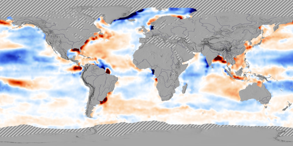
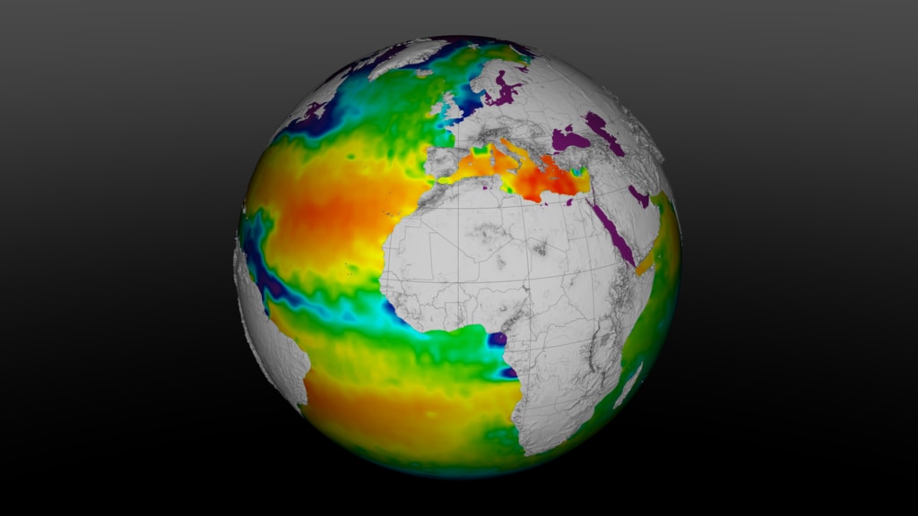
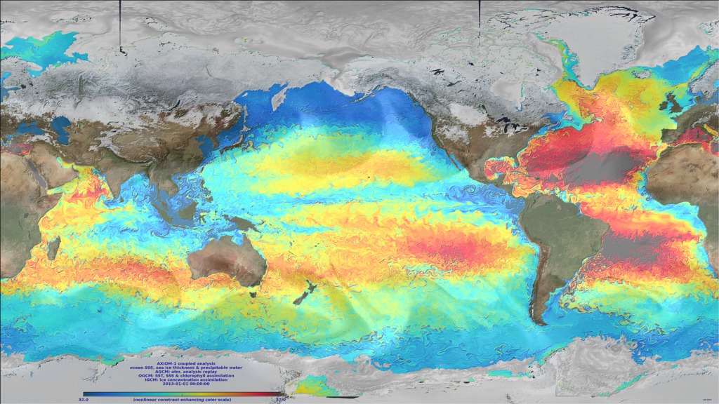
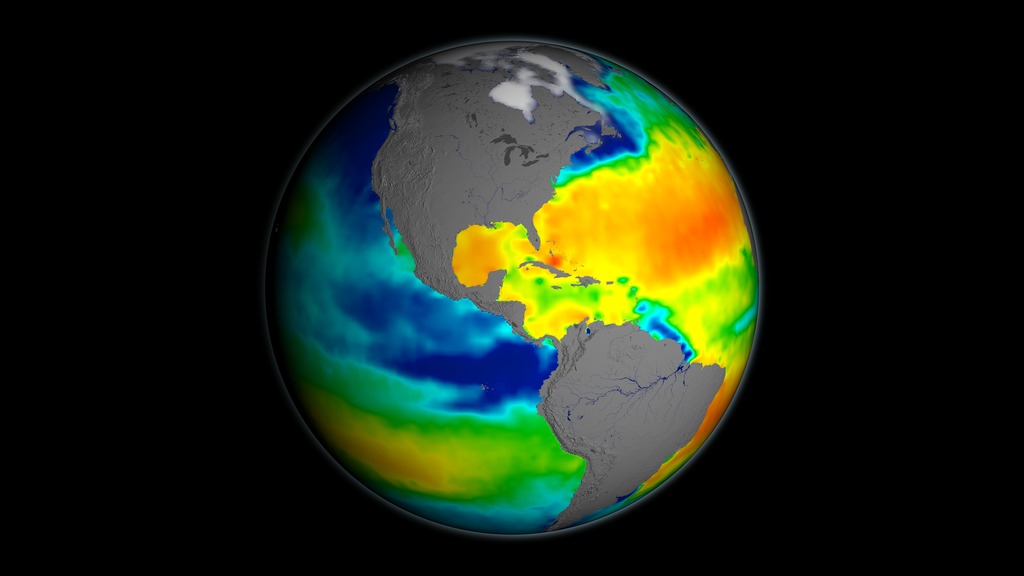
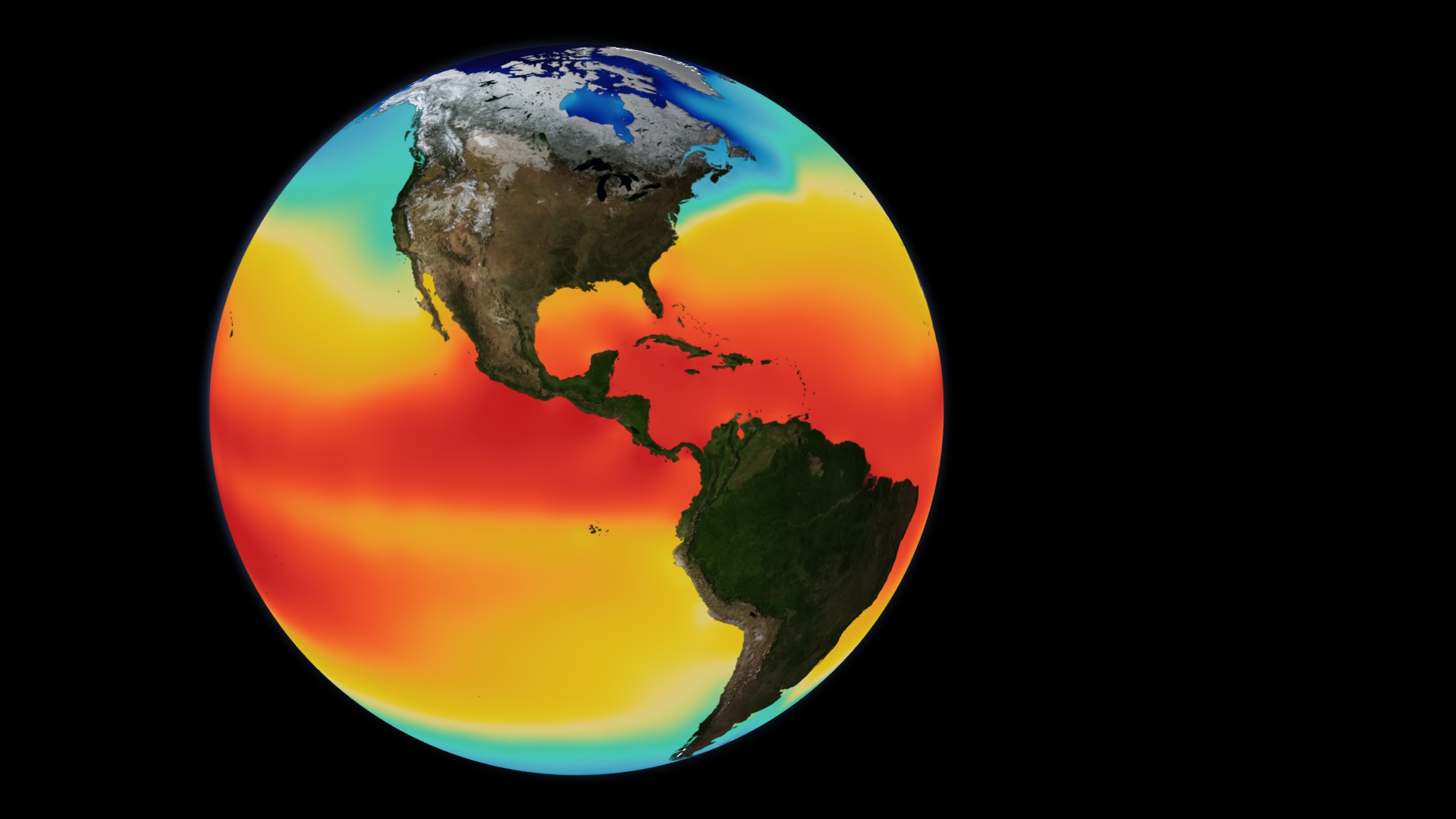
A Decade of Sea Surface Salinity
- Written by:
- Alex Kekesi
- Scientific consulting by:
- Nadya Vinogradova-Shiffer
- View full credits
Movies
- salinity_v49_1000p30.webm (2000x1000)
- salinity_v49_1000p30.mp4 (2000x1000)
- salinity_v49_1000p60.mp4 (2000x1000)
- salinity_v49_8k_2000p30_h265.mp4 (4000x2000)
Images
- salinity_v48_8k.4653_print.jpg (1024x512)
- salinity_v48_8k.4653_thm.png (80x40)
- salinity_v48_8k.4653_searchweb.png (320x180)
Frames
- frames/2000x1000_2x1_60p/ (2000x1000)
- frames/8000x4000_2x1_60p/ (8000x4000)
Right click movies to download them if they automatically play in your browser.
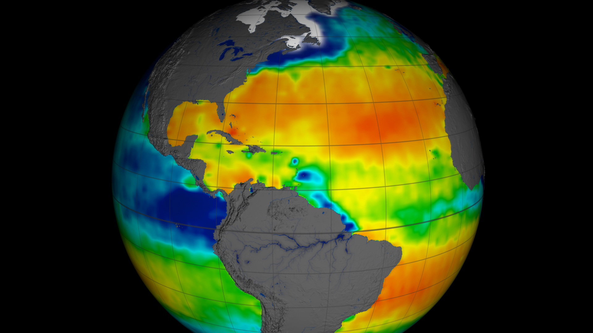
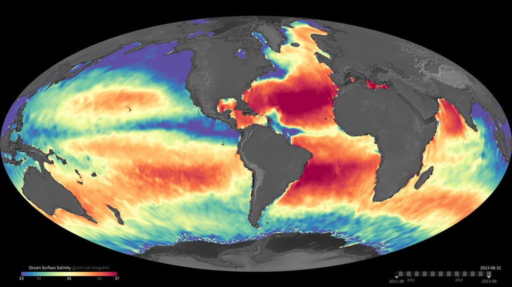
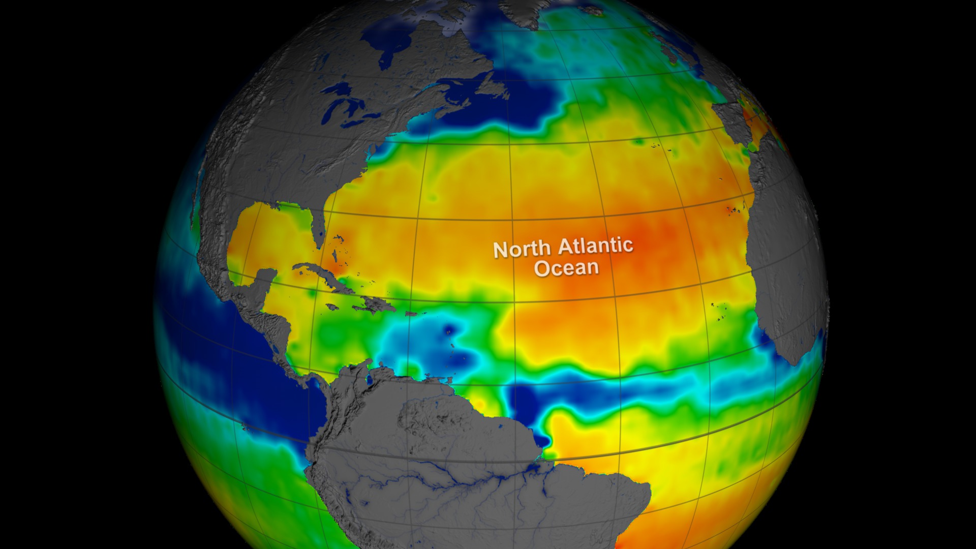
This data visualization shows sea surface salinity (i.e., ocean salt concentration) over a ten year period (2011 to 2021). Warm colors (orange to yellow) are areas of high salinity/hot tropics. Cooler colors (blue to violet) are fresher waters, many of which can be seen coming from rainy/river/wetter tropics.

Images
- salinity_v48_colorbar2_print.jpg (1024x257)
- salinity_v48_colorbar2.tif (2000x502)
Right click movies to download them if they automatically play in your browser.
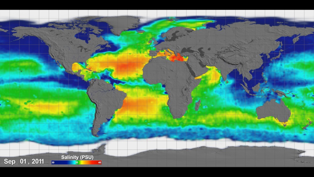
Sea Surface Salinity (i.e., ocean salt) colorbar.

Images
- salinity_dates.4653_print.jpg (1024x256)
Frames
- frames/2000x500_4x1_60p/ (2000x500)
Right click movies to download them if they automatically play in your browser.
Date overlay for above data visualization.
Movies
- salinity_comp_1080p30.mp4 (1920x1080)
- salinity_comp_1080p30.webm (1920x1080)
- salinity_comp_2160p30.mp4 (3840x2160)
Images
- salinity_comp0000_print.jpg (1024x576)
Frames
- frames/3840x2160_16x9_60p/ (3840x2160)
Right click movies to download them if they automatically play in your browser.
Example composite animation using the colorbar and date overlays.
Credits
Please give credit for this item to:
NASA's Scientific Visualization Studio
Data visualizers
- Alex Kekesi (GST) [Lead]
- Mark SubbaRao (NASA/GSFC)
Scientist
- Nadya Vinogradova-Shiffer (NASA/HQ) [Lead]
Technical support
- Ian Jones (ADNET)
- Laurence Schuler (ADNET)
Data provider
- Jinbo Wang (NASA/JPL)
Datasets used in this visualization
Comiso's Daily Sea Ice Concentration
Data Compilation OISSS_L4_multimission_7day_v1 (A.K.A. Multi-Mission Optimally Interpolated Sea Surface Salinity Global Dataset V1) (Collected with the SMAP/SMAP L-BAND RADIOMETER, SAC-D/AQUARIUS_SCATTEROMETER, SMOS/SMAP L-BAND RADIOMETER sensor)
Credit: Creator: Oleg Melnichenko
Dataset can be found at: https://podaac.jpl.nasa.gov/dataset/OISSS_L4_multimission_7day_v1
See more visualizations using this data setData Compilation Natural Earth River Data
Dataset can be found at: naturalearthdata.com
See more visualizations using this data setNote: While we identify the data sets used in these visualizations, we do not store any further details nor the data sets themselves on our site.
Related pages
Earth Day 2020: Sea Surface Salinity (SSS) from August 2011 through July 2014
April 14, 2020, 8 p.m.
Read moreThis visualization shows sea surface salinity (SSS) data of the oceans from August 2011 through July 2014. The data set used is from the Aquarius satellite. Aquarius is a collaboration between NASA and the Space Agency of Argentina to measure global sea surface salinity (the amount of dissolved salts in water). Measuring salinity can help us better understand the water cycle and can also lead to improved climate models.This visualization was created in part to support Earth Day 2020 media releases. Sea Surface Salinity
Aquarius Sea Surface Salinity 2011-2015
Sept. 9, 2015, 8 p.m.
Read moreAquarius is a collaboration between NASA and the Space Agency of Argentina to measure global sea surface salinity (the amount of dissolved salts in water). Measuring salinity can help us better understand the water cycle and can also lead to improved climate models. The visualizations show the complete observations of sea surface salinity taken during the life span (2011 through May 2015) of the Aquarius spacecraft. In these visualizations, sea surface salinity is shown ranging from 30 to 40 PSU (from blue to green to red) on a flat map using simple cartesian and extended Molleide projections. The visualizations were generated based on version 4.0 of the Aquarius data products. Salinity plays a major role in how ocean waters circulate around the globe. Salinity changes can create ocean circulation changes that, in turn, may impact regional and global climates. Rectangular flat map projection shows Sea Surface Salinity measurements taken by Aquarius in its whole life span (September 2011 - May 2015). The same data set of sea surface salinity in Mollweide map projection. Aquarius color bar showing salinity range from 30 to 40 PSU, going from blue to green to red.
AXIOM-1 Sea Surface Salinity, Sea Ice Thickness and Atmospheric Precipitable Water
Feb. 12, 2015, 7 p.m.
Read moreAXIOM-1 (eXperimental Analysis of sea Ice and Ocean Mesoscale version 1) is a coupled analysis of the global ocean and sea ice obtained by assimilating Aquarius sea surface salinity (SSS) and MODIS chlorophyll data together with sea surface temperature (SST) and sea ice concentrations from the OSTIA objective analysis into a global high-resolution coupled ocean/ atmosphere/sea ice model. The coupled model components are the MOM-5 ocean general circulation model, the GEOS-5 atmospheric general circulation model and the CICE sea ice model. The ocean and sea ice model horizontal resolutions vary from 11km to less than 3km in the Arctic and the atmospheric model resolution is the same as that used to produce the GMAO operational weather forecasts (25km).As a preamble to a fully coupled integrated earth system analysis, the atmospheric model is constrained to the GMAO MERRA-2 atmospheric reanalysis (prior to June 2013) and to the GMAO operational forward processing stream (after June 2013) while the SST, SSS, ice concentration and chlorophyll data are assimilated into the coupled model using a new methodology [State Adaptive Forecast-error Estimation (SAFE): https://gmao.gsfc.nasa.gov/pubs/docs/Keppenne721.pdf] developed especially for high-resolution data assimilation.This animation shows the ocean SSS and sea ice thickness fields (shown over grid cells where the fractional ice coverage is greater than 15%) and the vertical integral of atmospheric precipitable water (transparent overlay) sampled every 6 hours from June 1, 2012 to November 1, 2014 from a reanalysis completed with the AXIOM-1 system. The precipitations associated with tropical cyclones and other major storm systems induce localized surface freshenings which makes the corresponding storm tracks visible in the SSS field. This animation shows sea surface sailinity, sea ice thickness, and atmospheric precipitable water.
Aquarius Sea Surface Salinity 2011-2014 - Rotating Globes
Nov. 5, 2014, 7 p.m.
Read moreThe Aquarius spacecraft is designed to measure global sea surface salinity. It is important to understand salinity, the amount of dissolved salts in water, because it will lead us to better understanding of the water cycle and can lead to improved climate models. Aquarius is a collaboration between NASA and the Space Agency of ArgentinaThis visualization celebrates over three years of successful Aquarius observations. Sea surface salinity is shown on a spinning globe (with and without grid lines).The range of time shown is September 2011 through September 2014. This visualization was generated based on version 3.0 of the Aquarius data products. 3 years of sea surface salinity data displayed on a spinning globe focused on the northern hemisphere with date and color bar 3 years of sea surface salinity data displayed on a spinning globe (with grid lines) focused on the northern hemisphere with date and color bar 3 years of sea surface salinity data displayed on a spinning globe with date and color bar 3 years of sea surface salinity data displayed on a spinning globe (with grid lines) with date and color bar 3 years of sea surface salinity data displayed on a spinning globe focused on the northern hemisphere. No dates or color bar Print resolution still of the oceans around Africa Print resolution still of the oceans around Asia Print resolution still of the oceans around the Americas Aquarius color bar showing salinity range from 30 to 40 PSU, going from blue to green to red For More InformationSee [http://www.nasa.gov/mission_pages/aquarius/news/](http://www.nasa.gov/mission_pages/aquarius/news/)
NASA On Air: NASA's Aquarius Measures Ocean Salinity (3/13/2014)
March 12, 2014, 8 p.m.
Read moreLEAD: NASA s Aquarius instrument is observing the saltiness of the ocean surface from space.1. Bright orange colors = very salty. Blue = lower saltiness.2. Flying 400 miles above Earth, Aquarius can detect a change as little as a pinch of salt in a gallon of water.3. Scientists are studying why some hurricanes that pass over the Amazon River plume of lower saltiness tend to get stronger.TAG: Aquarius should help with El Niño forecasting as well.More information: http://aquarius.umaine.edu/cgi/sci_results.htm
Daily Salinity Maps
Feb. 10, 2014, 7 p.m.
Read moreNew daily maps show seasonal variations in salinity in the oceans of the world. Ocean surface salinity For More InformationSee [https://aquarius.nasa.gov](https://aquarius.nasa.gov)
Aquarius Sea Surface Salinity Tour 2012
Feb. 27, 2013, 7 a.m.
Read moreThe Aquarius spacecraft is designed to measure global sea surface salinity. It is important to understand salinity, the amount of dissolved salts in water, because it will lead us to better understanding of the water cycle and can lead to improved climate models. Aquarius is a collaboration between NASA and the Space Agency of ArgentinaThis visualization celebrates over a year of successful Aquarius observations. Sea surface salinity is shown at various locations around the globe highlighting the following:the Atlantic Ocean is generally much more salty than the Pacificlow salinity waters in the Eastern Equatorial Pacific are transported westwardhigh influxes of fresh water from the Amazon River basin can be clearly seenlow salinity waters are transported by the Labrador current to the southhigh influxes of fresh water from the Ganges River basin can be seen keeping the Eastern Indian Ocean lower salinity than the Western Indian OceanThe range of time shown is December 2011 through Decemeber 2012. The data continuously loops through this range every 6 seconds. This visualization was generated based on version 2.0 of the Aquarius data products with all 3 scanning beams. A narrated tour of Aquarius sea surface salinity data highlighting interesting features including: the North Atlantic, Eastern Pacific, Amazon outflow, Labrador current, and Indian Ocean.For complete transcript, click here.This video is also available on our YouTube channel. A Spanish language narrated tour of Aquarius sea surface salinity data highlighting interesting features including: the North Atlantic, Eastern Pacific, Amazon outflow, Labrador current, and Indian Ocean.For complete transcript, click here. A tour of Aquarius sea surface salinity data highlighting interesting features including: the North Atlantic, Eastern Pacific, Amazon outflow, Labrador current, and Indian Ocean. Print resolution still showing the salty North Atlantic. Print resolution still showing the low salinity region in the Eastern Tropical Pacific. Print resolution still showing the massive outflow of fresh water from the Amazon River. Print resolution still showing the low salinity melt water transported near Greenland and Labrador. Print resolution still showing the higher salinity Western Indian Ocean compared to the low salinity Eastern Indian Ocean. Print resolution still showing the Atlantic Ocean. Print resolution still showing the Pacific Ocean. Aquarius color bar intended for the public. The salinity range is low to high, going from blue to green to red. Aquarius color bar intended for scientists. The salinity range is 30 to 40 PSU, going from blue to green to red. For More InformationSee [http://www.nasa.gov/mission_pages/aquarius/news/data-first-year.html](http://www.nasa.gov/mission_pages/aquarius/news/data-first-year.html)
Aquarius Sea Surface Salinity on Rotating Globes 2012
Feb. 27, 2013, 7 a.m.
Read moreThe Aquarius spacecraft is designed to measure global sea surface salinity. It is important to understand salinity, the amount of dissolved salts in water, because it will lead us to better understanding of the water cycle and can lead to improved climate models. Aquarius is a collaboration between NASA and the Space Agency of ArgentinaThis visualization celebrates over a year of successful Aquarius observations. Sea surface salinity in the northern hemisphere is shown as the globe slowly rotates. The data cycles through a single year, 2012, and repeats. Two versions of the visualization are provied: a version with dates and a scientific color bar and another version without dates and a simpler color bar. The range of time shown is December 2011 through Decemeber 2012. The data continuously loops through this range every 6 seconds. This visualization was generated based on version 2.0 of the Aquarius data products with all 3 scanning beams.http://The Aquarius spacecraft Aquarius spinning globe without dates and with public colorbar. Aquarius spinning globe with dates and with science colorbar Print resolution still of the Atlantic Ocean. Print resolution still showing the Atlantic and Pacific Oceans. Print resolution still of the Eastern Pacific. Print resolution still of the Western Pacific Ocean. Print resolution still of oceans around Africa. Aquarius color bar intended for the public. The salinity range is low to high, going from blue to green to red. Aquarius color bar intended for scientists. The salinity range is 30 to 40 PSU, going from blue to green to red. For More InformationSee [http://www.nasa.gov/mission_pages/aquarius/news/data-first-year.html](http://www.nasa.gov/mission_pages/aquarius/news/data-first-year.html)
Aquarius Yields NASA's First Global Map of Ocean Salinity
Sept. 21, 2011, 8 p.m.
Read moreNASA s Earth Systems Science Pathfinder Program. JPL is managing Aquarius through its commissioning phase and will archive mission data. Goddard will manage Aquarius mission operations and process science data. CONAE provided the SAC-D spacecraft and the mission operations center. Salinity as measured by Aquarius
Sea Surface Temperature, Salinity and Density
Oct. 9, 2009, 9:24 a.m.
Read moreSea Surface TemperatureThe oceans of the world are heated at the surface by the sun, and this heating is uneven for many reasons. The Earth ) of sea surface temperature and salinity used in these animations come from the World Ocean Atlas 2005 (WOA2005)
Aquarius Sea Surface Salinity 2011-2014 - Flat Maps
Nov. 5, 2014, 7 p.m.
Read moreThe Aquarius spacecraft is designed to measure global sea surface salinity. It is important to understand salinity, the amount of dissolved salts in water, because it will lead us to better understanding of the water cycle and can lead to improved climate models. Aquarius is a collaboration between NASA and the Space Agency of ArgentinaThis visualization celebrates over three years of successful Aquarius observations. Sea surface salinity is shown on a flat map using simple cartesian and extended Molleide projections. Versions are included with and without grid lines, and in both Altantic-centered and Pacific-centered projections.The range of time shown is September 2011 through September 2014. This visualization was generated based on version 3.0 of the Aquarius data products. Rectangular flat map projection (Atlantic-centered) with grid lines showing Sea Surface Salinity measurements taken by Aquarius between September 2011 and September 2014. Rectangular flat map projection (Atlantic-centered) showing Sea Surface Salinity measurements taken by Aquarius between September 2011 and September 2014. Rectangular flat map projection (Pacific-centered) with grid lines showing Sea Surface Salinity measurements taken by Aquarius between September 2011 and September 2014. Rectangular flat map projection (Pacific-centered) showing Sea Surface Salinity measurements taken by Aquarius between September 2011 and September 2014. Extended Mollweide map projection (Atlantic-centered) with grid lines showing Sea Surface Salinity measurements taken by Aquarius between September 2011 and September 2014. Extended Mollweide map projection (Atlantic-centered) showing Sea Surface Salinity measurements taken by Aquarius between September 2011 and September 2014. Extended Mollweide map projection (Pacific-centered) with grid lines showing Sea Surface Salinity measurements taken by Aquarius between September 2011 and September 2014. Extended Mollweide map projection (Pacific-centered) showing Sea Surface Salinity measurements taken by Aquarius between September 2011 and September 2014. Print resolution still - Rectangular flat map projection (Atlantic-centered) showing Sea Surface Salinity measurements taken by Aquarius. Aquarius color bar showing salinity range from 30 to 40 PSU, going from blue to green to red. For More InformationSee [http://www.nasa.gov/mission_pages/aquarius/news/](http://www.nasa.gov/mission_pages/aquarius/news/)
Ocean Salinity and Daily Argo Coverage
May 12, 2014, 8 p.m.
Read moreSalinity has been measured at sea for centuries, first using buckets to collect samples, and later (within the past few decades) with instruments known as “CTDs,” which simultaneously measure conductivity (as a proxy for salinity), temperature, and ocean depth (based on pressure). This technology is used to provide single point samples throughout the ocean. The Argo program has over 3500 profiling floats with CTDs currently deployed in all ocean basins. The Argo array of profiling floats is the first attempt to monitor the global subsurface (upper 2000 meters) ocean temperature and salinity fields in real time. The first floats were deployed in late 1999 and it took another 8 years to reach the global target of 3000 operating floats delivering data every 10 days. While ~3500 floats seem like a lot, on a daily basis the ocean is still very undersampled.This visualization shows ocean salinity at 150 meters as derived by an eddy-resolving ocean model. The gray dots represent the daily locations of Argo floats from January 1993 to December 2010. Ocean salinity and temperature data from Argo floats have proved extremely useful, and can be used in combination with data from other sources (such as from NASA’s Aquarius mission and other satellite missions) to observe and model long-term ocean signals related to climate change. Modeled ocean salinity and daily locations of Argo floats, 1993 to 2010. For More InformationSee [podaac.jpl.nasa.gov/AnimationsImages/Animations](podaac.jpl.nasa.gov/AnimationsImages/Animations)
Aquarius Sea Surface Salinity Flat Maps 2012
Feb. 28, 2013, 8 a.m.
Read moreThe Aquarius spacecraft is designed to measure global sea surface salinity. It is important to understand salinity, the amount of dissolved salts in water, because it will lead us to better understanding of the water cycle and can lead to improved climate models. Aquarius is a collaboration between NASA and the Space Agency of ArgentinaThis visualization celebrates over a year of successful Aquarius observations. Sea surface salinity is shown on a flat map using a simple cartesian and extended Molleide projections. Versions are included with and without dates/color bars.The range of time shown is December 2011 through Decemeber 2012. The data continuously loops through this range every 6 seconds. This visualization was generated based on version 2.0 of the Aquarius data products with all 3 scanning beams. Flat map projection of Aquarius sea surface salinity Flat map projection of Aquarius sea surface salinity data with dates and colorbar Extended Mollweide projection of Aquarius sea surface salinity Extended Mollweide projection of Aquarius sea surface salinity with dates and colorbar Aquarius color bar showing salinity range from 30 to 40 PSU, going from blue to green to red. For More InformationSee [http://www.nasa.gov/mission_pages/aquarius/news/data-first-year.html](http://www.nasa.gov/mission_pages/aquarius/news/data-first-year.html)