Spread of the Dixie Fire - 2021
This visualization shows the spread of the Dixie fire between July 14 and October 22, 2021, updated every 12 hours based on new satellite active fire detections. The yellow outlines track the position of the active fire lines for the last 60 hours, with the latest location of the fire front in the brightest shade of yellow. The red points show the location of active fire detections, while the grey region shows the estimated total area burned. The graph shows the cumulative burned area in square kilometers.
Coming soon to our YouTube channel.
This visualization highlights data from a new fire detection and tracking approach (Chen et al., 2022) based on near-real time active fire detections from the VIIRS sensor on the Suomi-NPP satellite. Every 12 hours, the fire tracking algorithm uses new active fire detections to update the total fire perimeter and estimate the position of active fire lines where the fire may continue to spread. Yellow lines indicate the new fire fronts from active fire data (red points) every 12 hours. This approach provides a detailed perspective on the behavior of the Dixie fire, the largest fire in California history. The fire tracking data identify periods of rapid fire expansion, spot fires from blowing embers outside of the large fire perimeter, and active fire detections within the perimeter from continued flaming and smoldering behind the active fire fronts. In total, the Dixie fire burned for more than 100 days, including more than a month of fire activity after the perimeter was contained in mid-September.
For more details, see the paper here.
This movie is identical to the above movie except that it is played twice the speed.
Coming soon to our YouTube channel.

This image shows the extent of the Dixie fire on July 21, 2021. The yellow outlines track the position of the active fire lines for the last 60 hours, with the latest location of the fire front in the brightest shade of yellow. The red points show the location of active fire detections, while the grey region shows the estimated total area burned. The graph shows the cumulative burned area in square kilometers.
This image shows the extent of the Dixie fire on July 31, 2021. The yellow outlines track the position of the active fire lines for the last 60 hours, with the latest location of the fire front in the brightest shade of yellow. The red points show the location of active fire detections, while the grey region shows the estimated total area burned. The graph shows the cumulative burned area in square kilometers.
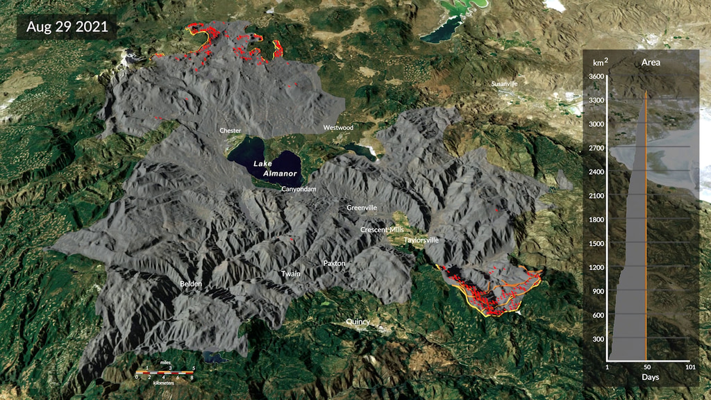
This image shows the extent of the Dixie fire on August 31, 2021. The yellow outlines track the position of the active fire lines for the last 60 hours, with the latest location of the fire front in the brightest shade of yellow. The red points show the location of active fire detections, while the grey region shows the estimated total area burned. The graph shows the cumulative burned area in square kilometers.
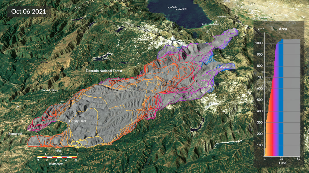
This image shows the spread of the Dixie fire between July 14 and October 22, 2021, with the fire line for each 12-hour step in time shown in a different color.
Perimeter of the Dixie wildfire as of October 22, 2021. The dropdown menu offers multiple resolutions for a 16:9 aspect ratio.
Credits
Please give credit for this item to:
NASA's Scientific Visualization Studio
-
Scientist
- Doug C. Morton (NASA/GSFC)
-
Visualizers
- Cindy Starr (Global Science and Technology, Inc.)
- Horace Mitchell (NASA/GSFC)
- Michala Garrison (SSAI)
- Andrew J Christensen (SSAI)
- Greg Shirah (NASA/GSFC)
- Kel Elkins (USRA)
- Alex Kekesi (Global Science and Technology, Inc.)
-
Technical support
- Laurence Schuler (ADNET Systems, Inc.)
- Ian Jones (ADNET Systems, Inc.)
Release date
This page was originally published on Wednesday, June 1, 2022.
This page was last updated on Wednesday, January 29, 2025 at 4:23 PM EST.
Related papers
Chen, Y., Hantson, S., Andela, N. et al. California wildfire spread derived using VIIRS satellite observations and an object-based tracking system. Sci Data 9, 249 (2022). https://doi.org/10.1038/s41597-022-01343-0
Chen, Y., Hantson, S., Andela, N. et al. California wildfire spread derived using VIIRS satellite observations and an object-based tracking system. Sci Data 9, 249 (2022). https://doi.org/10.1038/s41597-022-01343-0
Datasets used
-
DEM [SRTM: SIR-C]
ID: 481 -
Band Combination 4-3-2 [Landsat-8: OLI/TIRS]
ID: 1086 -
California Wildfire Spread Derived using VIIRS Observations and an Object-based Tracking System (California Wildfire Spread Derived using VIIRS Observations and an Object-based Tracking System) [Suomi-NPP: VIIRS]
ID: 1178Credit: Chen, Yang; Hantson, Stijn; Andela, Niels; Coffield, Shane; Graff, Casey; Morton, Douglas C.; et al. (2022): A Dataset of California Wildfire Spread Derived Using VIIRS Observations and an Object-based Tracking System. figshare. Collection. https://doi.org/10.6084/m9.figshare.c.5601537.v1
This dataset can be found at: https://springernature.figshare.com/collections/A_Dataset_of_California_Wildfire_Spread_Derived_Using_VIIRS_Observations_and_an_Object-based_Tracking_System/5601537/1
See all pages that use this dataset
Note: While we identify the data sets used on this page, we do not store any further details, nor the data sets themselves on our site.
Related
- ID: 4992
 Visualization
 - ID: 5009
 Visualization
Used as a Source In
- ID: 14285
![Complete transcript available.Universal Production Music: Big Found by Ran Shir [BMI], Rotem Moav [BMI]; Swirling Blizzard by Laurent Dury [SACEM]; Dry Ice by Alessandro Rizzo [PRS], Elliot Greenway Ireland [PRS], Paper Boy [PRS]; Into Motion by Peter Larsen [PRS] This video can be freely shared and downloaded. While the video in its entirety can be shared without permission, some individual imagery provided by Pond5.com is obtained through permission and may not be excised or remixed in other products. For more information on NASA’s media guidelines, visit https://www.nasa.gov/multimedia/guidelines/index.html](/vis/a010000/a014200/a014285/14285_Thumbnail.jpg) Produced Video
Produced Video - ID: 5088
 Visualization
 - ID: 31184
 Hyperwall Visual