A newer version of this visualization is available.
Global Temperature Anomalies from 1880 to 2021
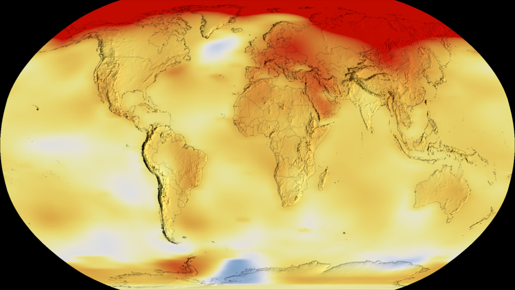
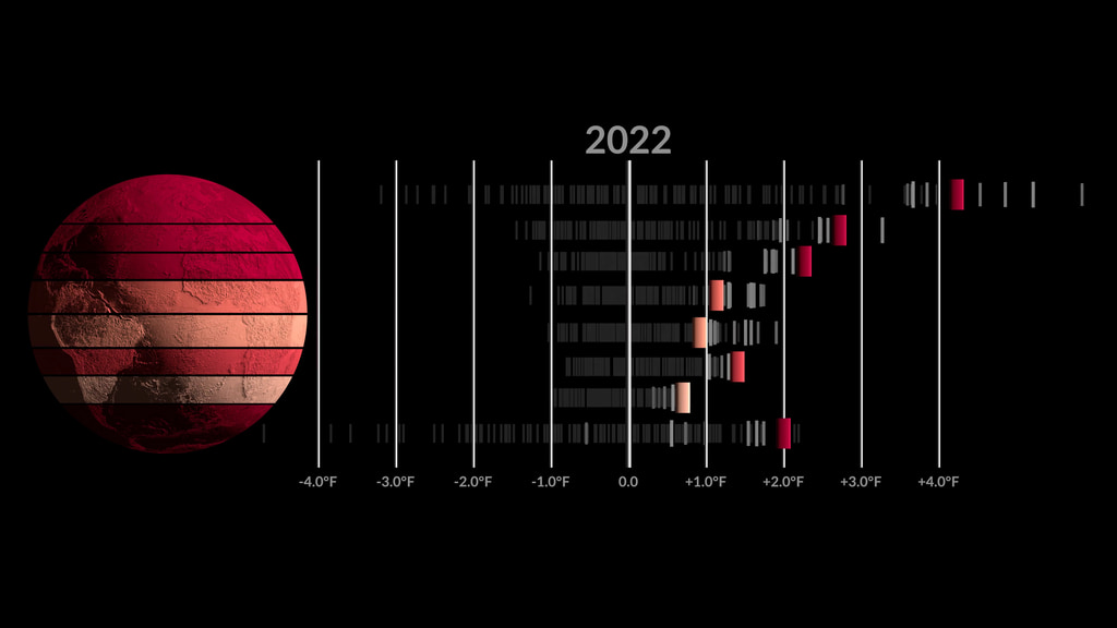
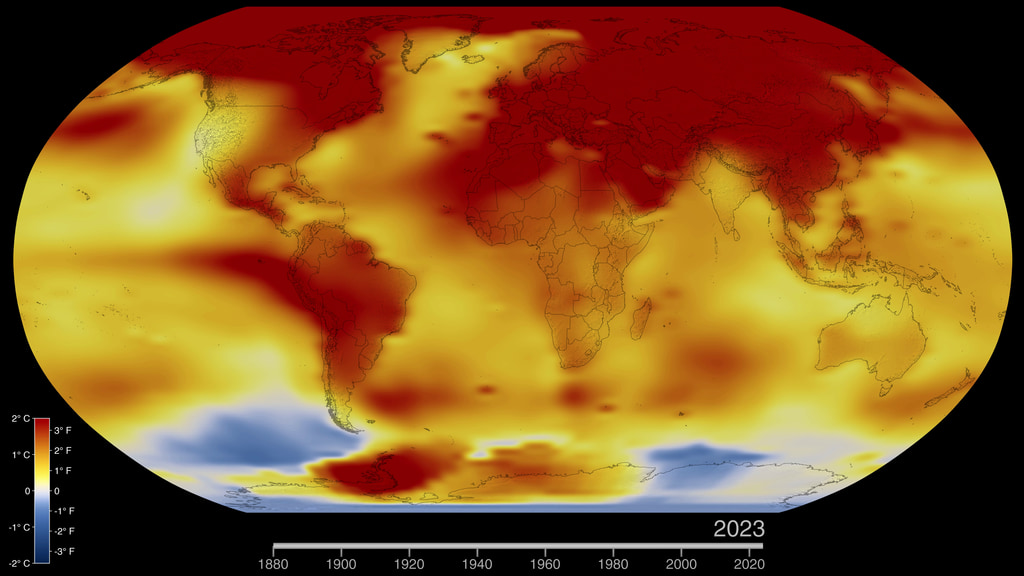
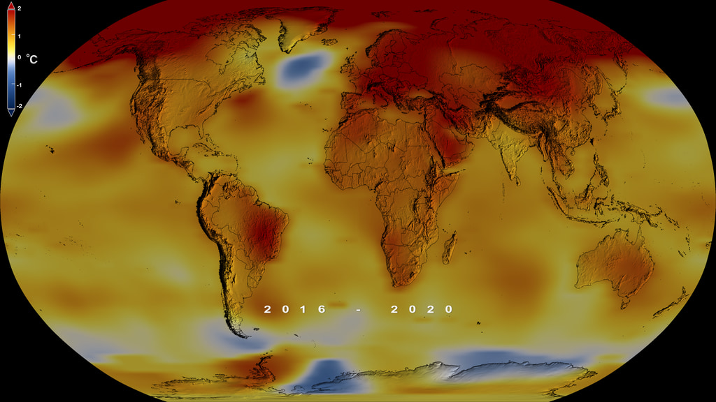
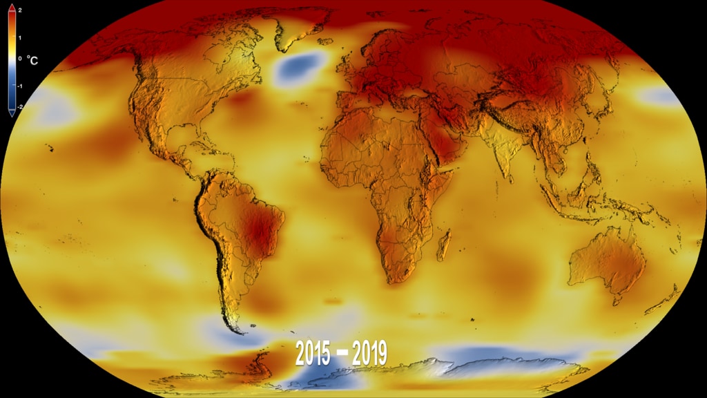
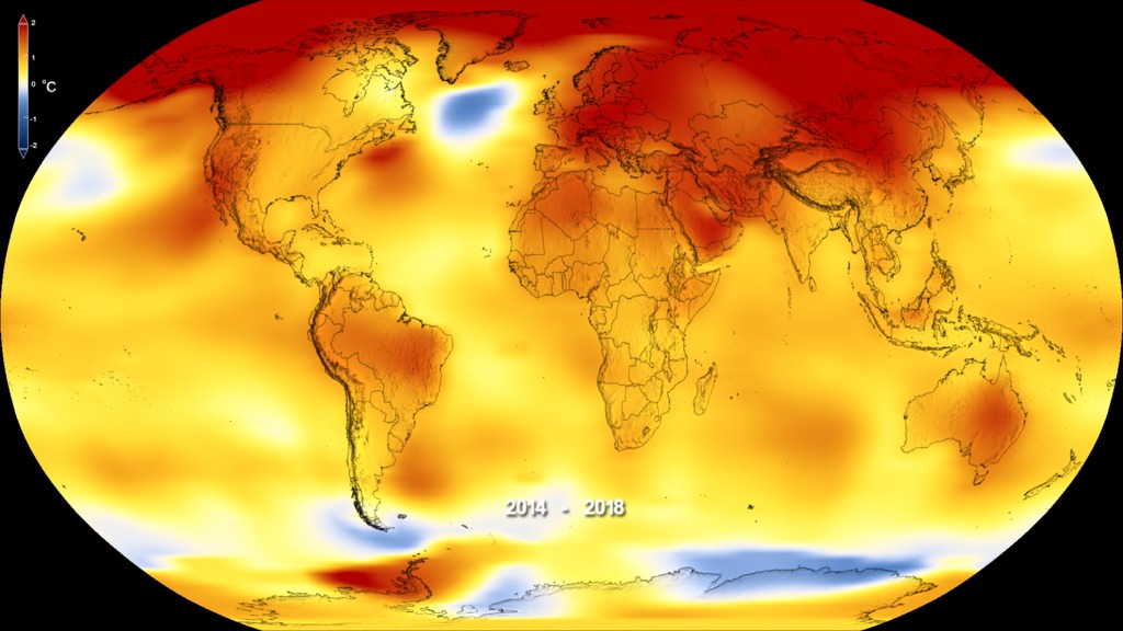
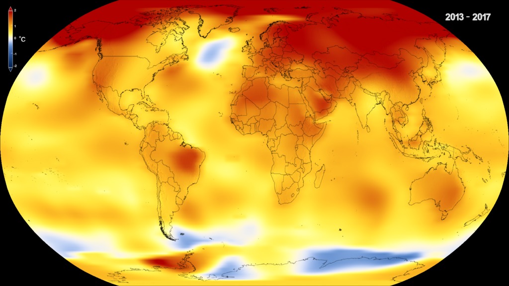
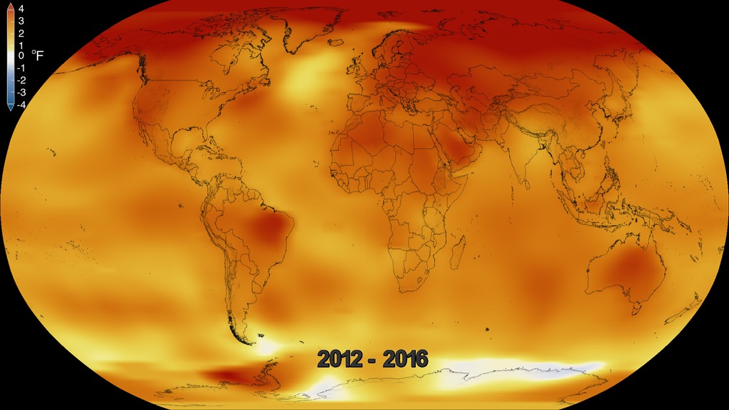
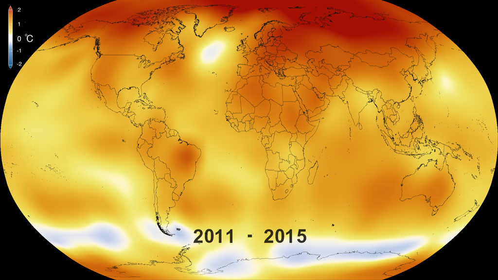
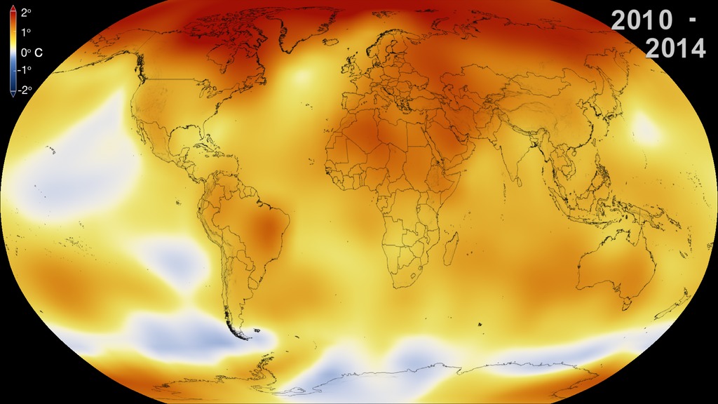
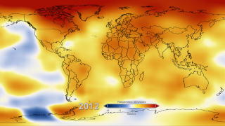
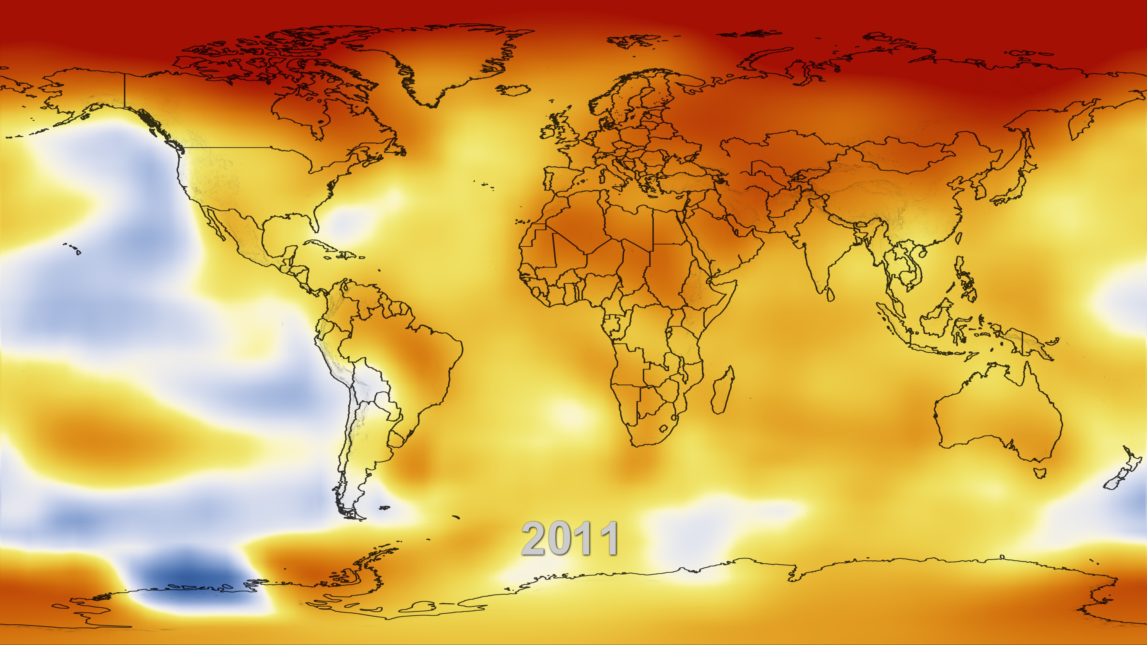
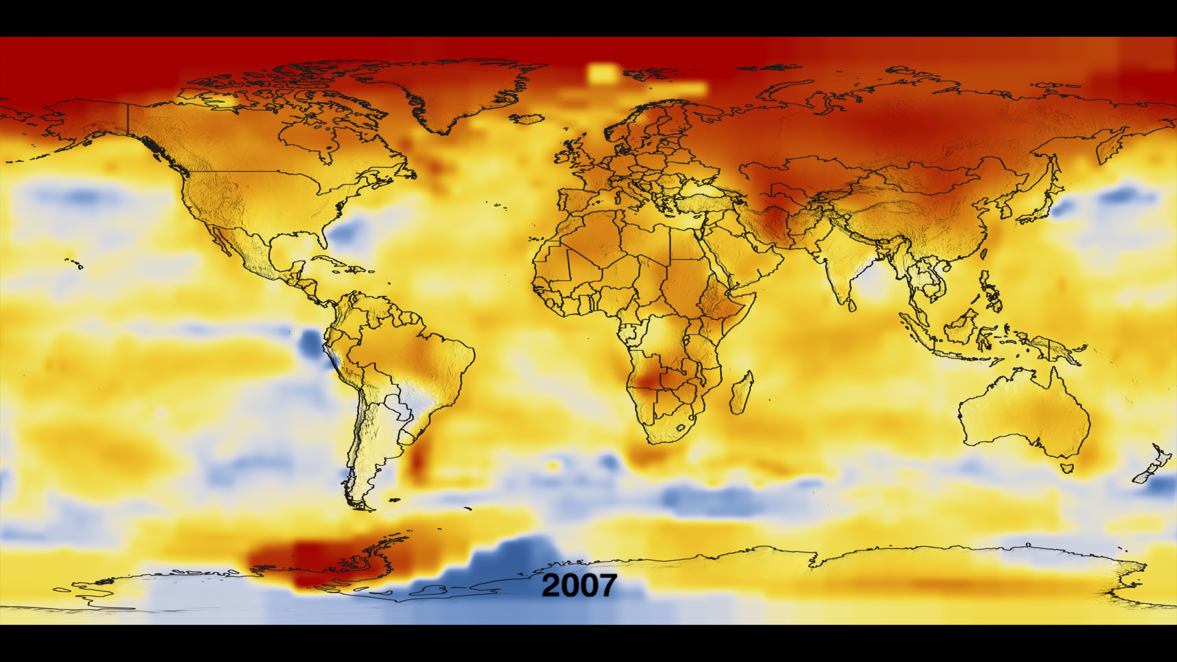
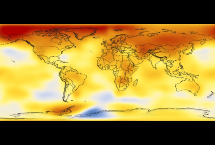
This color-coded map in Robinson projection displays a progression of changing global surface temperature anomalies. Normal temperatures are shown in white. Higher than normal temperatures are shown in red and lower than normal temperatures are shown in blue. Normal temperatures are calculated over the 30 year baseline period 1951-1980. The final frame represents the 5 year global temperature anomalies from 2017-2021. Scale in degrees Fahrenheit.
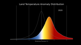
Earth’s global average surface temperature in 2021 tied with 2018 as the sixth warmest on record, according to independent analyses done by NASA and NOAA.
Continuing the planet’s long-term warming trend, global temperatures in 2021 were 1.5 degrees Fahrenheit (or 0.85 degrees Celsius) above the average for NASA’s baseline period, according to scientists at NASA’s Goddard Institute for Space Studies (GISS) in New York.
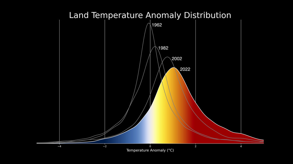
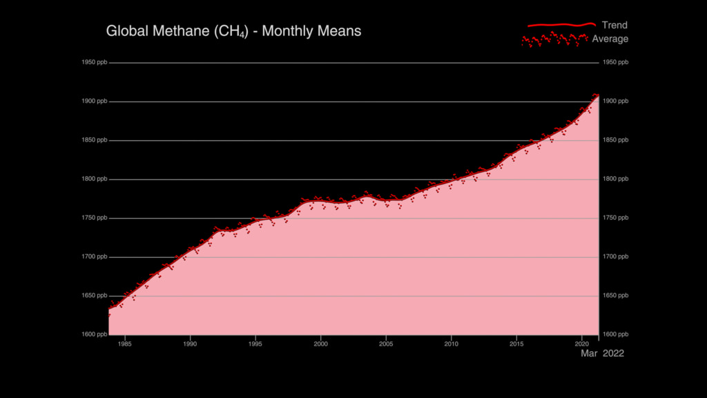
Collectively, the past eight years are the top eight warmest years since modern record keeping began in 1880. This annual temperature data makes up the global temperature record – and it’s how scientists know that the planet is warming.
GISS is a NASA laboratory managed by the Earth Sciences Division of the agency’s Goddard Space Flight Center in Greenbelt, Maryland. The laboratory is affiliated with Columbia University’s Earth Institute and School of Engineering and Applied Science in New York.
For more information about NASA’s Earth science missions, visit:
https://www.nasa.gov/earth
This data visualization shows the 2021 global surface temperature anomalies on a rotating globe to highlight the La Niña. La Niña has developed and is expected to last into early 2022. Despite the cooling influence of this naturally occurring climate phenomenon, temperatures in many parts of the world are above average. The year 2000 also saw a La Niña event of similar strength to that in 2021, but 2021 global temperatures was more than 0.75 degrees Fahrenheit hotter than 2000.
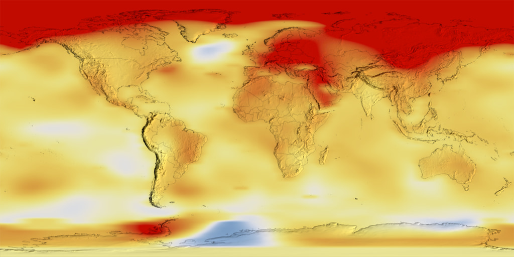
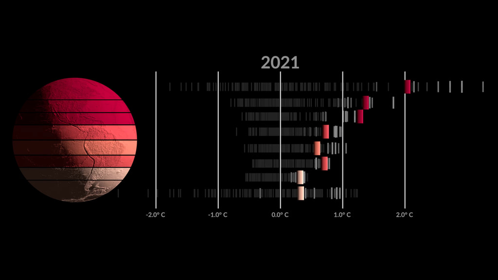
This color-coded map in Robinson projection displays a progression of changing global surface temperature anomalies. Normal temperatures are shown in white. Higher than normal temperatures are shown in red and lower than normal temperatures are shown in blue. Normal temperatures are calculated over the 30 year baseline period 1951-1980. The final frame represents the 5 year global temperature anomalies from 2017-2021. Scale in degrees Celsius.
This frame sequence is the corresponding date range for each frame in the sequence.

Degrees Fahrenheit Colorbar
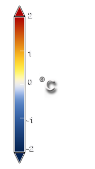
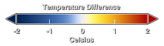
Degrees Celsius Colorbar
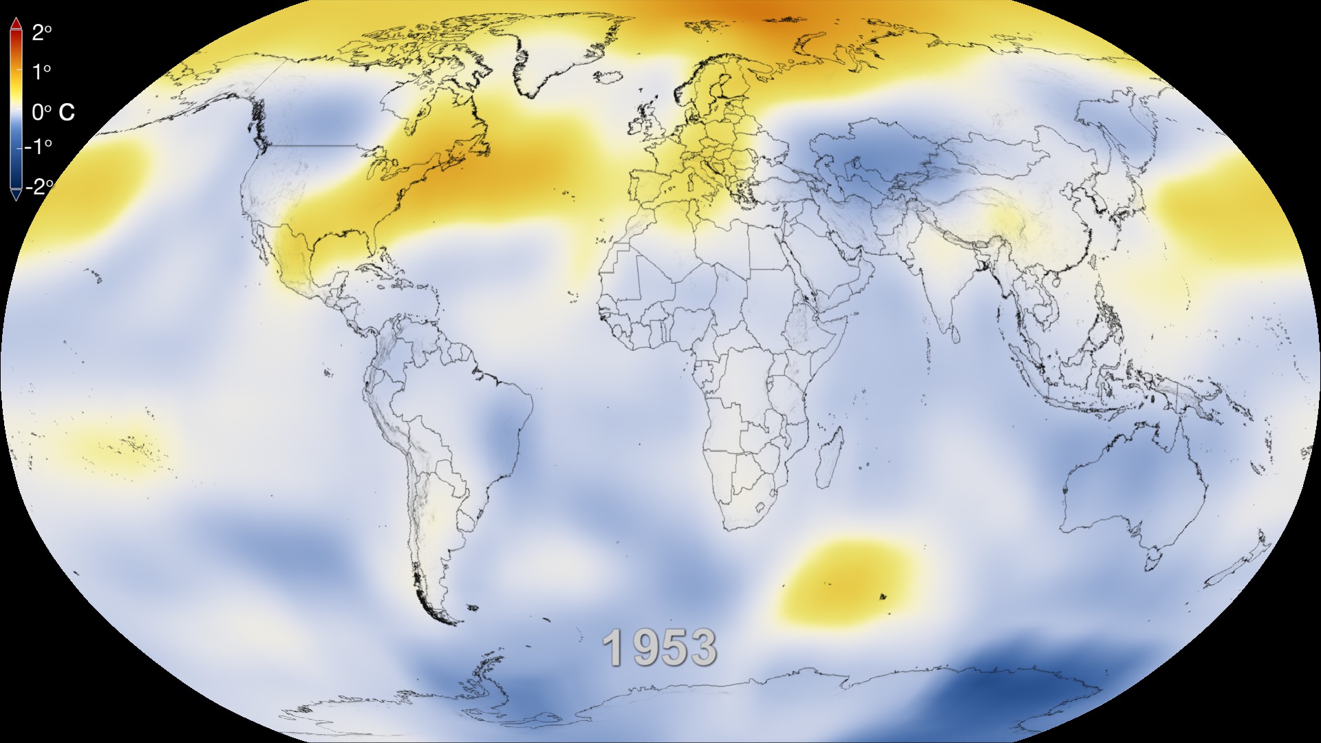
This frame sequence of color-coded global temperature anomalies in robinson projection display a progression of changing global surface temperatures anomalies in Fahrenheit. The first frame in this sequence represents the data from 1880-1884. The second frame represents 1881-1885, ...and the last frame represents 2017-2021. Higher than normal temperatures are shown in red and lower than normal are shown in blue. Normal temperatures are the average over the 30 year baseline period 1951-1980.
This frame sequence of color-coded global temperature anomalies in degrees celsius is designed to be displayed on the Science on a Sphere projection system. Each image represents a unique 5 year rolling time period with no fades between datasets. Frame 1884 represents data from 1880-1884, frame 1885 represents data from 1881-1885,... frame 2021 represents data from 2017-2021. Higher than normal temperatures are shown in red and lower than normal are shown in blue. Normal temperatures are the average over the 30 year baseline period 1951-1980.
This is the colorbar for the Science on a Sphere frameset above. It is in degrees celsius.
Credits
Please give credit for this item to:
NASA's Scientific Visualization Studio
Data provided by Robert B. Schmunk (NASA/GSFC GISS)
-
Visualizer
- Lori Perkins (NASA/GSFC)
-
Scientists
- Gavin A. Schmidt (NASA/GSFC GISS)
- Robert B Schmunk (SIGMA Space Partners, LLC.)
- Reto A. Ruedy (SIGMA Space Partners, LLC.)
-
Producers
- Kathryn Mersmann (USRA)
- Katie Jepson (USRA)
-
Public affairs officers
- Peter H. Jacobs (NASA/GSFC)
- Jacob Richmond (NASA/GSFC)
-
Writers
- Sofie Bates (KBR Wyle Services, LLC)
- Roberto Molar-Candanosa (KBR Wyle Services, LLC)
Release date
This page was originally published on Thursday, January 13, 2022.
This page was last updated on Sunday, April 7, 2024 at 12:15 AM EDT.
Series
This visualization can be found in the following series:Datasets used in this visualization
-
GISTEMP [GISS Surface Temperature Analysis (GISTEMP)]
ID: 585The GISS Surface Temperature Analysis version 4 (GISTEMP v4) is an estimate of global surface temperature change. Graphs and tables are updated around the middle of every month using current data files from NOAA GHCN v4 (meteorological stations) and ERSST v5 (ocean areas), combined as described in our publications Hansen et al. (2010) and Lenssen et al. (2019).
Credit: Lenssen, N., G. Schmidt, J. Hansen, M. Menne, A. Persin, R. Ruedy, and D. Zyss, 2019: Improvements in the GISTEMP uncertainty model. J. Geophys. Res. Atmos., 124, no. 12, 6307-6326, doi:10.1029/2018JD029522.
This dataset can be found at: https://data.giss.nasa.gov/gistemp/
See all pages that use this dataset
Note: While we identify the data sets used in these visualizations, we do not store any further details, nor the data sets themselves on our site.
Related
- ID: 5208
 Visualization
 - ID: 5209
 Visualization
 - ID: 5211
- ID: 5065
- ID: 5059
 Visualization
 - ID: 4978
 Visualization
 - ID: 14069
- ID: 4961
 Visualization
 - ID: 4908
 Visualization
 - ID: 4891
- ID: 13791
 Produced Video
Newer Versions
- ID: 5207
 Visualization
 - ID: 5007
 Visualization
Older Versions
- ID: 4882
 Visualization
 - ID: 4787
 Visualization
 - ID: 4626
 Visualization
 - ID: 4609
 Visualization
 - ID: 4546
 Visualization
 - ID: 4419
 Visualization
 - ID: 4252
 Visualization
 - ID: 4135
 Visualization
 - ID: 4030
 Visualization
 - ID: 3901
- ID: 3490
- ID: 3375
Used as a Source In
- ID: 14066
![Universal Production Music: Knock and Wait (Instrumental) by Brice Davoli [SACEM], Well That’s Difference (Instrumental) by Jeff Cardoni [ASCAP], Wanna Be Hipster (Instrumental) by Jeff Cardoni [ASCAP], Curiosity Killed Kitty (Instrumental) by Robert Leslie Bennett [ASCAP], Eco Issues (Instrumental) by Max van Thun [GEMA] Additional Footage: Pond5.com, CSPANComplete transcript available.](/vis/a010000/a014000/a014066/Title.jpg) Produced Video
Produced Video - ID: 31168
 Hyperwall Visual
 - ID: 13979
![Music: Futurity by Lee Groves [PRS] and Peter George Marett [PRS]Complete transcript available.](/vis/a010000/a013900/a013979/Screen_Shot_2021-10-28_at_2.29.18_PM.png)
- ID: 13909
 Produced Video
 - ID: 13814
 Produced Video
 - ID: 13799
![Music: Organic Machine by Bernhard Hering [GEMA] and Matthias Kruger [GEMA]Complete transcript available.](/vis/a010000/a013700/a013799/2020Temp.png) Produced Video
Produced Video - ID: 13781
![Music: A Curious Incident by Jay Price [PRS] and Paul Reeves [PRS]Complete transcript available.](/vis/a010000/a013700/a013781/CO20.jpg)
- ID: 13747
![Music: Rain over the Sea by Bruno Vouillon [SACEM]Complete transcript available.](/vis/a010000/a013700/a013747/Thumbnail0.jpg) Produced Video
Produced Video - ID: 13652
![Music: "Solar Winds" by Ben Niblett [PRS] and Jon Cotton [PRS] courtesy of Universal Production Music.
Complete transcript available.](/vis/a010000/a013600/a013652/BushFire_Still_2.jpg) Produced Video
Produced Video - ID: 13516
![Music: Avalanches by Chris Constantinou [PRS] and Paul Frazer [PRS]Complete transcript available.](/vis/a010000/a013500/a013516/2019Temp.png) Produced Video
Produced Video - ID: 13309
![Music: Hiraeth by Anthony Edwin Phillips [PRS], James Edward CollinsComplete transcript available.](/vis/a010000/a013300/a013309/Arctic_Min_2019_Thumbnail_LKW.png) Produced Video
Produced Video - ID: 13281
![Music: Stepping Stone Bridge by Timothy Michael Hammond [PRS], Wayne Roberts [PRS]Watching Ladybirds by Benjamin James Parsons [PRS] This video can be freely shared and downloaded. While the video in its entirety can be shared without permission, some individual imagery provided by pond5.com and Artbeats is obtained through permission and may not be excised or remixed in other products. Specific details on stock footage may be found here. For more information on NASA’s media guidelines, visit https://www.nasa.gov/multimedia/guidelines/index.html. Complete transcript available.](/vis/a010000/a013200/a013281/Thumbnail_Arctic_Fires_Print.jpg) Produced Video
Produced Video - ID: 13188
![Music: After the Sun by Andrew Michael Britton [PRS], David Stephen Goldsmith [PRS], Andrew Skeet [PRS]Complete transcript available.](/vis/a010000/a013100/a013188/Still_print.jpg) Produced Video
Produced Video - ID: 13142
![Music: Sculpture by Axel Coon [GEMA], Ralf Goebel [GEMA]Complete transcript available.](/vis/a010000/a013100/a013142/FlatMapStill.jpg) Produced Video
Produced Video