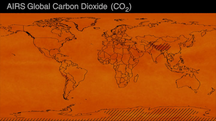
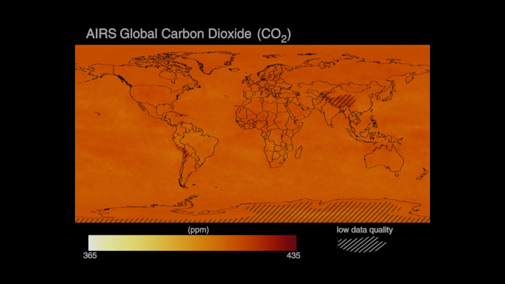
Concentration Increase of Atmospheric Carbon Dioxide (CO₂)
- Visualizations by:
- Helen-Nicole Kostis
- Produced by:
- Mark SubbaRao
- View full credits
Movies
- CarbonDioxide_Increase_1920x1080_30p.mp4 (1920x1080) [5.4 MB]
- CarbonDioxide_Increase_1920x1080_30p.webm (1920x1080) [5.9 MB]
- CarbonDioxide_Increase_4K.mp4 (3840x2160) [31.1 MB]
Images
- CO2_Increase_1920x1080_30p.01509_print.jpg (1024x576) [45.5 KB]
- CO2_Increase_1920x1080_30p.01509.png (1920x1080) [382.9 KB]
- CO2_Increase_1920x1080_30p.01509.tif (1920x1080) [7.9 MB]
Frames
- frames/1920x1080_16x9_30p/CarbonDioxide_Increase_alpha/ (1920x1080) [76.0 KB]
- frames/1920x1080_16x9_30p/CarbonDioxide_Increase/ (1920x1080) [76.0 KB]
- frames/3840x2160_16x9_30p/CarbonDioxide_Increase_Alpha/ (3840x2160) [76.0 KB]
- frames/3840x2160_16x9_30p/CarbonDioxide_Increase/ (3840x2160) [76.0 KB]
Timeplot of increase of atmospheric Carbon Dioxide (CO2) concentrations relative to the pre-industrial CO2 long-term mean value of 278ppm. During 2021, atmospheric CO2 concentrations reached a record-level increase of 50% relative to pre-industrial CO2 levels.
Using the complete record of Mauna Loa CO2 monthly mean data, the timeplot featured on this page displays the ongoing Keeling’s research and observations: the monthly average of atmospheric CO2 concentration values, which show the seasonal cycle of CO2 (jagged/wavy red line) and the seasonally-adjusted mean values (adjusted/straight red line). The jagged/wavy red line visualizes natural oscillations caused by plant growth cycles, while the adjusted/straight red line demonstrates the steady increase over time that is caused by human activities, such as the burning of fossil fuels.
To illustrate the significance of the steady increase of atmospheric CO2 since 1958 and to provide a visual understanding of the monthly average CO2 values as they are measured in parts per million (ppm):
- Monthly CO2 values are plotted on the range of [0-500] ppm over the period of March 1958 to December 2021 (present).
- The pre-industrial CO22 average of 278 ppm is marked as an orange block.
- As time passes the monthly adjusted percent increase is calculated relative to the pre-industrial CO2 value of 278ppm and is shown next to a red arrow.
In addition to highlighting the steady increase of CO2 in the Earth’s atmosphere, this timeplot underpins the historical contributions of the Keeling Curve to climate science, as it was designated a National Historic Chemical Landmark by the American Chemical Society in 2015. Continuous and precise observations across agencies and institutions are critical to help scientists and the public understand the linkages between increases in CO2 and human-caused climate change.
The rest of this webpage offers a version of the timeplot with dark background, the Keeling Curve, as of December 2021 and data sources.
Movies
- CarbonDioxide_Increase_Dark_1920x1080_30p.mp4 (1920x1080) [4.5 MB]
- CarbonDioxide_Increase_Dark_1920x1080_30p.webm (1920x1080) [5.9 MB]
- CarbonDioxide_Increase_Dark_4K.mp4 (3840x2160) [24.0 MB]
Images
- CO2_Increase_Dark_1920x1080_30p.01509_print.jpg (1024x576) [45.7 KB]
- CO2_Increase_Dark_1920x1080_30p.01509.png (1920x1080) [378.5 KB]
- CO2_Increase_Dark_1920x1080_30p.01509_thm.png (80x40) [2.3 KB]
- CO2_Increase_Dark_1920x1080_30p.01509_searchweb.png (320x180) [15.7 KB]
- CO2_Increase_Dark_1920x1080_30p.01509.tif (1920x1080) [6.0 MB]
Frames
- frames/1920x1080_16x9_30p/CarbonDioxide_Increase_Dark/ (1920x1080) [88.0 KB]
- frames/3840x2160_16x9_30p/CarbonDioxide_Increase_Dark/ (3840x2160) [88.0 KB]
Timeplot of increase of atmospheric Carbon Dioxide (CO2) concentrations relative to the pre-industrial CO2 long-term mean value of 278ppm. During 2021, atmospheric CO2 concentrations reached a record-level increase of 50% relative to pre-industrial CO2 levels. This version is created with a dark background.
![Keeling Curve for the period March 1958-December 2021 (present). Monthly Carbon Dioxide (CO2) values are plotted on the range of [300-450]ppm. On December 2021, the seasonally-adjusted mean value of CO2 reached 417.41ppm.](/static/svs/images/no_preview_web_black.png)
Images
- CO2_KeelingCurve_Dec2021_1920x1080_print.jpg (1024x576) [54.8 KB]
- CO2_KeelingCurve_Dec2021_1920x1080.png (1920x1080) [252.8 KB]
- CO2_KeelingCurve_Dec2021_3840x2160.png (3840x2160) [684.9 KB]
- CO2_KeelingCurve_Dec2021_1920x1080.exr (1920x1080) [413.9 KB]
- CO2_KeelingCurve_Dec2021_3840x2160.exr (3840x2160) [1.3 MB]
Keeling Curve for the period March 1958-December 2021 (present). Monthly Carbon Dioxide (CO2) values are plotted on the range of [300-450]ppm. On December 2021, the seasonally-adjusted mean value of CO2 reached 417.41ppm.
Data Sources:
- Trends in Atmospheric Carbon Dioxide by NOAA. The visualization featured on this page utilizes the complete record from the Mauna Loa CO2 monthly mean data for the period March 1958-December 2021 (accessed: January 7, 2022). Within the data record the continuous monthly average values are represented in the visualization as the jagged/wavy line that shows the seasonal cycle of CO2 and the monthly de-seasonalized mean values are represented in the visualization as the adjusted line.
Citation: Dr. Pieter Tans, NOAA/GML (gml.noaa.gov/ccgg/trends/) and Dr. Ralph Keeling, Scripps Institution of Oceanography (scrippsco2.ucsd.edu/).
Citation: Keeling, Ralph F; Keeling, Charles D. (2017). Atmospheric Monthly In Situ CO2 Data - Mauna Loa Observatory, Hawaii (Archive 2021-09-07). In Scripps CO2 Program Data. UC San Diego Library Digital Collections. https://doi.org/10.6075/J08W3BHW
Credits
Please give credit for this item to:
NASA's Scientific Visualization Studio
Visualizers
- Helen-Nicole Kostis (USRA) [Lead]
- Andrew J Christensen (SSAI)
Producer
- Mark SubbaRao (NASA/GSFC) [Lead]
Technical support
- Eric Sokolowsky (GST)
- Ian Jones (ADNET)
- Laurence Schuler (ADNET)
Papers
This visualization is based on the following papers:-
Keeling C.D. et al. (2005) Atmospheric CO2 and 13CO2 Exchange with the Terrestrial Biosphere and Oceans from 1978 to 2000: Observations and Carbon Cycle Implications. In: Baldwin I. et al. (eds) A History of Atmospheric CO2 and Its Effects on Plants, Animals, and Ecosystems. Ecological Studies (Analysis and Synthesis), vol 177. Springer, New York, NY. https://doi.org/10.1007/0-387-27048-5_5
C. D. Keeling, S. C. Piper, R. B. Bacastow, M. Wahlen, T. P. Whorf, M. Heimann, and H. A. Meijer, Exchanges of atmospheric CO2 and 13CO2 with the terrestrial biosphere and oceans from 1978 to 2000. I. Global aspects, SIO Reference Series, No. 01-06, Scripps Institution of Oceanography, San Diego, 88 pages, 2001. http://escholarship.org/uc/item/09v319r9
Datasets used in this visualization
Trends in Atmospheric Carbon Dioxide (A.K.A. Mauna Loa CO2 monthly mean data)
Credit: Dr. Pieter Tans, NOAA/GML (gml.noaa.gov/ccgg/trends/) and Dr. Ralph Keeling, Scripps Institution of Oceanography (scrippsco2.ucsd.edu/).
Dataset can be found at: https://gml.noaa.gov/ccgg/trends/data.html
See more visualizations using this data setNote: While we identify the data sets used in these visualizations, we do not store any further details nor the data sets themselves on our site.
Related pages
National Carbon Dioxide (CO₂) budgets inferred from atmospheric observations
March 7th, 2023
Read moreNational yearly carbon dioxide (CO₂) budgets for over 100 countries around the world for the period 2015-2020. This data visualization shows the emissions (sources) and removals (sinks) of carbon dioxide (CO₂) for more than 100 countries around the world. These estimates are informed by observations of atmospheric CO₂ observed by a network of ground-based sites and NASA’s Orbiting Carbon Observatory 2 (OCO-2), which has mapped CO₂ around the globe since 2014.The net emissions and removals are the combined impact of fossil fuel emissions and land carbon stock changes. These terrestrial carbon stock changes indicate changes in the amount of carbon stored in organic matter on land, which is impacted by land use and land use change, including emissions from deforestation and removals from improved land stewardship and reforestation.The visualization shows that fossil fuel emissions drive net emissions of CO₂ to the atmosphere, which are in turn driving climate change. Terrestrial carbon stock changes are smaller than the fossil fuel emissions and regionally varying. In general, terrestrial carbon stocks are increasing across the northern extratropics but are more variable in the tropics, where deforestation is more extensive. Mean fossil fuel emissions for over 100 countries around the world for the period 2015-2020. This version is provided with white background and black text. Mean fossil fuel emissions for over 100 countries around the world for the period 2015-2020. This version is provided with white background and black text. Mean terrestrial carbon stock change for over 100 countries around the world for the period 2015-2020. This version is provided with white background and black text. National mean carbon dioxide budgets for over 100 countries around the world for the period 2015-2020. This visualization shows yearly net surface emissions and removals by more than 100 countries from 2015 to 2020. . Countries with emissions, seen here in red, appear to pop from the page, compared to countries with removals, seen in green. This data visualization shows yearly fossil fuel emissions by more than 100 countries from 2015 to 2020. Countries with high emissions, including the U.S. and China, seen here in dark red, appearing to pop from the page, compared to others with lower emissions. This data visualization illustrates changes in the amount of carbon stored in organic matter on land, called terrestrial carbon stock changes, from 2015 to 2020. Activities such as improved land stewardship and deforestation, which is more extensive in the tropics than other regions, affect these stock changes. Mean net surface emissions and removals of carbon dioxide (CO₂) for over 100 countries around the world for the period 2015-2020. Este mapa muestra el promedio de emisiones y eliminaciones netas de dióxido de carbono entre 2015 y 2020 utilizando estimaciones informadas por las mediciones del satélite OCO-2 de la NASA. Los países en los que se eliminó más dióxido de carbono del emitido aparecen como depresiones verdes, mientras que los países con mayores emisiones son de color marrón o rojo y parecen sobresalir de la página.Crédito: Estudio de Visualización Científica de la NASA Mean fossil fuel emissions for over 100 countries around the world for the period 2015-2020. Mean terrestrial carbon stock change for over 100 countries around the world for the period 2015-2020. National yearly carbon dioxide (CO₂) budgets for over 100 countries around the world for the period 2015-2020. This version has a dark ocean. National mean carbon dioxide budgets for over 100 countries around the world for the period 2015-2020. This version has a dark ocean. Yearly net surface emissions and removals of carbon dioxide for over 100 countries around the world for the period 2015-2020. This version has a dark ocean. Mean net surface emissions and removals of carbon dioxide (CO₂) for over 100 countries around the world for the period 2015-2020. This version has a dark ocean. This data visualization shows yearly fossil fuel emissions by more than 100 countries from 2015 to 2020. Countries with high emissions, including the U.S. and China, seen here in dark red, appearing to pop from the page, compared to others with lower emissions. This version has a dark ocean. Mean fossil fuel emissions for over 100 countries around the world for the period 2015-2020. This version has a dark ocean. This data visualization illustrates changes in the amount of carbon stored in organic matter on land, called terrestrial carbon stock changes, from 2015 to 2020. Activities such as improved land stewardship and deforestation, which is more extensive in the tropics than other regions, affect these stock changes. This version has a dark ocean. Mean terrestrial carbon stock change for over 100 countries around the world for the period 2015-2020. This version has a dark ocean. Related pages
OCO-2 Gridded Global Carbon Dioxide (CO₂)
Feb. 24th, 2023
Read moreData visualization of global carbon dioxide (CO₂) for the period January 2015-February 2022, showcasing data from NASA's Obriting Carbon Observatory 2 (OCO-2) Gridded/Level 3 product. Data visualization of global carbon dioxide (CO₂) for the period January 2015-February 2022 in molleweide projection, showcasing data from NASA's Obriting Carbon Observatory 2 (OCO-2) Gridded/Level 3 product. This set of frames provides the map layer of the OCO-2 gridded global carbon dioxide visualization sequence. Frames are provided with transparency in 4K resolution. This set of frames provides the annotation layer of the OCO-2 gridded global carbon dioxide visualization sequence. The annotation layer consists of the visualization title, the animated colorbar and the timestamp. Frames are provided with transparency in 4K resolution. This set of frames provides the composition of the OCO-2 gridded global carbon dioxide visualization sequence in mollweide projection with transparency. Frames are provided in 4K resolution. This set of frames provides the map layer of the OCO-2 gridded global carbon dioxide visualization sequence in mollweide projection. Frames are provided with transparency in 4K resolution. Frames and movie in 4096x2048 resolution for Science On a Sphere displays. Colorbar for OCO-2 gridded global carbon dioxide (CO₂). Thumbnail image for Science on a Sphere (SOS). Colorbar for the OCO-2 gridded global carbon dioxide (CO₂) visualization sequence. Blue/purple- to-orange/yellow colormap (low-to-high values) to show the increase and seasonality of global carbon dioxide over the years.
20 years of AIRS Global Carbon Dioxide (CO₂) measurements (2002-October 2022)
Jan. 31st, 2023
Read moreData visualization of global carbon dioxide (CO₂) for the period September 2002-October 2022, showcasing data products from NASA's Aqua mission. Data visualization assets are designed for HD resolution. Data visualization of global carbon dioxide (CO2) for the period September 2002-October 2022, showcasing data products from NASA's Aqua mission. Data visualization assets are designed for 720x586 resolution for climate.nasa.gov Monthly frames (720x480 resolution) of global carbon dioxide (CO2) for the period September 2002-October 2022, showcasing data products from NASA's Aqua mission. Each frame represents a montly timestep for the period September 2002-October 2022.The CO2_60South_frames_dates_values.csv can be used to sync frame number, date and CO₂ values. Data visualization of global carbon dioxide (CO2) for the period September 2002-October 2022, showcasing data products from NASA's Aqua mission. Data visualization assets are designed for 720x586 resolution for climate.nasa.gov Monthly frames (720x480 resolution) of global carbon dioxide (CO2) for the period September 2002-March 2022, showcasing data products from NASA's Aqua mission. Each frame represents a montly timestep for the period September 2002-October 2022.The CO2_frames_dates_values.csv can be used to sync frame number, date and CO₂ values. Data visualization of global carbon dioxide (CO2) for the period September 2002-October 2022, showcasing data products from NASA's Aqua mission. Data visualization assets are designed for HD resolution. Data visualization of global carbon dioxide (CO2) for the period September 2002-October 2022, showcasing data products from NASA's Aqua mission. Data visualization assets are designed for 4K resolution. Data visualization of global carbon dioxide (CO2) for the period September 2002-October 2022, showcasing data products from NASA's Aqua mission. Data visualization assets are designed for 4K resolution. Frames and movie in 4096x2048 resolution for Science On a Sphere displays. Colorbar of AIRS global carbon dioxide (CO2) data and annotations.Light yellow (low value) to red (very high value) sequential colorbar to illustrate the increase of global carbon dioxide over the years. The striped overlays in the data visualization mark areas of low data quality. Thumbnail image for Science On a Sphere. Colorbar created for the AIRS global carbon dioxide (CO2) visualization. White/yellow-to-red colormap (low-to-high values) to show the increase of global carbon dioxide over the years.The stops and rgb values are available in the following .csv files:Colormap in RGB(0, 1): AIRS_colormap_RGB_range0_1.csvColormap in RGB(0, 255): AIRS_colormap_RGB_range0_255.csv
20 years of AIRS Global Carbon Dioxide (CO₂) measurements (2002-May 2022)
Sept. 14th, 2022
Read moreData visualization of global carbon dioxide (CO₂) for the period September 2002-May 2022, showcasing data products from NASA's Aqua mission. Data visualization assets are designed for HD resolution. Data visualization of global carbon dioxide (CO₂) for the period September 2002-May 2022, showcasing data products from NASA's Aqua mission. Data visualization assets are designed for 720x586 resolution for climate.nasa.gov Monthly frames (720x480 resolution) of global carbon dioxide (CO₂) for the period September 2002-May 2022, showcasing data products from NASA's Aqua mission. Each frame represents a montly timestep for the period September 2002-May 2022.The CO2_frames_dates_values.csvcan be used to sync frame number, date and CO₂ values. Data visualization of global carbon dioxide (CO₂) for the period September 2002-May 2022, showcasing data products from NASA's Aqua mission. Data visualization assets are designed for 720x586 resolution for climate.nasa.gov Monthly frames (720x480 resolution) of global carbon dioxide (CO₂) for the period September 2002-May 2022, showcasing data products from NASA's Aqua mission. Each frame represents a montly timestep for the period September 2002-May 2022.The CO2_frames_dates_values.csv can be used to sync frame number, date and CO₂ values. Data visualization of global carbon dioxide (CO₂) for the period September 2002-May 2022, showcasing data products from NASA's Aqua mission. Data visualization assets are designed for HD resolution. Data visualization of global carbon dioxide (CO₂) for the period September 2002-May 2022, showcasing data products from NASA's Aqua mission. Data visualization assets are designed for 4K resolution. Data visualization of global carbon dioxide (CO₂) for the period September 2002-May 2022, showcasing data products from NASA's Aqua mission. Data visualization assets are designed for 4K resolution. Colorbar created for the AIRS global carbon dioxide (CO2) visualization. White/yellow-to-red colormap (low-to-high values) to show the increase of global carbon dioxide over the years.The stops and rgb values are available in the following .csv files:Colormap in RGB(0, 1): 5025colormap_RGB_range0_1.csvColormap in RGB(0, 255): 5025colormap_RGB_range0_255.csv This data visualization shows the global distribution and variation of the concentration of mid-tropospheric carbon dioxide observed by the Atmospheric Infrared Sounder (AIRS) on the NASA Aqua spacecraft over a 20 year timespan. One obvious feature that we see in the data is a continual increase in carbon dioxide with time, as seen in the shift in the color of the map from light yellow towards red as time progresses. Another feature is the seasonal variation of carbon dioxide in the northern hemisphere, which is governed by the growth cycle of plants. This can be seen as a pulsing in the colors, with a shift towards lighter colors starting in April/May each year and a shift towards red as the end of each growing season passes into winter. The seasonal cycle is more pronounced in the northern hemisphere than the southern hemisphere, since the majority of the land mass is in the north. The visualization includes a data-driven spatial map of global carbon dioxide and a timeline on the bottom. The timeline showcases the monthly timestep and is paired with the adjusted carbon dioxide value. Areas where the air pressure is less than 750mB (areas of high-altitude) have been marked in the visualization as low data quality (striped) areas. This entry offers two versions of low data quality (stiped) areas. One version includes striped regions as they are calculated on data values and the second version features striped regions below 60 South.Data Sources:Carbon Dioxide (CO2) from the Sounder SIPS: AQUA AIRS IR-only Level 3 CLIMCAPS: Comprehensive Quality Control Gridded Monthly V2 (SNDRAQIL3CMCCP), which is a monthly product of global coverage and of spatial resolution 1x1 degrees.The visualizations included on this page, utilize the variable co2_vmr_uppertop from the CLIMCAPS product. Areas where the air pressure is less than 750mB (areas of high-altitude) and below 60 degrees South have been marked in the visualization as low data quality (striped areas). In addition, areas with data gaps and of high altitude less than 5% of the resolution of the product have been filled using the nearest neighbor algorithm.Citation: Chris Barnet (2019), Sounder SIPS: AQUA AIRS IR-only Level 3 CLIMCAPS: Comprehensive Quality Control Gridded Monthly V2, Greenbelt, MD, USA, Goddard Earth Sciences Data and Information Services Center (GES DISC), Accessed: [September 9, 2022], doi: 10.5067/ZPZ430KOPMIXTrends in Atmospheric Carbon Dioxide by NOAA. The visualizations on this page feature de-seasonalized mean value measurements from the Mauna Loa CO2 monthly mean data for the period September 2002-May 2022, Accessed: [September 9 2022]. Citation: Dr. Pieter Tans, NOAA/GML (gml.noaa.gov/ccgg/trends/) and Dr. Ralph Keeling, Scripps Institution of Oceanography (scrippsco2.ucsd.edu).Citation: Keeling, Ralph F; Keeling, Charles D. (2017). Atmospheric Monthly In Situ CO2 Data - Mauna Loa Observatory, Hawaii (Archive 2021-09-07). In Scripps CO2 Program Data. UC San Diego Library Digital Collections. https://doi.org/10.6075/J08W3BHWContinental and country outlines from the Scientific Visualization Studio, NASA/GSFC. The rest of this webpage offers custom versions for web, HD and 4K display systems.climate.nasa.govThis section contains assets designed for climate.nasa.gov HD contentAdditional visualization content in HD resolution. 4K content ColormapThe following section contains colormap information. Related pages
20 years of AIRS Global Carbon Dioxide (CO₂) measurements (2002- March 2022)
May 27th, 2022
Read moreData visualization of global carbon dioxide (CO2) for the period September 2002-March 2022, showcasing data products from NASA's Aqua mission. Data visualization assets are designed for HD resolution. Data visualization of global carbon dioxide (CO2) for the period September 2002-March 2022, showcasing data products from NASA's Aqua mission. Data visualization assets are designed for 720x586 resolution for climate.nasa.gov Monthly frames (720x480 resolution) of global carbon dioxide (CO2) for the period September 2002-March 2022, showcasing data products from NASA's Aqua mission. Each frame represents a montly timestep for the period September 2002-March 2022.The CO2_frames_dates_values.csv can be used to sync frame number, date and CO2 values. Data visualization of global carbon dioxide (CO2) for the period September 2002-March 2022, showcasing data products from NASA's Aqua mission. Data visualization assets are designed for 720x586 resolution for climate.nasa.gov Monthly frames (720x480 resolution) of global carbon dioxide (CO2) for the period September 2002-March 2022, showcasing data products from NASA's Aqua mission. Each frame represents a montly timestep for the period September 2002-March 2022.The CO2_frames_dates_values.csv can be used to sync frame number, date and CO2 values. Data visualization of global carbon dioxide (CO2) for the period September 2002-March 2022, showcasing data products from NASA's Aqua mission. Data visualization assets are designed for HD resolution. Data visualization of global carbon dioxide (CO2) for the period September 2002-March 2022, showcasing data products from NASA's Aqua mission. Data visualization assets are designed for 4K resolution. Data visualization of global carbon dioxide (CO2) for the period September 2002-March 2022, showcasing data products from NASA's Aqua mission. Data visualization assets are designed for 4K resolution. Frames and movie in 4096x2048 resolution for Science On a Sphere displays. Colorbar of AIRS global carbon dioxide (CO2) data and annotations. Light yellow (low value) to red (very high value) sequential colorbar to illustrate the increase of global carbon dioxide over the years. The striped overlays in the data visualization mark areas of low data quality. Thumbnail image for Science On a Sphere. Colorbar created for the AIRS global carbon dioxide (CO2) visualization. White/yellow-to-red colormap (low-to-high values) to show the increase of global carbon dioxide over the years. The stops and rgb values are available in the following .csv files:Colormap in RGB(0, 1): 4990colormap_RGB_range0_1.csvColormap in RGB(0, 255): 4990colormap_RGB_range0_255.csv This data visualization shows the global distribution and variation of the concentration of mid-tropospheric carbon dioxide observed by the Atmospheric Infrared Sounder (AIRS) on the NASA Aqua spacecraft over a 20 year timespan. One obvious feature that we see in the data is a continual increase in carbon dioxide with time, as seen in the shift in the color of the map from light yellow towards red as time progresses. Another feature is the seasonal variation of carbon dioxide in the northern hemisphere, which is governed by the growth cycle of plants. This can be seen as a pulsing in the colors, with a shift towards lighter colors starting in April/May each year and a shift towards red as the end of each growing season passes into winter. The seasonal cycle is more pronounced in the northern hemisphere than the southern hemisphere, since the majority of the land mass is in the north. The visualization includes a data-driven spatial map of global carbon dioxide and a timeline on the bottom. The timeline showcases the monthly timestep and is paired with the adjusted carbon dioxide value. Areas where the air pressure is less than 750mB (areas of high-altitude) have been marked in the visualization as low data quality (striped) areas. This entry offers two versions of low data quality (stiped) areas. One version includes striped regions as they are calculated on data values and the second version features striped regions below 60 South.Data Sources:Carbon Dioxide (CO2) from the Sounder SIPS: AQUA AIRS IR-only Level 3 CLIMCAPS: Comprehensive Quality Control Gridded Monthly V2 (SNDRAQIL3CMCCP), which is a monthly product of global coverage and of spatial resolution 1x1 degrees.The visualizations included on this page, utilize the variable co2_vmr_uppertop from the CLIMCAPS product. Areas where the air pressure is less than 750mB (areas of high-altitude) and below 60 degrees South have been marked in the visualization as low data quality (striped areas). In addition, areas with data gaps and of high altitude less than 5% of the resolution of the product have been filled using the nearest neighbor algorithm.Citation: Chris Barnet (2019), Sounder SIPS: AQUA AIRS IR-only Level 3 CLIMCAPS: Comprehensive Quality Control Gridded Monthly V2, Greenbelt, MD, USA, Goddard Earth Sciences Data and Information Services Center (GES DISC), Accessed: [May 26, 2022], doi: 10.5067/ZPZ430KOPMIXTrends in Atmospheric Carbon Dioxide by NOAA. The visualizations on this page feature de-seasonalized mean value measurements from the Mauna Loa CO2 monthly mean data for the period September 2002-March 2022, Accessed: [April 8, 2022]. Citation: Dr. Pieter Tans, NOAA/GML (gml.noaa.gov/ccgg/trends/) and Dr. Ralph Keeling, Scripps Institution of Oceanography (scrippsco2.ucsd.edu).Citation: Keeling, Ralph F; Keeling, Charles D. (2017). Atmospheric Monthly In Situ CO2 Data - Mauna Loa Observatory, Hawaii (Archive 2021-09-07). In Scripps CO2 Program Data. UC San Diego Library Digital Collections. https://doi.org/10.6075/J08W3BHWContinental and country outlines from the Scientific Visualization Studio, NASA/GSFC. The rest of this webpage offers custom versions for web, HD and 4K display systems.climate.nasa.govThis section contains assets designed for climate.nasa.gov HD contentAdditional visualization content in HD resolution. 4K content Science On a Sphere (SOS) contentThe following section contains assets designed for Science On a Sphere and related displays.SOS playlist file: playlist.sosSOS label file: labels.txt ColormapThe following section contains colormap information. Related pages
Global Carbon Dioxide 2020-2021 for Hyperwalls
April 11th, 2022
Read moreData visualization in wide aspect ratio and 9600x3240 resolution, featuring volumetric carbon dioxide on a global scale for the period June 1, 2020 - July 31, 2021. This set of frames can be shown on 5x3 hyperwalls and wide aspect ratio displays. Lower resolution movies are provided for preview. This low resolution movie includes lines to illustrate the extents of the 5x3 hyperwall screens. This movie is provided only for preview. This webpage provides a wide aspect ratio version of: Global Carbon Dioxide 2020-2021, released on November 2, 2021. This version has been created for wide aspect ratio display systems with resolution up to 9600x3240. It is recommended to use content from this version for display systems with 16:9 aspect ratio. NASA’s Orbiting Carbon Observatory, 2 (OCO-2) provides the most complete dataset tracking the concentration of atmospheric carbon dioxide (CO2), the main driver of climate change. Every day, OCO-2 measures sunlight reflected from Earth’s surface to infer the dry-air column-averaged CO2 mixing ratio and provides around 100,000 cloud-free observations. Despite these advances, OCO-2 data contain many gaps where sunlight is not present or where clouds or aerosols are too thick to retrieve CO2 data. In order to fill gaps and provide science and applications users a spatially complete product, OCO-2 data are assimilated into NASA’s Goddard Earth Observing System (GEOS), a complex modeling and data assimilation system used for studying the Earth’s weather and climate. GEOS is also informed by satellite observations of nighttime lights and vegetation greenness along with about 1 million weather observations collected every hour. These data help scientists infer CO2 mixing ratios even when a direct OCO-2 observation is not present and provide additional information on the altitude of CO2 plumes that the satellite is not able to see. Together, OCO-2 and GEOS create one of the most complete pictures of CO2. The visualization featured on this page shows the atmosphere in three dimensions and highlights the accumulation of CO2 during a single calendar year. Every year, the world’s vegetation and oceans absorb about half of human CO2 emissions, providing an incredibly valuable service that has mitigated the rate of accumulation of greenhouse gases in the atmosphere. However, around 2.5 parts per million remain in the atmosphere every year causing a steady upward march in concentrations that scientists have tracked since the 1950s at surface stations. The volumetric visualization starts in June 2020, showing all of the model’s values of global CO2. All 3d cells of the model are opaque, revealing a solid brick of data. During the month of June 2020, the higher values of CO2 coalesce around the equatorial belt. By mid-July 2020 the visualization reduces the opacity of lower CO2 values between 385 parts-per-millon (ppm) and 405 ppm in the atmosphere making them transparent. These lower values tend to be higher up in the atmosphere. By doing this, the higher CO2 concentrations, which are closer to the ground, are highlighted revealing the seasonal movement of high CO2 at a global scale. During the months of June-September (summer months for northern hemisphere), global CO2 concentrations tend to be lowest because northern hemisphere plants actively absorb CO2 from the atmosphere via photosynthesis. During northern hemisphere fall and winter months, much of this CO2 is re-released to the atmosphere due to respiration and can be seen building up. By June and July 2021, plants again draw CO2 out of the atmosphere, but notably higher concentrations remain in contrast to the nearly transparent colors of the previous year. The diurnal rhythm of CO2 is apparent over our planet's largest forests, such as the Amazon rainforest in South America and the Congo rainforest in Central Africa. The fast-paced pulse in those rainforests is due to the day-night cycle; plants absorb CO2 during the day via photosynthesis when the sun is out, then stop absorbing CO2 at night. In addition to highlighting the buildup of atmospheric CO2, this visualization shows how interconnected the world’s greenhouse gas problem is. NASA’s unique combination of observations and models plays a critical role in helping scientists track increases in CO2 as they happen to better understand their climate impact.Data Sources:Volumetric Carbon Dioxide extracted from NASA's Goddard Earth Observing System (GEOS) model, which is produced by the Global Modeling and Assimilation Office. The visualization featured on this page utilizes 3-hourly data for the period June 1, 2020-July 31, 2021.Blue Marble: Next Generation was produced by Reto Stöckli, NASA Earth Observatory (NASA Goddard Space Flight Center). Citation: Reto Stöckli, Eric Vermote, Nazmi Saleous, Robert Simmon and David Herring. The Blue Marble Next Generation – A true color earth dataset including seasonal dynamics from MODIS, October 17, 2005. The visualization on this page utilizes monthly Blue Marble data to map the water and land bodies around the globe and show seasonal changes.Sea ice for the Arctic and Antarctic regions, provided by the Japan Aerospace Exploration Agency (JAXA), by utilizing GCOMP-W/AMSR2 10 km Level 3 daily Sea Ice Concentration (SIC) and GCOMP-W/AMSR2 10 km Level 3 daily 89 GHz Brightness Temperature (BT) data for the period June 1, 2020-July 31, 2021.Global 30 Arc-Second Elevation (GTOPO 30) from U.S. Geological Survey (USGS). GTOPO30 is a global raster digital elevation model (DEM) with a horizontal grid spacing of 30 arc seconds (approximately 1 kilometer). GTOPO30 was derived from several raster and vector sources of topographic information. The data-driven visualization featured on this page utilizes the GTOPO30 model to represent the three-dimensional features of over land terrain and submarine topography world-wide. doi: 10.5066/F7DF6PQS. Related pages
Global Carbon Dioxide 2020-2021
Nov. 2nd, 2021
Read moreData visualization featuring volumetric carbon dioxide on a global scale for the period June 1, 2020 - July 31, 2021.Coming soon to our YouTube channel. NASA’s Orbiting Carbon Observatory, 2 (OCO-2) provides the most complete dataset tracking the concentration of atmospheric carbon dioxide (CO2), the main driver of climate change. Every day, OCO-2 measures sunlight reflected from Earth’s surface to infer the dry-air column-averaged CO2 mixing ratio and provides around 100,000 cloud-free observations. Despite these advances, OCO-2 data contain many gaps where sunlight is not present or where clouds or aerosols are too thick to retrieve CO2 data. In order to fill gaps and provide science and applications users a spatially complete product, OCO-2 data are assimilated into NASA’s Goddard Earth Observing System (GEOS), a complex modeling and data assimilation system used for studying the Earth’s weather and climate. GEOS is also informed by satellite observations of nighttime lights and vegetation greenness along with about 1 million weather observations collected every hour. These data help scientists infer CO2 mixing ratios even when a direct OCO-2 observation is not present and provide additional information on the altitude of CO2 plumes that the satellite is not able to see. Together, OCO-2 and GEOS create one of the most complete pictures of CO2. The visualization featured on this page shows the atmosphere in three dimensions and highlights the accumulation of CO2 during a single calendar year. Every year, the world’s vegetation and oceans absorb about half of human CO2 emissions, providing an incredibly valuable service that has mitigated the rate of accumulation of greenhouse gases in the atmosphere. However, around 2.5 parts per million remain in the atmosphere every year causing a steady upward march in concentrations that scientists have tracked since the 1950s at surface stations. The volumetric visualization starts in June 2020, showing all of the model’s values of global CO2. All 3d cells of the model are opaque, revealing a solid brick of data. During the month of June 2020, the higher values of CO2 coalesce around the equatorial belt. By mid-July 2020 the visualization reduces the opacity of lower CO2 values between 385 parts-per-millon (ppm) and 405 ppm in the atmosphere making them transparent. These lower values tend to be higher up in the atmosphere. By doing this, the higher CO2 concentrations, which are closer to the ground, are highlighted revealing the seasonal movement of high CO2 at a global scale. During the months of June-September (summer months for northern hemisphere), global CO2 concentrations tend to be lowest because northern hemisphere plants actively absorb CO2 from the atmosphere via photosynthesis. During northern hemisphere fall and winter months, much of this CO2 is re-released to the atmosphere due to respiration and can be seen building up. By June and July 2021, plants again draw CO2 out of the atmosphere, but notably higher concentrations remain in contrast to the nearly transparent colors of the previous year. The diurnal rhythm of CO2 is apparent over our planet's largest forests, such as the Amazon rainforest in South America and the Congo rainforest in Central Africa. The fast-paced pulse in those rainforests is due to the day-night cycle; plants absorb CO2 during the day via photosynthesis when the sun is out, then stop absorbing CO2 at night. In addition to highlighting the buildup of atmospheric CO2, this visualization shows how interconnected the world’s greenhouse gas problem is. NASA’s unique combination of observations and models plays a critical role in helping scientists track increases in CO2 as they happen to better understand their climate impact.This visualization was created specifically to support a series of talks from NASA scientists for the 2021 United Nations Climate Change Conference (COP26), Glasgow, UK, 31 October-12 November 2021.Data Sources:Volumetric Carbon Dioxide extracted from NASA's Goddard Earth Observing System (GEOS) model, which is produced by the Global Modeling and Assimilation Office. The visualization featured on this page utilizes 3-hourly data for the period June 1, 2020-July 31, 2021.Blue Marble: Next Generation was produced by Reto Stöckli, NASA Earth Observatory (NASA Goddard Space Flight Center). Citation: Reto Stöckli, Eric Vermote, Nazmi Saleous, Robert Simmon and David Herring. The Blue Marble Next Generation – A true color earth dataset including seasonal dynamics from MODIS, October 17, 2005. The visualization on this page utilizes monthly Blue Marble data to map the water and land bodies around the globe and show seasonal changes.Sea ice for the Arctic and Antarctic regions, provided by the Japan Aerospace Exploration Agency (JAXA), by utilizing GCOMP-W/AMSR2 10 km Level 3 daily Sea Ice Concentration (SIC) and GCOMP-W/AMSR2 10 km Level 3 daily 89 GHz Brightness Temperature (BT) data for the period June 1, 2020-July 31, 2021.Global 30 Arc-Second Elevation (GTOPO 30) from U.S. Geological Survey (USGS). GTOPO30 is a global raster digital elevation model (DEM) with a horizontal grid spacing of 30 arc seconds (approximately 1 kilometer). GTOPO30 was derived from several raster and vector sources of topographic information. The data-driven visualization featured on this page utilizes the GTOPO30 model to represent the three-dimensional features of over land terrain and submarine topography world-wide. doi: 10.5066/F7DF6PQS. Related pages
2021 Tied for the Sixth Warmest Year on Record, NASA Finds
Jan. 13th, 2022
Read moreUniversal Production Music: Knock and Wait (Instrumental) by Brice Davoli [SACEM], Well That’s Difference (Instrumental) by Jeff Cardoni [ASCAP], Wanna Be Hipster (Instrumental) by Jeff Cardoni [ASCAP], Curiosity Killed Kitty (Instrumental) by Robert Leslie Bennett [ASCAP], Eco Issues (Instrumental) by Max van Thun [GEMA] Additional Footage: Pond5.com, CSPANComplete transcript available. 2021 tied for Earth’s sixth warmest year on record, continuing a long-term trend. The last decade was the hottest since at least 1880.Complete transcript available. 2021 empató como el sexto año más cálido de la Tierra, lo que continúa una tendencia a largo plazo. La última década fue la más cálida por lo menos desde 1880.Complete transcript available. Vertical VersionThis vertical version of the video is for IGTV or Snapchat. The IGTV episode can be pulled into Instagram Stories and the regular Instagram feed. Vertical VersionThis vertical version of the video is for IGTV or Snapchat. The IGTV episode can be pulled into Instagram Stories and the regular Instagram feed. Vertical VersionThis vertical version of the video is for IGTV or Snapchat. The IGTV episode can be pulled into Instagram Stories and the regular Instagram feed. Vertical VersionThis vertical version of the video is for IGTV or Snapchat. The IGTV episode can be pulled into Instagram Stories and the regular Instagram feed. 2021 was tied for the sixth warmest year on NASA’s record, stretching more than a century. But, what is a temperature record?GISTEMP, NASA’s global temperature analysis, takes in millions of observations from instruments on weather stations, ships and ocean buoys, and Antarctic research stations, to determine how much warmer or cooler Earth is on average from year to year.Stretching back to 1880, NASA’s record shows a clear warming trend. However, individual weather events and La Niña — a pattern of cooler waters in the Pacific that was responsible for slightly cooling 2021’s average temperature — can affect individual years.Because the record is global, not every place on Earth experienced the sixth warmest year on record. Some places had record-high temperatures, and we saw record droughts, floods and fires around the globe. Related pages