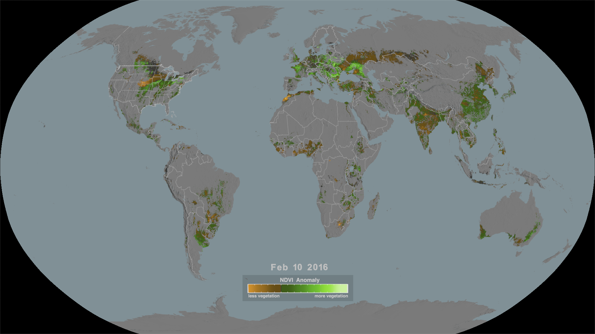
Normalized Difference Vegetation Index (NDVI) Anomaly in crop-growing regions for selected years
This visualization shows the NDVI anomaly in areas where maize, rice, soybeans, spring wheat or winter wheat are grown over the United States, Australia, Russia, Europe and southern Africa during certain years. Green colors indicate more than average vegetatation while orange colors indicate less productive areas.
Coming soon to our YouTube channel.
Conditions in certain regions of the globe are suitable for growing particular crops but weather can alter the growing conditions in those regions throughout the year. Satellite data can gauge the health of plants, which is a good indicator of crop productivity. The satellite imagery used in this visualization shows changes in vegetation in regions where maize, rice, soybeans, spring wheat and winter wheat are grown.
The Normalized Difference Vegetation Index (NDVI) measures how dense and green plant leaves are which suggests overall vegetative health. Scientists calculate average NDVI values over a span of years to find out what is normal at each time of year. They then compare the current NDVI value for each day of year to the average computed over the set of base years to determine if the areas are more or less productive than the average. This comparison, called the NDVI Anomaly, is used in this visualization showing the changes in global crop production in regions of the globe and time periods when they experienced significant drought conditions. The NDVI anomaly images are useful as a measure of drought when compared to 'normal' plant health. In this visualization, areas of drought are shown in shades of orange, with the most severe drought being the brightest orange/yellow. Regions where crops are more productive than average are shown by shades of green where the brightest colors are the most productive.
This data was measured by the vegetation instrument Moderate Resolution Imaging Spectroradiometer (MODIS) on NASA’s Terra satellite. However, this instrument is not able to see the surface through clouds so there are regions where no data is collected on cloudy days. In these regions, the most recent prior days value is used up to 10 days before. Areas without data for ten or more days are designated as having no data. Areas with no data or areas that have a value close to average are shown in dark grey. Time periods when no data is available globally have been skipped in this visualization.

A high-resolution image showing crop productivity over North America on Sept 2, 2012.
A high-resolution image showing crop productivity over Europe on July 29, 2019.
A high-resolution image showing crop productivity over Australia on December 30, 2019.
Credits
Please give credit for this item to:
NASA's Scientific Visualization Studio
-
Visualizers
- Cindy Starr (Global Science and Technology, Inc.)
- Lori Perkins (NASA/GSFC)
-
Scientists
- Inbal Becker Reshef (University of Maryland)
- Michael Humber (University of Maryland)
-
Communications specialist
-
Producers
- Katie Jepson (KBR Wyle Services, LLC)
- Kathryn Mersmann (KBR Wyle Services, LLC)
- LK Ward (KBR Wyle Services, LLC)
-
Project support
- Eric Sokolowsky (Global Science and Technology, Inc.)
- Kaushal Patel (SSAI)
-
Technical support
- Laurence Schuler (ADNET Systems, Inc.)
- Ian Jones (ADNET Systems, Inc.)
Release date
This page was originally published on Monday, August 9, 2021.
This page was last updated on Wednesday, November 15, 2023 at 12:17 AM EST.
Datasets used in this visualization
-
Normalized Difference Vegetation Index (NDVI) (Normalized Difference Vegetation Index (NDVI)) [Terra: MODIS]
ID: 1122
Note: While we identify the data sets used in these visualizations, we do not store any further details, nor the data sets themselves on our site.
Related
Used as a Source In
- ID: 13899
 Produced Video
 - ID: 13894
![Music: Building Ideas [Instrumental] by Todd James Carlin BakerComplete transcript available.](/vis/a010000/a013800/a013894/GLAM_thumbnail.png) Produced Video
Produced Video