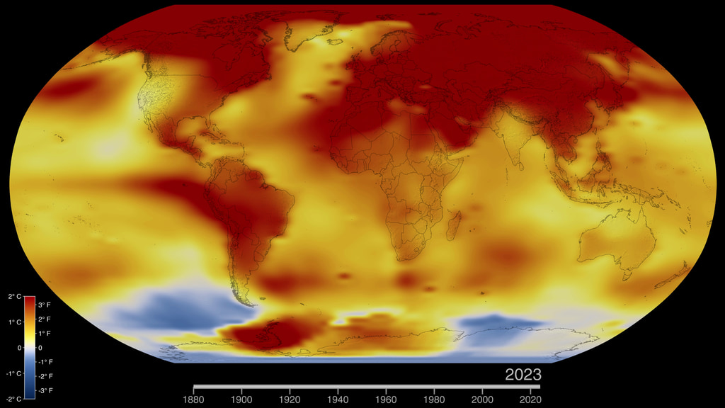
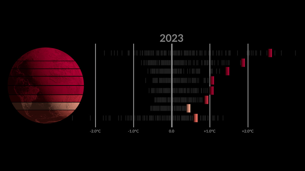
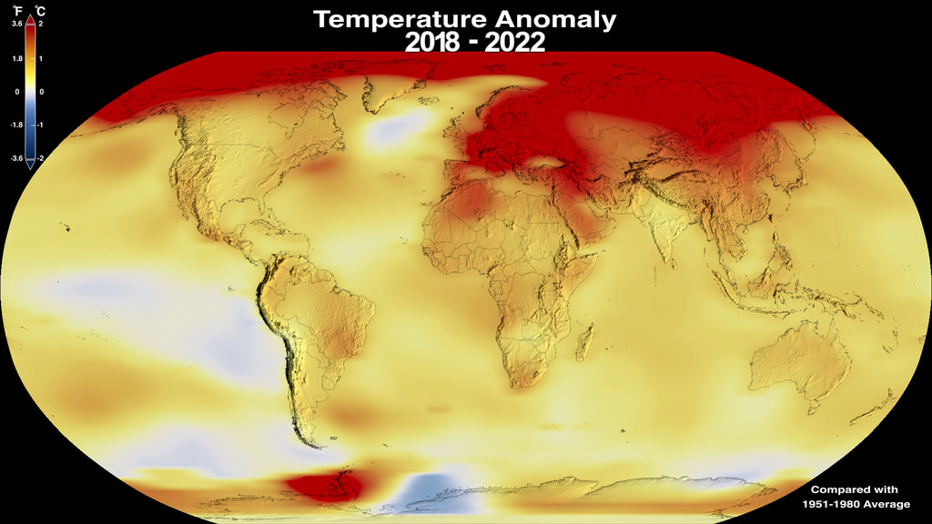
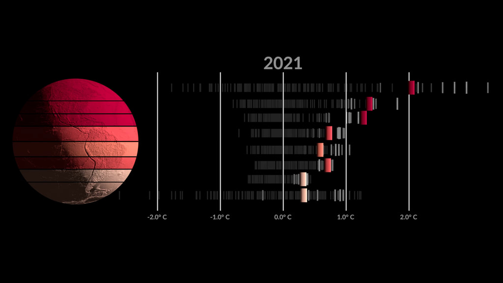
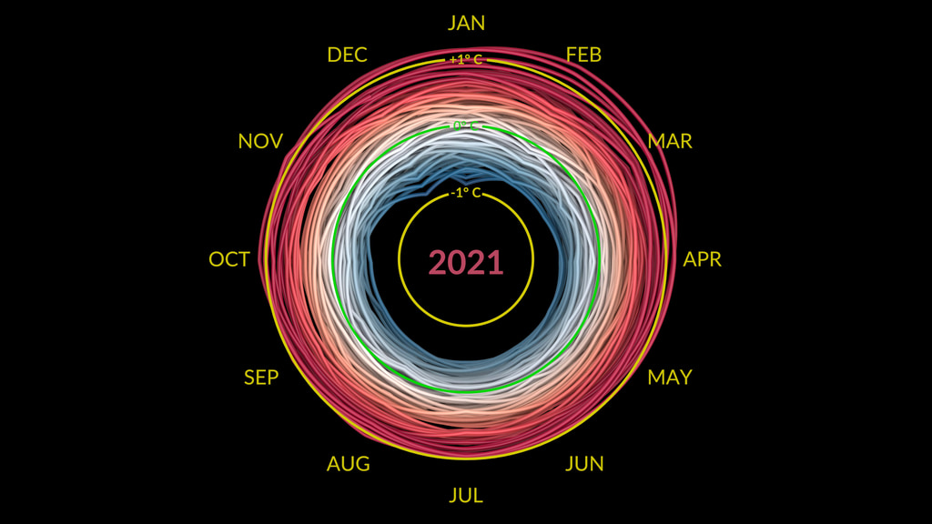
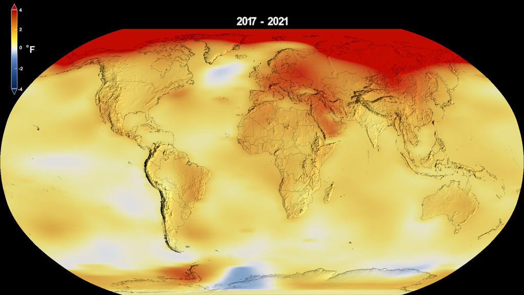
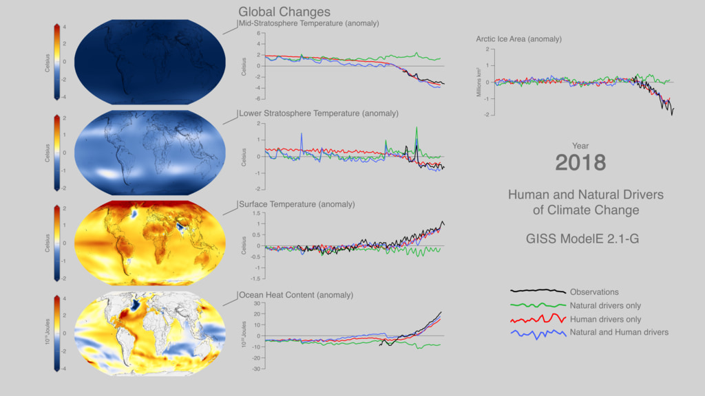
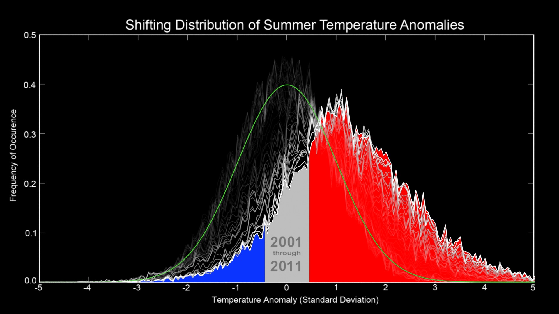
Shifting Distribution of Land Temperature Anomalies, 1951-2020
The change in the distribution of land temperature anomalies over the years 1951 to 2020
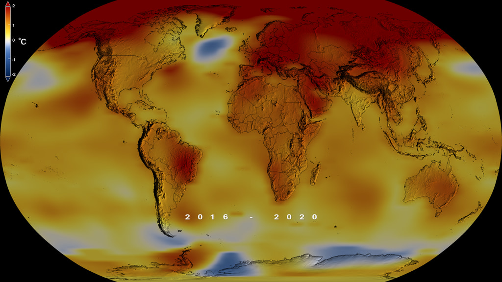
This visualization shows how the distribution of land temperature anomalies has varied over time. As the planet has warmed, we see the peak of the distribution shifting to the right. The distribution of temperatures broadens as well. This broadening is most likely due to differential regional warming rather than increased temperature variability at any given location.
These distributions are calculated from the Goddard Institute of Space Studies GISTEMP surface temperature analysis. Distributions are determined for each year using a kernal density esitmator, and we morph between those distributions in the animation.
NASA’s full surface temperature data set – and the complete methodology used to make the temperature calculation – are available at: https://data.giss.nasa.gov/gistemp
GISS is a NASA laboratory managed by the Earth Sciences Division of the agency’s Goddard Space Flight Center in Greenbelt, Maryland. The laboratory is affiliated with Columbia University’s Earth Institute and School of Engineering and Applied Science in New York.
The python based Jupyter Notebook used to create these visualizations is available. Click here to download.

A ridgeline plot showing how the land temperature anomaly distribution has changed over seven decades
Credits
Please give credit for this item to:
NASA's Scientific Visualization Studio
-
Visualizer
- Mark SubbaRao (NASA/GSFC)
-
Technical support
- Laurence Schuler (ADNET Systems, Inc.)
- Ian Jones (ADNET Systems, Inc.)
-
Project support
- Leann Johnson (Global Science and Technology, Inc.)
-
Scientists
- Helga (Kikki) Kleiven (University of Bergen)
- Gavin A. Schmidt (NASA/GSFC GISS)
-
Advisor
- Peter H. Jacobs (NASA/GSFC)
Release date
This page was originally published on Friday, April 23, 2021.
This page was last updated on Wednesday, April 24, 2024 at 12:16 AM EDT.
Datasets used in this visualization
-
GISTEMP [GISS Surface Temperature Analysis (GISTEMP)]
ID: 585The GISS Surface Temperature Analysis version 4 (GISTEMP v4) is an estimate of global surface temperature change. Graphs and tables are updated around the middle of every month using current data files from NOAA GHCN v4 (meteorological stations) and ERSST v5 (ocean areas), combined as described in our publications Hansen et al. (2010) and Lenssen et al. (2019).
Credit: Lenssen, N., G. Schmidt, J. Hansen, M. Menne, A. Persin, R. Ruedy, and D. Zyss, 2019: Improvements in the GISTEMP uncertainty model. J. Geophys. Res. Atmos., 124, no. 12, 6307-6326, doi:10.1029/2018JD029522.
This dataset can be found at: https://data.giss.nasa.gov/gistemp/
See all pages that use this dataset
Note: While we identify the data sets used in these visualizations, we do not store any further details, nor the data sets themselves on our site.
Related
- ID: 5207
 Visualization
 - ID: 5209
 Visualization
 - ID: 5191
 Visualization
 - ID: 5190
 Visualization
 - ID: 5161
 Visualization
 - ID: 5137
 Visualization
 - ID: 5057
 Visualization
 - ID: 5059
 Visualization
 - ID: 5060
 Visualization
 - ID: 4978
 Visualization
 - ID: 4975
 Visualization
 - ID: 4964
 Visualization
 - ID: 4908
 Visualization
 - ID: 4882
 Visualization
Older Versions
- ID: 3975
Used as a Source In
- ID: 13979
![Music: Futurity by Lee Groves [PRS] and Peter George Marett [PRS]Complete transcript available.](/vis/a010000/a013900/a013979/Screen_Shot_2021-10-28_at_2.29.18_PM.png)