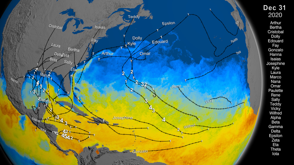
NASA captures Isaias bringing heavy rains to the Northern Bahamas
GPM captured Tropical Storm Isaias off the coast of Florida as it pounded the Northern Bahama Islands on August 2nd, 2020.
This video is also available on our YouTube channel.
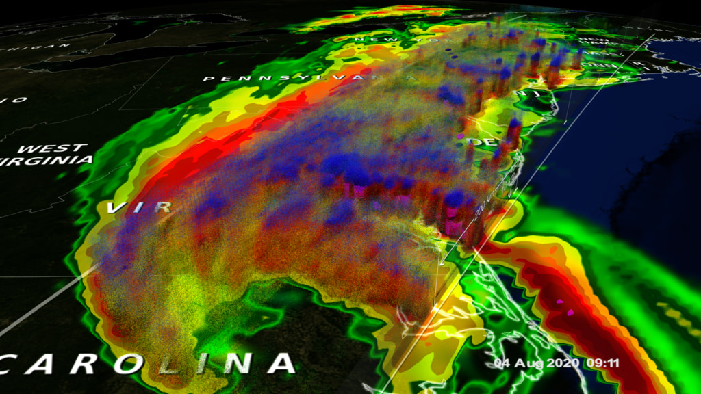
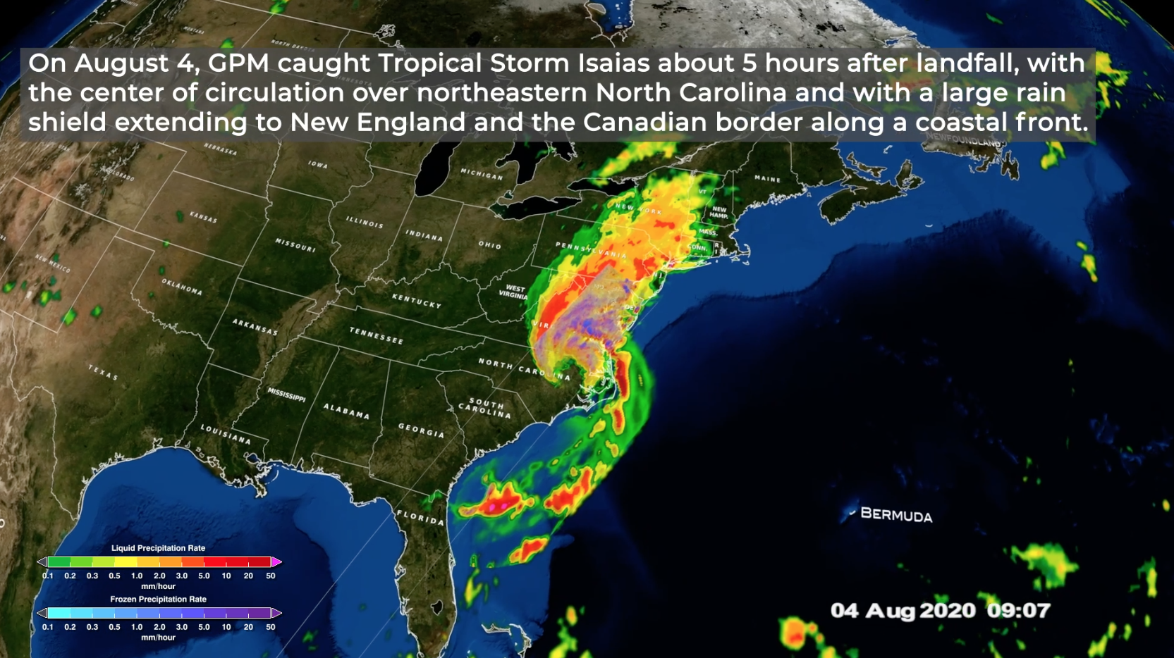
After forming into a tropical storm in the eastern Caribbean, Isaias crossed over Hispaniola and back into the western Atlantic heading northwest towards the Bahamas. During this time, Isaias strengthened into a Category 1 hurricane before then passing through the southern and central Bahamas. As it crossed Andros Island in the central Bahamas, Isaias also came under the effects of southwesterly wind shear, which together with the land interaction caused it to weaken back to a strong tropical storm. This animation follows Isaias into the central Bahamas using NASA’s IMERG rainfall product. With IMERG, precipitation estimates from the GPM core satellite are used to calibrate precipitation estimates from microwave and IR sensors on other satellites to produce half-hourly precipitation maps at 0.1 degree horizontal resolution. After it crossed Andros Island, Isaias was overflown by the GPM core satellite itself at 09:11 UTC (5:11 am EDT) on the morning of Sunday August 2nd, which is detailed in the second part of the animation. Here rainfall rates derived directly from the GPM Microwave Instrument (or GMI) and Dual-Polarization Radar (or DPR) provide a detailed look into Isaias. GPM shows a large area of heavy rain (shown in red) covering the northern Bahamas. GPM also shows that this rain is located almost entirely northeast of Isaias’ center with very little rain on the western side of the storm. This highly asymmetric structure reflects both the effects of the wind shear as well as Isaias’ lack of intensity and hence ability to wrap precipitation around to the western side of the circulation. At the time of the GPM overpass, Isaias’ maximum sustained winds were reported at 65 mph by the National Hurricane Center, making it a strong tropical storm. Isaias would go onto regain hurricane intensity due to the warm waters of the Gulf Stream before making landfall on the southern coast of North Carolina.
GPM data is archived at https://pps.gsfc.nasa.gov/

Color bar for frozen precipitation rates (ie, snow rates). Shades of cyan represent low amounts of frozen precipitation, whereas shades of purple represent high amounts of precipitation.
Color bar for liquid precipitation rates (ie, rain rates). Shades of green represent low amounts of liquid precipitation, whereas shades of red represent high amounts of precipitation.
Credits
Please give credit for this item to:
NASA's Scientific Visualization Studio
-
Data visualizers
- Alex Kekesi (Global Science and Technology, Inc.)
- Greg Shirah (NASA/GSFC)
-
Scientists
- George Huffman (NASA/GSFC)
- Scott Braun (NASA/GSFC)
-
Producer
- Ryan Fitzgibbons (USRA)
-
Writer
- Stephen Lang (SSAI)
Release date
This page was originally published on Tuesday, August 4, 2020.
This page was last updated on Wednesday, November 15, 2023 at 12:16 AM EST.
Missions
This visualization is related to the following missions:Series
This visualization can be found in the following series:Datasets used in this visualization
-
Rain Rates (Surface Precipitation) [GPM: GMI]
ID: 822Credit: Data provided by the joint NASA/JAXA GPM mission.
See all pages that use this dataset -
Volumetric Precipitation data (Ku) [GPM: DPR]
ID: 830Credit: Data provided by the joint NASA/JAXA GPM mission.
See all pages that use this dataset -
IMERG
ID: 863This dataset can be found at: http://pmm.nasa.gov/sites/default/files/document_files/IMERG_ATBD_V4.4.pdf
See all pages that use this dataset -
[GOES-16: ABI]
ID: 978Advanced Baseline Imager (ABI) has 16 spectral bands, including two visible channels, four near-infrared channels and ten infrared channels. It is nearly identical to the imagers on Himawari 8 and Himawari 9.
See all pages that use this dataset
Note: While we identify the data sets used in these visualizations, we do not store any further details, nor the data sets themselves on our site.
Related
- ID: 4884
 Visualization
 - ID: 13749
 Produced Video
 - ID: 4847
 Visualization
Used as a Source In
- ID: 13681
 Produced Video