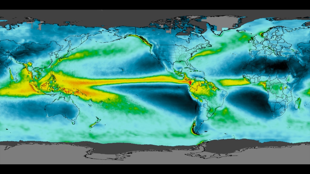
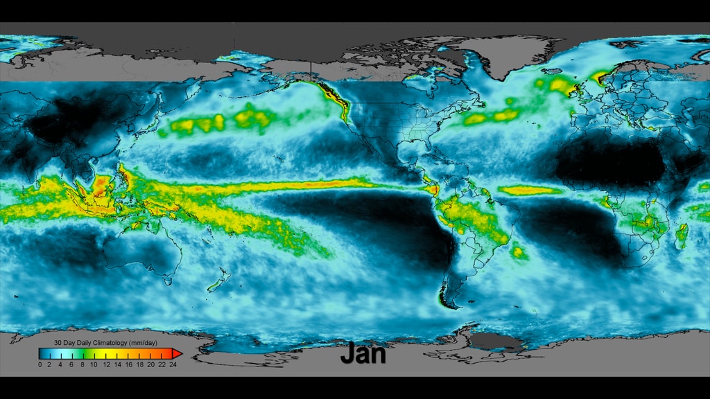
IMERG Monthly Climatology
This data visualization cycles through the monthly precipitation rates. Both the colorbar and corresponding months are burned into the movie.
The monthly climatology dataset covers January 2001 to December 2018 as was created for the unveiling of the Global Precipitation Missions's (GPM) newly redesigned website
This data visualization cycles throught the monthly precipitation rates throughout the year. (The colorbar and dates are not included in this version in case an editor wants to include their own graphical overlays.)
Date overlay match framed to the above data visualization to re-create the topmost example visualization if desired.

Colorbar for average monthly precipitation rates shown in millimeters per hour. Cool colors (ie, blue and green) are areas that receive low amounts of precipitation for a given month. Warmer colors (yellow, orange, and red) receive higher amounts of precipitation for the given month.

January Climatology
February Climatology
March Climatology
April Climatology
May Climatology
June Climatology
July Climatology
August Climatology
September Climatology
October Climatology
November Climatology
December Climatology
Credits
Please give credit for this item to:
NASA's Scientific Visualization Studio
-
Visualizer
- Alex Kekesi (Global Science and Technology, Inc.)
-
Data visualizer
- Horace Mitchell (NASA/GSFC)
-
Scientists
- George Huffman (NASA/GSFC)
- Dalia B Kirschbaum (NASA/GSFC)
-
Producers
- Ryan Fitzgibbons (USRA)
- Joy Ng (USRA)
-
Technical support
- Laurence Schuler (ADNET Systems, Inc.)
- Ian Jones (ADNET Systems, Inc.)
Release date
This page was originally published on Friday, July 3, 2020.
This page was last updated on Wednesday, April 10, 2024 at 12:13 AM EDT.
Datasets used in this visualization
-
IMERG
ID: 863This dataset can be found at: http://pmm.nasa.gov/sites/default/files/document_files/IMERG_ATBD_V4.4.pdf
See all pages that use this dataset
Note: While we identify the data sets used in these visualizations, we do not store any further details, nor the data sets themselves on our site.
Related
- ID: 4760
 Visualization
 - ID: 4759
 Visualization
Used as a Source In
- ID: 13909
 Produced Video