GPM observes Hurricane Dorian lashing Florida
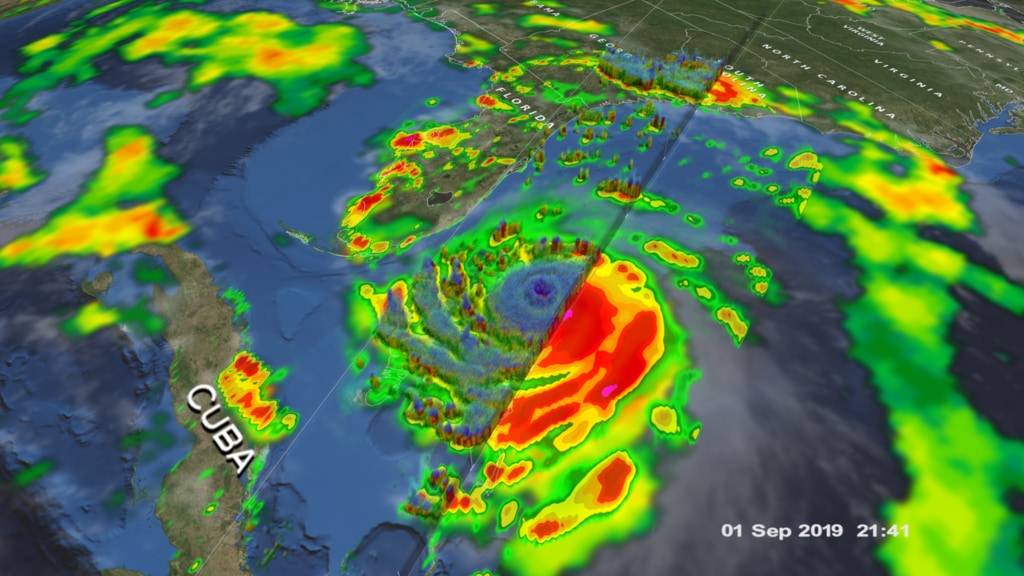
Snapshot view of 3D precipitation from DPR and surface rain rates (mm/hr) from GMI at 10:41 UTC (6:41 am EDT) 4 September 2019 when the center of Dorian was near the coast of central Florida about 90 miles due east of Daytona Beach.
This video is also available on our YouTube channel.
GPM captured Dorian at 10:41 UTC (6:41 am EDT) on the 4th of September when the storm was moving north-northwest parallel to the coast of Florida about 90 miles due east of Daytona Beach. Three days earlier, Dorian had struck the northern Bahamas as one of the most powerful Category 5 hurricanes on record in the Atlantic with sustained winds of 185 mph. Weakening steering currents allowed the powerful storm to ravage the northern Bahamas for 2 full days. During this time, Dorian began to weaken due to its interactions with the islands as well as the upwelling of cooler ocean waters from having remained in the same location for so long. Immediately apparent is Dorian’s well-defined but very large eye. This feature is often seen in the later stages of powerful tropical cyclones, which includes hurricanes and typhoons. As these mature, powerful storms age, their wind field tends to expand. They often undergo what is known as eye wall replacement cycles wherein a 2nd concentric eye wall forms outside of the original inner eye wall. The inner eye wall is choked off and weakens leaving the outer eye wall as the dominant eye wall. The outer eye wall can still contract, but often the storm is left with a larger eye as is the case with Dorian. At the time of this image, Dorian’s maximum sustained winds were still 105 mph, making it a Category 2 storm, but a very large Category 2 storm.
GPM data is archived at https://pps.gsfc.nasa.gov/

Color bar for frozen precipitation rates (ie, snow rates). Shades of cyan represent low amounts of frozen precipitation, whereas shades of purple represent high amounts of precipitation.
Color bar for liquid precipitation rates (ie, rain rates). Shades of green represent low amounts of liquid precipitation, whereas shades of red represent high amounts of precipitation.
Credits
Please give credit for this item to:
NASA's Scientific Visualization Studio
-
Data visualizers
- Alex Kekesi (Global Science and Technology, Inc.)
- Greg Shirah (NASA/GSFC)
- Kel Elkins (USRA)
-
Scientists
- George Huffman (NASA/GSFC)
- Dalia B Kirschbaum (NASA/GSFC)
- Gail Skofronick Jackson (NASA/GSFC)
- Scott Braun (NASA/GSFC)
-
Writer
- Stephen Lang (SSAI)
-
Producer
- Ryan Fitzgibbons (USRA)
Release date
This page was originally published on Friday, September 6, 2019.
This page was last updated on Wednesday, November 15, 2023 at 12:13 AM EST.
Missions
This visualization is related to the following missions:Series
This visualization can be found in the following series:Datasets used in this visualization
-
Rain Rates (Surface Precipitation) [GPM: GMI]
ID: 822Credit: Data provided by the joint NASA/JAXA GPM mission.
See all pages that use this dataset -
Volumetric Precipitation data (Ku) [GPM: DPR]
ID: 830Credit: Data provided by the joint NASA/JAXA GPM mission.
See all pages that use this dataset -
IMERG
ID: 863This dataset can be found at: http://pmm.nasa.gov/sites/default/files/document_files/IMERG_ATBD_V4.4.pdf
See all pages that use this dataset
Note: While we identify the data sets used in these visualizations, we do not store any further details, nor the data sets themselves on our site.
Related
- ID: 4751
 Visualization