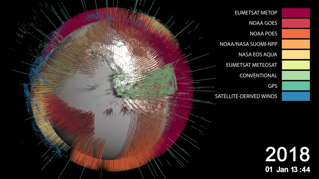
SVS Demo Reel
Movies
- svs_siggraphreel2019.mp4 (1920x1080)
- svs_siggraphreel2019.webm (1920x1080)
Images
- svs_siggraphreel2019_print.jpg (1920x1080)
- svs_siggraphreel2019_print_thm.png (80x40)
- svs_siggraphreel2019_print_searchweb.png (320x180)
Right click movies to download them if they automatically play in your browser.
This is the SVS Demo Reel presented at SIGGRAPH 2019 in Los Angeles, CA.
Credits
Please give credit for this item to:
NASA's Scientific Visualization Studio
Music Credit: Westar Music Track "One Idea Leads to Another"
Visualizers
- Alex Kekesi (GST)
- Cindy Starr (GST)
- Ernie Wright (USRA)
- Greg Shirah (NASA/GSFC)
- Helen-Nicole Kostis (USRA)
- Horace Mitchell (NASA/GSFC)
- Kel Elkins (USRA)
- Lori Perkins (NASA/GSFC)
- Tom Bridgman (GST)
- Trent L. Schindler (USRA)
Producer
- Devika Elakara (GSFC Interns)
Technical support
- Leann Johnson (GST)
Related pages
SVS Demo Reel 2020
Feb. 17, 2021, 7 p.m.
Read moreMusic Credit: by Stefan Rodescu [SACEM], Yannick Kalfayan [SACEM], Universal Production Music This is the SVS Demo Reel submitted to SIGGRAPH 2021.Coming soon to our YouTube channel.
A Web Around Asteroid Bennu – Visualizations
May 10, 2021, noon
Read moreThe Origins Spectral Interpretation Resource Identification Security - Regolith Explorer (OSIRIS-REx) spacecraft arrived at near-Earth asteroid Bennu in December 2018. After studying the asteroid for nearly two years, the spacecraft successfully performed a Touch-And-Go (TAG) sample collection maneuver on October 20, 2020. The spacecraft will remain in asteroid Bennu’s vicinity until May 10, when the mission will enter its Return Cruise phase and begin its two-year journey back to Earth. This data visualization presents the mission’s complete trajectory during its time at Bennu. This visualization depicts the OSIRIS-REx spacecraft’s trajectory around the asteroid Bennu from the initial arrival in Dec 2018 through the final departure in April 2021. The trajectory is presented in a Sun Bennu North reference frame. Several mission segments are highlighted in white, leading up to the TAG sample collection maneuver on Oct 20, 2020. This is a single layer of the Web Around Bennu visualization that includes just the asteroid and the orbit lines with a transparent background. This is a single layer of the Web Around Bennu visualization that includes just the star background This is a single layer of the Web Around Bennu visualization that includes just dates
Jakobshavn Regional View of Three Simulated Greenland Ice Sheet Response Scenarios: 2008 - 2300
June 19, 2019, 10 a.m.
Read moreThe Greenland Ice Sheet holds enough water to raise the world’s sea level by over 7 meters (23 feet). Rising atmosphere and ocean temperatures have led to an ice loss equivalent to over a centimeter increase in global mean sea-level between 1991 and 2015. Large outlet glaciers, rivers of ice moving to the sea, drain the ice from the interior of Greenland and cause the outer margins of the ice sheet to recede. Improvements in measuring the ice thickness in ice sheets is enabling better simulation of the flow in outlet glaciers, which is key to predicting the retreat of ice sheets into the future.Recently, a simulation of the effects of outlet glacier flow on ice sheet thickness coupled with improved data and comprehensive climate modeling for differing future climate scenarios has been used to estimate Greenland’s contribution to sea-level over the next millennium. Greenland could contribute 5–34 cm (2-13 inches) to sea-level by 2100 and 11–162 cm (4-64 inches) by 2200, with outlet glaciers contributing 19–40 % of the total mass loss. The analysis shows that uncertainties in projecting mass loss are dominated by uncertainties in climate scenarios and surface processes, followed by ice dynamics. Uncertainties in ocean conditions play a minor role, particularly in the long term. Greenland will very likely become ice-free within a millennium without significant reductions in greenhouse gas emissions.Three visualizations of the evolution of the Jakobshavn region of the Greenland Ice Sheet between 2008 and 2300 based on three different climate scenarios are shown below. Each scenario is described briefly in the caption under each visualization. Each of the three visualizations are provided with a date, colorbar and a distance scale as well as without. The regions shown in a violet color are exposed areas of the Greenland bed that were covered by the ice sheet in 2008.The data sets used for these animations are the control (“CTRL”) simulations and were produced with the open-source Parallel Ice Sheet Model (www.pism-docs.org). All data sets for this study are publicly available at https://arcticdata.io (doi:10.18739/A2Z60C21V). Above is a visualization of the Jakobshavn region of the Greenland Ice Sheet from 2008 to 2300 based on the Representative Concentration Pathway (RCP) 2.6 climate scenario. This is the best case scenario for limiting greenhouse gasses and assumes that emissions will peak by mid-century and decline thereafter.This video is also available on our YouTube channel. Above is a visualization of the Jakobshavn region of the Greenland Ice Sheet from 2008 to 2300 based on the RCP 4.5 climate scenario. This mid-range scenario is based on the assumption that emissions will stabilize by the year 2100 and that forest lands will expand.This video is also available on our YouTube channel. Above is a visualization of the Jakobshavn region of the Greenland Ice Sheet from 2008 to 2300 based on the RCP 8.5 climate scenario. This RCP scenario is characterized by increasing greenhouse gas emissions over time.This video is also available on our YouTube channel. This visualization is a copy of the RCP 2.6 visualization above without the overlay of the date, colorbar and distance scale. This visualization is a copy of the RCP 4.5 visualization above without the overlay of the date, colorbar and distance scale. This visualization is a copy of the RCP 8.5 visualization above without the overlay of the date, colorbar and distance scale. An image of the Jakobshavn region in the year 2300 using RPC 2.6 scenario An image of the Jakobshavn region in the year 2300 using the RCP 4.5 scenario An image of the Jakobshavn region in the year 2300 using the RCP 8.5 scenario An image of the Jakobshavn region in the year 2300 using RPC 2.6 scenario without the date, colorbar and distance scale. An image of the Jakobshavn region in the year 2300 using RPC 4.5 scenario without the date, colorbar and distance scale. An image of the Jakobshavn region in the year 2300 using RPC 8.5 scenario without the date, colorbar and distance scale. The overlay used above with transparency. This includes the colorbar, date and distance scale.
ENSO teleconnections in South East Asia for the period of 2015-2016
Feb. 28, 2019, 4 a.m.
Read moreEl Niño-Southern Oscillation (ENSO) is an irregularly recurring climate pattern characterized by warmer (El Niño) and colder (La Niña) than usual ocean temperatures in the equatorial eastern Pacific, which creates a ripple effect of anticipated weather changes in far-spread regions on our planet. Weather changes associated with the ENSO phenomenon result in climate anomalies related to each other, such as rainfall (increase or lack of thereof) and land surface temperature anomaly conditions that trigger outbreaks of infectious diseases of public health concern in different regions around the world. These distant weather effects are called teleconnections. Therefore, the effects of ENSO are called ENSO teleconnections, highlighting that warmer or colder than usual ocean temperatures in the equatorial Pacific Ocean with extents (5N-5S, 120W-170W) affect areas far from the source typically 2-3 months after.During the last 20 years NASA scientist Dr. Assaf Anyamba and colleagues have been tracking ENSO events (please see: Niño 3.4 Index and Sea Surface Temperature Anomaly Timeline: 1982-2017) and studying associated teleconnections by monitoring various climate datasets, among them Sea Surface Temperature, Precipitation and Land Surface Anomaly datasets from NASA and National Oceanic and Atmospheric Administration (NOAA). At the same time, the science team has been collecting, cataloguing and analyzing patterns and sources of infectious disease outbreaks worldwide. Dr. Anyamba and colleagues conducted a scientific study - the first one to comprehensively assess the public health impacts of the major climate event on a global scale - that was open access published in the journal Nature Scientific Reports, with the title Global Disease Outbreaks Associated with the 2015-2016 El Niño event. According to the study, the 2015-2016 El Niño event brought weather conditions that triggered infectious disease outbreaks in ENSO teleconnected regions around the world, such as plague and hantavirus in Colorado and New Mexico (in 2015), cholera in East Africa’s Tanzania (during 2015- 2016), and dengue fever in Brazil and Southeast Asia (during 2015) among others. These outbreaks have been visualized with data in web entry: Sea Surface Temperature anomalies and patterns of Global Disease Outbreaks: 2009-2018 (4K version)).The data visualization featured on this page with corresponding multiplot graph illustrates the relationship between the 2015-2016 El Niño event and the amplification of dengue outbreaks over the region of South East Asia for the same period. The visualization comprises of two parts:Top:On the top part we can see three separate representations of Earth (spheres) with three distinct datasets. On the left sphere Sea Surface Temperature (SST) anomaly data are mapped over water and our planet is rotated so that we can observe changes of temperature (increase/red hues, decrease/blue hues) over the equatorial Pacific Ocean. The strong ENSO (El Niño) event during May 2015-May 2016 is manifested in the visualization as increased temperature over water (red hues) in the equatorial Pacific Ocean, where the Nino 3.4 Index SST region (5N-5S, 120W-170W) is located. In the middle sphere, our planet is rotated so that we can see Precipitation anomaly data (dry/brown to wet/teal) over land in the South East Asia region. On the right sphere, Land Surface Temperature (LST) anomaly data (low/blue to high/red) are mapped on land.The three distinct representations of each dataset are accompanied right below each sphere with the corresponding colorbar information (for example, Sea Surface Temperature colorbar, Precipitation Anomaly colorbar and Land Surface Temperature Anomaly colorbar)Bottom:On the bottom, a synchronized multiplot of Precipitation Anomaly (mm) and Temperature Anomaly (Co ) for the same period, tracks and visualizes indicators from three sources represented in the top part of the visualization. The three indicators are:Monthly Sea Surface Temperature (SST) Anomaly data (°C) for the Niño 3.4 Index region over the equatorial Pacific with extents (5N-5S, 120W-170W). Represented in the multiplot as the orange area graph. Monthly Precipitation Anomaly data (mm) for the South East (SE) Asia Region (Myanmar, Vietnam, Laos, Thailand, Cambodia, Malaysia, Singapore, Indonesia). Represented in the multiplot as the grey area graph.Monthly Land Surface Temperature (LST) Anomaly data (°C) for the South East (SE) Asia Region (Myanmar, Vietnam, Laos, Thailand, Cambodia, Malaysia, Singapore, Indonesia). Represented in the multiplot as the yellow area graph.The multiplot references both temperature-related anomaly datasets: Sea Surface Temperature (SST) Anomaly and Land Surface Temperature (LST) Anomaly data to the right axis of the multiplot. Temperature Anomaly values are referenced to the left axis of the multiplot. The overall design of this data visualization was chosen in an effort to make visible the relationships between the three datasets and their indicators concurrently. As time progresses, labels and visual cues in the multiplot guide the viewer about the occurrence and duration of the El Niño event, its different phases (Moderate, Strong, Very Strong) and the Dengue Amplification Period.To explain a bit further the weather patterns and teleconnections, lets take a closer look at the sequence of events and their timelines. The El Niño event (May 2015-May 2016) is manifested over the equatorial Pacific Ocean, as increased temperature (left sphere, red hues) on the top part of the visualization and with the orange area graph on the bottom. During the same period, the South East Asia region receives below than normal precipitation (middle sphere, brown hues) resulting in drier than usual conditions, which in turn caused an anomalous increase in land surface temperature (left sphere, red hues). The dry and hot conditions in the South East Asia region were conducive for the upsurge in populations of mosquito vectors in urban areas, where there are open water storage containers providing ideal habitats for mosquito production. In addition, the higher than normal temperature on land shortens the maturation time of larvae to adult mosquitos and induces frequent blood feeding/biting of humans by mosquito vectors, resulting in the Dengue Amplification Period (July 2015-March 2016) over the South East Asia region. Dengue fever is a painful, debilitating disease and is transmitted between people by mosquito vectors. It is a predominantly tropical disease affecting approximately 400 million people annually in many areas of the global tropics including South America and South East Asia. Dengue epidemics worldwide occur in urban areas where there is a coincidence of large numbers of dengue vectors (Aedes aegypti) and people with no immunity to one of the virus types.The impact of precipitation and land surface temperature anomalies on the dengue outbreaks over the South East Asia region have been visualized with data on the following two web entries: Precipitation Anomaly and Dengue Outbreaks in South East Asia: 2015-2016Land Surface Temperature Anomaly and Dengue Outbreaks in South East Asia Region: 2015-2016The strong relationship between ENSO events and disease outbreaks underscores the importance of seasonal forecasts. Since disease outbreaks typically manifest 2-3 months after the start of El Niño and La Nina events, early and regular climate monitoring, paired with the use of monthly and seasonal climate forecasts become significant tools for disease control and prevention. Findings of the scientific study by Dr. Assaf Anyamba and colleagues, suggests that by monitoring monthly climate datasets, country public health agencies such as CDC and international organizations such as the United Nations s (DTRA) Joint Science and Technology Office for Chemical and Biological Defense (JSTO-CBD) Biosurveillance Ecosystem (BSVE) Program (HDTRA1-16-C-0045) and the Defense Health Agency-Armed Forces Health Surveillance Branch (AFHSB) Global Emerging Infections Surveillance and Response System (GEIS) under Project # P0072_19_NS.The rest of this webpage offers additional versions, frames, layers and colorbar information associated with the development of this data-driven visualization. The 2015-2016 strong El Niño event brought changes to weather conditions across the globe that triggered regional infectious disease outbreaks, including mosquito-borne dengue fever in South East Asia. This visualization with corresponding multi-plot graph shows how Sea Surface Temperature anomalies in the equatorial Pacific Ocean (left), resulted in anomalous drought conditions (center) and increase in land surface temperatures (right) in South East Asia. During the 2015-2016 El Niño event, the South East Asia region received below than normal precipitation resulting in drier and warner than normal conditions, which increased the populations of mosquito vectors in urban areas, where there are open water storage containers providing ideal habitats for mosquito production. In addition, the higher than normal temperature on land shortens the maturation time of larvae to adult mosquitos and induces frequent blood feeding/biting of humans by mosquito vectors resulting in the amplification of dengue disease outbreaks over the South East Asia region. This visualization is similar to the one above, except the timeplot graph is unveiled for the entire period 2015-2016. The 2015-2016 strong El Niño event brought changes to weather conditions across the globe that triggered regional infectious disease outbreaks, including mosquito-borne dengue fever in South East Asia. This visualization with corresponding multi-plot graph shows how Sea Surface Temperature anomalies in the equatorial Pacific Ocean (left), resulted in anomalous drought conditions (center) and increase in land surface temperatures (right) in South East Asia. During the 2015-2016 El Niño event, the South East Asia region received below than normal precipitation resulting in drier and warner than normal conditions, which increased the populations of mosquito vectors in urban areas, where there are open water storage containers providing ideal habitats for mosquito production. In addition, the higher than normal temperature on land shortens the maturation time of larvae to adult mosquitos and induces frequent blood feeding/biting of humans by mosquito vectors resulting in the amplification of dengue disease outbreaks over the South East Asia region. This set of frames provides the Sea Surface Temperature Anomaly layer for the period 2014-2016, with alpha channel. This set of frames provides the dates layer for the Sea Surface Temperature Anomaly visuals. Colorbar for sea surface temperature anomaly. Monthly preicipitation anomaly in the Asia Region for the period of 2014-2016. This set of frames are provided with alpha channel. Colorbar for precipitation anomaly. Monthly Land Surface Temperature Anomaly data in the Asia region during 2014-2016. This set of frames is provided with alpha channel. This set of frames provides the dates layer for the Land Surface Temperature Anomaly visuals. Frames are provided with alpha channel. Colorbar for land surface temperature anomaly.
Earthrise in 4K
Dec. 21, 2018, 4 a.m.
Read moreOn December 24, 1968, Apollo 8 astronauts Frank Borman, Jim Lovell, and Bill Anders became the first humans to witness the Earth rising above the moon Earthrise and 8 Homeward by the International Astronomical Union to commemorate the 50th anniversary of the Apollo 8 mission.
Evolution of the Meteorological Observing System in the MERRA-2 Reanalysis
Dec. 14, 2018, 7 a.m.
Read moreThe Global Modeling and Assimilation Office (GMAO) at NASA Goddard Space Flight Center uses the Goddard Earth Observing System (GEOS) modeling and data assimilation system to produce gridded estimates of the atmospheric state by combining short-term forecasts with observations from numerous observing systems. While the GEOS system is under continual development, it is periodically frozen and used to reprocess the modern satellite era, which begins in about 1980. This period specifically has been the focus of the second version of the Modern-Era Retrospective analysis for Research and Applications (MERRA-2). The modern satellite era in the context of MERRA-2 stems from the launch of the NASA/NOAA Television InfraRed Observational Satellite N-series (TIROS-N) satellite. This satellite served as the space platform for the first of the TIROS Operational Vertical Sounder (TOVS) series, which included TIROS-N and NOAA-6 through NOAA-14. The series of TOVS observations included global infrared and microwave radiance observations that provided the first comprehensive space-based observations that served as the remotely sensed backbone of the assimilation system. These observations, along with wind estimates from geostationary satellites and the global surface and upper air conventional observing network (e.g. surface reporting stations, radiosondes, aircraft measurements) provide the observations for the beginning of MERRA-2 in 1980.The observing system has advanced substantially since the launch of TIROS-N. Both satellite and conventional observations have increased in both quality and quantity over the course of the past four decades. In 1980, the median number of observations assimilated over a six hour period was 175,000. In 2018, this number has approached 5 million. The transition from the TOVS to the ATOVS (Advanced TOVS) observing system, which began in 1998 with the launch of the NOAA-15 platform, provided better horizontal and vertical resolution, along with improved observational quality. NASA’s Atmospheric Infrared Sounder (AIRS) instrument on the EOS-Aqua spacecraft provided yet another major advance in remote sensing of Earth, providing the first well-calibrated hyperspectral infrared radiance observations of the atmosphere, leading to a massive increase in the number of observations available to constrain the system. Designed as a research instrument, AIRS has been adopted by international operational weather prediction centers in their analysis and forecasting systems and also provides a key part of the meteorological observing system for MERRA-2. The demonstrable value of NASA’s AIRS observations also provided the impetus for developing hyperspectral infrared radiance instruments by the weather agencies, with the Infrared Atmospheric Sounding Interferometers (IASI) on the EUMETSAT Metop spacecraft and the Cross-track Infrared Sounders (CrIS) on the NASA-NOAA Suomi-NPP and JPSS platforms providing massive boosts in the number of available observations for use in weather analysis and forecasting. These measurements all provide critical inputs to the observing system used in MERRA-2. One of the fundamental scientific goals of the GMAO reanalysis projects is to provide the optimal estimate atmospheric state in a manner that is consistent over time. These animations illustrate how different the observing system were in 1980 compared to today. On the one hand, these animations demonstrate the critical role that NASA has played in developing the observing systems that are used in satellite measurements, including the enhancements of the spacecraft observations between 1980 and the present time. They also highlight one of the great challenges in producing consistent long-term records of the atmospheric state in MERRA-2 and other reanalyses: technological advances lead to larger numbers of higher quality observations. Even though the underlying assimilation systems remain frozen over time, the great challenge is to overcome the impacts of an ever improving suite of observations. Meteorological Observing Systems, 1980 and 2018. Data is revealed within a moving 1.5 hour window centered on the time shown. Sistemas de observación meteorológica, 1980 y 2018. Los datos se muestran en una ventana móvil de 1,5 horas centrada en el tiempo indicado. Meteorological Observing Systems, 1980. Data is revealed within a moving 1.5 hour window centered on the time shown. Sistemas de observación meteorológica, 1980. Los datos se muestran en una ventana móvil de 1,5 horas centrada en el tiempo indicado. Meteorological Observing Systems, 2018. Data is revealed within a moving 1.5 hour window centered on the time shown. Sistemas de observación meteorológica, 2018. Los datos se muestran en una ventana móvil de 1,5 horas centrada en el tiempo indicado. Individual Meteorological Observing Systems, 1980. Each image represents 6 hours of observations, centered on 12Z. Dropdown menu contains complete set. Individual Meteorological Observing Systems, 2018. Each image represents 6 hours of observations, centered on 12Z. Dropdown menu contains complete set.
El Yunque National Forest, Puerto Rico Canopy Change from Afar (2017-2018)
Dec. 10, 2018, 7 a.m.
Read moreIn September 2017, Hurricane Maria s forests had far-reaching effects, Morton said. Fallen trees that no longer stabilize soil on slopes with their roots as well as downed branches can contribute to landslides and debris flows, increased erosion, and poor water quality in streams and rivers where sediments build up. Sample Composite that split screens the lidar swath over the El Yunque National Forest, Puerto Rico. During the split screen, 2017 data is on the upper left and 2018 data on the bottom right. As the camera moves northwest, the viewer can see patches of ground becoming visible in the 2018 data. This is due to the vast numbers of trees that were stripped or fell during Hurricane Maria in September 2017. 2017 El Yunque National Forest, Puerto Rico six months before Maria. 2018 El Yunque National Forest, Puerto Rico after Maria hit in late 2017.
NASA's Black Marble night lights used to examine disaster recovery in Puerto Rico
Dec. 8, 2018, 7 p.m.
Read moreAt night, Earth is lit up in bright strings of roads dotted with pearl-like cities and towns as human-made artificial light takes center stage. During Hurricane Maria, Puerto Rico dataset. The camera then zooms in to several locations around the island to examine each stage of recovery in more detail. This version has no legend/labels. Still image - Hurricane Maria just after passing over Puerto Rico Still image - Puerto Rico night lights after Hurricane Maria passes over (path shown here in red) Color bar for night light intensity Color bar for number of days without power Print resolution still - This view of Puerto Rico shows number of days without power. Greens and yellows are fewer days (0-60), and reds and pinks are more days (120-180). (With and without city labels) Print resolution still - This view of Puerto Rico shows number of days without power. Greens and yellows are fewer days (0-60), and reds and pinks are more days (120-180). Print resolution still - This view of Puerto Rico shows number of days without power. Greens and yellows are fewer days (0-60), and reds and pinks are more days (120-180). Print resolution still - Baseline (pre-storm) view of Puerto Rico night lights. (With and without city labels) Print resolution still - Average night lights 2 months (Sep 20 - Nov 20) after Hurricane Maria passed over Puerto Rico. (With and without city labels) Print resolution still - Average night lights 3-4 months (Nov 21- Jan 20) after Hurricane Maria hit Puerto Rico. (With and without city labels) Print resolution still - Average night lights 5-6 months (Jan 21- Mar 20) after Hurricane Maria hit Puerto Rico. (With and without city labels) Print resolution still - Baseline (pre-storm) view of San Juan night lights. Print resolution still - Average San Juan night lights 2 months (Sep 20 - Nov 20) after Hurricane Maria passed over Puerto Rico.
PACE - Studying Plankton, Aerosols, Clouds, and the Ocean Ecosystem
Dec. 5, 2018, 4 a.m.
Read moreIn terms of life on Earth, color describes more than simply how features look. In many cases color serves as a proxy for biological processes. When studying ocean biology, colors count in a big way. NASA’s PACE mission (Plankton, Aerosol, Cloud, ocean Ecosystem) has been conceived principally as a way to measure ocean color for assessing large scale ocean health. These measurements will provide data to determine the distribution of phytoplankton, tiny plants and algae that sustain the marine food web. A simple way to think about this is the more “green” that’s visible from space, the more prevalent are plant cells containing chlorophyll, an essential green pigment responsible for energy-producing photosynthesis in plants. Phytoplankton populations are fundamental to understanding the overall health of the ocean food web, as well as a wide range of related processes. PACE will be able to see other colors too—a broad range of color, in fact, stretching beyond the bounds of visible light into both ultraviolet as well as infrared. PACE will also be able to make measurements of aerosols in the atmosphere, essential for scientists to improve our understanding of and our ability to forecast weather and climate. PACE continues a more than 20 year legacy of ocean color measurements, providing the scientific community with a long time series of data. That legacy enables better assessments of long term trends about complex processes on Earth. The visualization starts close on the PACE spacecraft. A representative data swath is shown, depicting biosphere plankton data. The camera then pulls out to show the spacecraft s ocean and atmosphere. This version end with static biosphere data. Visualization layer - masked biosphere Visualization layer - aerosols Visualization layer - clouds Visualization layer - animated biosphere Visualization layer - static biosphere Visualization layer - PACE spacecraft model
The Hiawatha Impact Crater
Nov. 14, 2018, 9 a.m.
Read moreThe series of visualizations below are derived from satellite imagery and radar sounding. They portray both the location and size of the 31-kilometer-wide impact crater beneath Hiawatha Glacier. They also portray the structure of the glacier ice that flows into and fills the crater.The Hiawatha impact crater was first suspected to exist in the summer of 2015, from examination of a compilation of Greenland s layers found near the surface. Note the disturbance in the layers found close to the bed. This video is also available on our YouTube channel. This visualization begins by flying over the Greenland Ice Sheet heading northwest towards the coast of Greenland and Nares Strait. As we near the Hiawatha Glacier, a square section of the ice surface fades away to show the topography of the Hiawatha impact crater beneath the ice sheet. This video is also available on our YouTube channel. This image shows some of the radar data from the airborne survey of the Hiawatha crater displayed on opaque curtains. This image shows another view of some radar data from the airborne survey of the Hiawatha crater displayed on opaque curtains. Labels indicate layers in the ice sheet. The blue arrow points to one of the central peaks. A still image showing the Greenland Ice Sheet and the Hiawatha Glacier. A still image showing the ice sheet removed in the region around the Hiawatha Glacier. The bed topography under the ice clearly shows the Hiawatha crater. A still iamge showing the distance across the Hiawatha crater A still image showing a comparison of the size of the Hiawatha crater to Washington, DC. A still image showing a comparison of the size between the Hiawatha crater and Paris, France. The region shown is limited by the Paris super-périphérique (A86) ring road around the city. A still image showing the crater beneath the ice sheet partially removed. The radar data is shown on the facing removed surface. The flight lines from the survey of the area are shown in green. An image showing the AWI radar data collected by the airborne survey on semi-transparent curtains. Arrows pointing to the central peaks of the crater are visible through the curtains. A still image of the crater beneath the Hiawatha Glacier, outlined with a semi-transparent red cylinder. The central peaks of the crater are identified by blue arrows. This image shows another view of some radar data from the airborne survey of the Hiawatha crater displayed on opaque curtains. A blue bar indicates the height of one kilometer. The blue arrow points to one of the central peaks.
Simulations Create New Insights Into Pulsars
Oct. 10, 2018, 7 a.m.
Read moreScientists studying what amounts to a computer-simulated “pulsar in a box” are gaining a more detailed understanding of the complex, high-energy environment around spinning neutron stars, also called pulsars. The model traces the paths of charged particles in magnetic and electric fields near the neutron star, revealing behaviors that may help explain how pulsars emit gamma-ray and radio pulses with ultraprecise timing. A pulsar is the crushed core of a massive star that exploded as a supernova. The core is so compressed that more mass than the Sun s Goddard Space Flight Center Still image, positrons only, with label.The pulsar simulation shows that positrons mostly flow out from the surface at lower latitudes. They form a relatively thin structure called the current sheet. Lighter trails indicate greater particle energies. The highest-energy positrons in the simulation represent less than 0.1 percent of the total, but are capable of producing gamma rays similar to those observed, confirming the results of earlier studies. Each particle seen in this visualization actually represents trillions of positrons. Credit: NASA’s Goddard Space Flight Center For More InformationSee [https://www.nasa.gov/feature/goddard/2018/pulsar-in-a-box-reveals-surprising-picture-of-a-neutron-star-s-surroundings](https://www.nasa.gov/feature/goddard/2018/pulsar-in-a-box-reveals-surprising-picture-of-a-neutron-star-s-surroundings)
NASA Scientists see Gravity Waves in Concentric Rings
Oct. 9, 2018, 8 p.m.
Read moreNASA scientists have tracked gravity waves spreading upward for hundreds of miles and outward for thousands of miles in concentric rings, like ripples in a pond. The waves were created by a large convective storm in 2013 that also spawned a deadly tornado. The visualization shows near-simultaneous measurements of the gravity waves in the troposphere, stratosphere and ionosphere. The Atmospheric Infrared Sounder (AIRS) instrument on NASA s next pass 11 hours later, it detected even stronger waves.We pull up 250 miles to the ionosphere, where the waves can be observed by GPS satellites. Here gravity waves are shown in greens and yellows, like ripples in a pond. The waves and tornado were both produced by a long-lived storm system.Understanding the spread of gravity waves improves global weather forecasting and space weather forecasting.Complete transcript available.This video is also available on our YouTube channel. We pull up 250 miles to the ionosphere, where the waves can be observed by GPS satellites. Here gravity waves are shown in greens and yellows, like ripples in a pond. AIRS brightness temperature variance colorbar Total Electron Content colorbar for data collected in the Ionosphere from GPS satellites.
Inside Hurricane Maria in 360°
Oct. 4, 2018, 5:55 a.m.
Read moreTour Hurricane Maria in a whole new way! Late on September 17, 2017 (10:08 p.m. EDT) Category 1 Hurricane Maria was strengthening in the Atlantic Ocean when the Global Precipitation Measurement (GPM) mission ll see estimates of the precipitation particle sizes, which the GPM DPR is uniquely capable of showing, and which provide important insights into storm processes.GPM is a joint mission between NASA and the Japanese space agency JAXA. A set of smoothly animated viewing directions were chosen to show a portion of this 360 movie. Example of 360 video playback of Hurricane Maria 360. In this example, the view is moved around looking at various locations within the scene. You should try this on your own and choose you own views! Visualization of Hurricane Maria. These are full 360 degree frames. These fames appear warped because they include the entire 360 degree view.This video is also available on our YouTube channel.
Jupiter's Magnetosphere
July 26, 2018, 8 p.m.
Read moreEarth s magnetosphere - a basic view. The camera view is from a wide orbit.
MMS Sees a New Type of Reconnection
May 9, 2018, 9 a.m.
Read moreThe Magnetospheric Multiscale (MMS) mission consists of four identical satellites that traverse various regions of Earth in this region. The energetic event of interest occurs at clock time of 09:03:54.3 TAI. This version has a lower time resolution (0.15 seconds per frame) so some detail is lost. This visualization is frame-synchronized with the animated graph. From a wide view of the MMS orbit, this visualization zooms down to the four spacecraft as they move between the magnetopause and bow shock. Along the track of each spacecraft we see the measured magnetic field vectors (magenta arrows) and the measured current vectors (green arrows). The energetic event of interest occurs at clock time of 09:03:54.3 TAI. From a wide view of the MMS orbit, this visualization zooms down to the four spacecraft as they move between the magnetopause and bow shock. Along the track of each spacecraft we see the measured magnetic field vectors (magenta arrows) and the measured current vectors (green arrows). The energetic event of interest occurs at clock time of 09:03:54.3 TAI. Animated plot of current measured by the MMS spacecraft. This animation is frame-synchronized with the DataTour visualization above. It also plots the data at a higher time-resolution than DataTour. Colors correspond to the spacecraft doing the measurement. Red=MMS1, blue=MMS2, cyan=MMS3, yellow=MMS4.
Snowflakes Melting Simulation Over Turntable
March 28, 2018, 8 p.m.
Read moreThese simulated melting snowflakes were based on a smoothed particle hydrodynamics model. Scientists are interested in understanding the microphysics of such events to help improve remote sensing of melting layer precipitation. Clockwise rotating turntable of a cluster of melting snowflakes. Print resolution image of a snowflake cluster in it s initial fully frozen state. Print resolution image of snowflakes beginning to show some melting primarily at their tips. Print resolution image of liquid droplets starting to form across the entire frozen snowflake structure. Print resolution image of liquid water enveloping most of the frozen structure at this stage. Print resolution image of almost fully liquid structure now, with only a few remaining small frozen structures remaining. Print resolution image of fully formed water droplets.
New island forms in Tonga
Dec. 11, 2017, 5 a.m.
Read moreThe evolution of the newly-erupted apa between January 2015 and September 2017.This video is also available on our YouTube channel. This movie begins with the visualization above and concludes showing video footage and photographs taken by Damiaen Grouille and Cecile Sabau on June 4th and 5th, 2017.This video is also available on our YouTube channel. This image shows the island as it appeared on September 19, 2017 with an outline of the initial extent of the island from January 2015. This images shows the island as it appeared on September 19, 2017 with the semi-transparent overlay of the area that was eroded between January 2015 and September 2017. This movie is identical to the first visualization on this page except that the simulated smoke depicting the volcanic eruption is not included in this version. This is an image generated from a digital elevation model derived from stereo views of a Martian volcano. Data was collected from the HiRISE instrument aboard Mars Reconnaissance Orbiter. Study of HTHH may give us insights into how land forms like this formed on Mars two or three billion years ago.
ICESat-2 Orbit
Nov. 3, 2017, 11 a.m.
Read moreICESat-2 is a spacecraft designed to accurately measure land and ice elevations on Earth. By comparing observations from different times, scientists will be able to study changes in elevations. ICESat-2 will be in a polar orbit which will provide high coverage near the poles where ice elevations are changing relatively quickly. This visualization shows ICESat-2 s global coverage which repeats about once every 90 days.The ATLAS lidar on ICESat-2 uses 3 pairs of laser beams to measure the earth’s elevation and elevation change. As a global mission, ICESat-2 will collect data over the entire globe, however the ATLAS instrument is optimized to measure land ice and sea ice elevation in the polar regions.For more information on ICESat-2 click here. ICESat-2 orbiting Earth: starting with global view building up ground track, then riding the satellite view, then back to a global view with full ground track ICESat-2 orbit with ground track (short version)
Global Surface- and Upper-Level Winds
Aug. 28, 2017, 8 p.m.
Read moreThis entry compiles a series of animations created for the use of WGBH in an educational webside. The animations visualize data from the MERRA reanalysis product, showing winds at both the 850 mb and 250 mb levels. The upper level is rainbow-colored, the lower level is white. Both color and opacity of each level are being driven by windspeed. 850 mb and 250 mb levels 850 mb level 250 mb level Upper- and Lower-Level Winds, Hyperwall Version Colorbar
Tracking Data Relay Satellite (TDRS) Orbital Fleet Communicating with User Spacecraft 2017 - 360 vi…
Aug. 15, 2017, 8 p.m.
Read moreVisualization depicting TDRS satellites communicating with customer satellites. White lines represent periods of communication between satellites. Constant contact between TDRS satellites and ground stations is also displayed using grey lines. The Tracking Data Relay Satellite (TDRS) fleet has provided spacecraft communications and tracking since the 1980 s. Designed to replace most ground stations and provide longer periods of coverage, TDRS spacecraft have become an indispensable component of both manned and unmanned Earth orbiting space missions.The TDRS project is building the follow-on and replacement spacecraft necessary to maintain and expand NASA’s Space Network. The third satellite of the third generation, TDRS-M, is set to launch in August 2017. TDRS-M will launch from Cape Canaveral Air Force Station in Florida aboard an Atlas V rocket. This satellite will join a constellation of space-based communications satellites providing tracking, telemetry, command and high-bandwidth data return services. 360 degree (spherical projection) visualization depicting TDRS satellites communicating with customer satellites. White lines represent periods of communication between satellites. Constant contact between TDRS satellites and ground stations is also displayed using grey lines. This video is also available on our YouTube channel. TDRS Communication Fleet in 360 DegreesNote: The YouTube video above is an interactive 360 degree video. If you are viewing this video on your computer, click and drag in the window to change the camera view. If you are viewing this video on your phone or tablet, open the video in the YouTube video app and change the view by moving/rotating your device. This YouTube video is also compatible with Google Cardboard VR viewers. 360 degree (top/bottom stereo omnidirectional projection) visualization depicting TDRS satellites communicating with customer satellites. White lines represent periods of communication between satellites. Constant contact between TDRS satellites and ground stations is also displayed using grey lines. This video is also available on our YouTube channel. TDRS Communication Fleet in VR 360 DegreesNote: The YouTube video above is an interactive 360 degree video. If you are viewing this video on your computer, click and drag in the window to change the camera view. If you are viewing this video on your phone or tablet, open the video in the YouTube video app and change the view by moving/rotating your device. This YouTube video is also compatible with Google Cardboard VR viewers.
A New Multi-dimensional View of a Hurricane
July 24, 2017, 8 p.m.
Read moreNASA researchers now can use a combination of satellite observations to re-create multi-dimensional pictures of hurricanes and other major storms in order to study complex atmospheric interactions. In this video, they applied those techniques to Hurricane Matthew. When it occurred in the fall of 2016, Matthew was the first Category 5 Atlantic hurricane in almost ten years. Its torrential rains and winds caused significant damage and loss of life as it coursed through the Caribbean and up along the southern U.S. coast. Music: Donn Wilkerson, Killer Tracks.Complete transcript available.
2015-2016 El Niño: Daily Sea Surface Temperature Anomaly and Ocean Currents
May 26, 2017, 6:30 a.m.
Read moreEl Nio-inducing westerlies- winds coming from the west that blow east- causing eastward currents to occur in pulses.These visualizations are derived from NASA Goddard s Global Modeling and Assimilation Office, using Modern-Era Retrospective Analysis for Research and Applications(MERRA) dataset, which comprises an optimal combination of observations and ocean and atmospheric models. For more information, see https://gmao.gsfc.nasa.gov/reanalysis/MERRA/. This visualization shows 2015-2016 El Nino through changes in sea surface temperature and ocean currents. Blue regions represent colder temperatures and red regions represent warmer temperatures when compared with normal conditions. Yellow arrows illustrate eastward currents and white arrows are westward currents. This is the colorbar for the daily sea surface temperature anomaly. Regions close to normal values (0 ) are transparent. Blue regions represent colder temperatures and red regions warmer temperatures when compared to normal conditions. This visualization is the same visualization as the movie above, but this visualization does not have the encoded colorbar overlay.
Seasonal sea ice and snow cover visualizations
Jan. 3, 2017, 7 p.m.
Read moreSeasonal snow cover and sea ice across the globe from September 2010 to August 2011 This set of frames provides the background layer only of the seasonal snow cover and sea ice across the globe from September 2010 to August 2011. This set of frames provides the dates layer only of the seasonal snow cover and sea ice across the globe from September 2010 to August 2011. North America sea ice and snow cover from September 2010 to August 2011 This set of frames provides the background layer only of the North America sea ice and snow cover from September 2010 to August 2011 This set of frames provides the dates layer only of the North America sea ice and snow cover from September 2010 to August 2011 Data from NASA s AMSR-E instrument captures the connected patterns of snow and sea ice cover in Baffin and Hudson Bay from September 2010 to August 2011 This set of frames provides the background layer only with alpha channel of the snow and sea ice cover in Baffin and Hudson Bay from September 2010 to August 2011. This set of frames provides the dates layer only with alpha channel of the snow and sea ice cover in Baffin and Hudson Bay from September 2010 to August 2011.
Carbon Dioxide from GMAO using Assimilated OCO-2 Data
Dec. 13, 2016, 9 a.m.
Read moreCarbon dioxide is the most important greenhouse gas released to the atmosphere through human activities. It is also influenced by natural exchange with the land and ocean. This visualization provides a high-resolution, three-dimensional view of global atmospheric carbon dioxide concentrations from September 1, 2014 to August 31, 2015. The visualization was created using output from the GEOS modeling system, developed and maintained by scientists at NASA. The height of Earth’s atmosphere and topography have been vertically exaggerated and appear approximately 400 times higher than normal to show the complexity of the atmospheric flow. Measurements of carbon dioxide from NASA’s second Orbiting Carbon Observatory (OCO-2) spacecraft are incorporated into the model every 6 hours to update, or “correct,” the model results, called data assimilation.As the visualization shows, carbon dioxide in the atmosphere can be mixed and transported by winds in the blink of an eye. For several decades, scientists have measured carbon dioxide at remote surface locations and occasionally from aircraft. The OCO-2 mission represents an important advance in the ability to observe atmospheric carbon dioxide. OCO-2 collects high-precision, total column measurements of carbon dioxide (from the sensor to Earth’s surface) during daylight conditions. While surface, aircraft, and satellite observations all provide valuable information about carbon dioxide, these measurements do not tell us the amount of carbon dioxide at specific heights throughout the atmosphere or how it is moving across countries and continents. Numerical modeling and data assimilation capabilities allow scientists to combine different types of measurements (e.g., carbon dioxide and wind measurements) from various sources (e.g., satellites, aircraft, and ground-based observation sites) to study how carbon dioxide behaves in the atmosphere and how mountains and weather patterns influence the flow of atmospheric carbon dioxide. Scientists can also use model results to understand and predict where carbon dioxide is being emitted and removed from the atmosphere and how much is from natural processes and human activities. Carbon dioxide variations are largely controlled by fossil fuel emissions and seasonal fluxes of carbon between the atmosphere and land biosphere. For example, dark red and orange shades represent regions where carbon dioxide concentrations are enhanced by carbon sources. During Northern Hemisphere fall and winter, when trees and plants begin to lose their leaves and decay, carbon dioxide is released in the atmosphere, mixing with emissions from human sources. This, combined with fewer trees and plants removing carbon dioxide from the atmosphere, allows concentrations to climb all winter, reaching a peak by early spring. During Northern Hemisphere spring and summer months, plants absorb a substantial amount of carbon dioxide through photosynthesis, thus removing it from the atmosphere and change the color to blue (low carbon dioxide concentrations). This three-dimensional view also shows the impact of fires in South America and Africa, which occur with a regular seasonal cycle. Carbon dioxide from fires can be transported over large distances, but the path is strongly influenced by large mountain ranges like the Andes. Near the top of the atmosphere, the blue color indicates air that last touched the Earth more than a year before. In this part of the atmosphere, called the stratosphere, carbon dioxide concentrations are lower because they haven’t been influenced by recent increases in emissions. Carbon Dioxide from the GEOS-5 modelThis video is also available on our YouTube channel. Volumetric Color bar
2017 Path of Totality: Oblique View
Dec. 12, 2016, 7 p.m.
Read moreThis animation closely follows the Moon s disk) are both fully accounted for, and they both have dramatic and surprising effects on the shape of the umbra and the location of the path. To read more about these effects, go here.The animation runs at a rate of 30T68.917 seconds For More InformationSee [http://eclipse2017.nasa.gov](http://eclipse2017.nasa.gov)
OSIRIS-REx orbits, maneuvers, and mapping
Oct. 3, 2016, 8 p.m.
Read moreThe Origins Spectral Interpretation Resource Identification Security - Regolith Explorer spacecraft will travel to a near-Earth asteroid, called Bennu (formerly 1999 RQ36), and bring at least a 2.1-ounce sample back to Earth for study. The mission will help scientists investigate how planets formed and how life began, as well as improve our understanding of asteroids that could impact Earth.OSIRIS-REx launched on Sept. 8, 2016, at 7:05 p.m. EDT. As planned, the spacecraft will reach its target asteroid in 2018 and return a sample to Earth in 2023. These animations depict the journey of OSIRIS-REx to Bennu and back, including the complex maneuvers that the spacecraft will perform in the asteroid s entire surface. OSIRIS-REx scans the surface of Bennu. Video available in both 30fps and 60fps formats. OSIRIS-REx scans one of several potential sample locations. OSIRIS-REx will perform a series of reconnaissance passes close to the asteroid. This visualization depicts a 225 meter pass. OSIRIS-REx will perform a series of reconnaissance passes close to the asteroid. This visualization depicts a 525 meter pass. OSIRIS-REx Checkpoint TAG rehearsal OSIRIS-REx Matchpoint TAG rehearsal After studying the asteroid for more than a year, OSIRIS-REx will briefly ‘tag’ the surface to collect a small sample, which it will return to Earth in 2023. OSIRIS-REx returns to Earth with its precious sample of asteroid Bennu. After releasing the sample return capsule, the spacecraft will go into orbit around the Sun. 8:3 aspect ratio version of outbound orbit 8:3 aspect ratio version of OSIRIS-REx arriving at Bennu 8:3 aspect ratio version of return orbit For More InformationSee [http://www.nasa.gov/osiris-rex](http://www.nasa.gov/osiris-rex)
Dynamic Earth-A New Beginning
June 16, 2016, 11 a.m.
Read moreThe visualization s often used in presentations and Hyperwall shows to illustrate the connections between the Earth and the Sun, as well as the power of computer simulation in understanding those connections.There is one part of this visualization, however, that has always seemed a little clumsy to us. The opening shot is a pullback from the limb of the sun, where the sun is represented by a movie of 304 Angstrom images from the Solar Dynamics Observatory (SDO). It is difficult to pull back from the limb of a flat sun image and make the sun look spherical, and the problem was made more difficult because the original sun images were in a spherical dome show format. As a result, the pullback from the sun showed some odd reprojection artifacts.The best solution to this issue was to replace the existing pullout with a new one, one which pulled directly out from the center of the solar disk. For the new beginning, we chose a series of SDO images in the 171 Angstrom channel that show a visible coronal mass ejection (CME) in the lower right corner of the solar disk. Although this is not the specific CME that is seen affecting Venus and Earth later in this visualization, its presence links the SDO animation thematically to the later solar storm. The SDO images were also brightened considerably and tinted yellow to match the common perception of the Sun as a bright yellow object (even though it is actually white).Please go to the original version of this visualization to see the complete credits and additional details. This is the complete Dynamic Earth excerpt with a new beginning at 1080p and 4K resolution.This video is also available on our YouTube channel. This is the new beginning for the Dynamic Earth excerpt, at 4K resolution. Also available are full 5x3 Hyperwall resolution frames.
Solar Wind Strips the Martian Atmosphere
Nov. 5, 2015, 9 a.m.
Read moreToday, Mars is a global desert with an atmosphere far too thin to support bodies of flowing water, but evidence shows that Mars was considerably wetter in the ancient past. Scientists think that climate change on Mars was caused by the loss of an early, thick atmosphere, and NASA’s MAVEN mission is investigating whether it was driven into space.One of the prime suspects is the solar wind, a stream of electrically charged particles continuously blowing outward from the Sun. Unlike Earth, Mars lacks a global magnetic field to deflect the incoming solar wind. Instead, charged particles from the Sun crash into the Mars upper atmosphere, and can accelerate Martian ions into space. Now, MAVEN has observed this process in action – by measuring the velocity of ions escaping from Mars.The movies on this page compare simulations of ion escape with MAVEN’s observations of oxygen ion flux. The results closely fit the expected pattern, with the most energetic ions (in red) accelerated in a plume above Mars, while the majority of escaping ions (green) are lost along the “tail” region in the wake of the solar wind. MAVEN’s observations confirm that the solar wind is a significant contributor to atmosphere loss on Mars, and they bring scientists closer to solving the mystery of the ancient Martian climate. Read the full press release about this finding.Watch the November 2015 MAVEN Science Update. Scientists have long suspected the solar wind of stripping the Martian upper atmosphere into space, turning Mars from a blue world to a red one. Now, NASA induced magnetic field (in blue) For More InformationSee [NASA.gov](http://www.nasa.gov/mission_pages/maven/main/index.html)
Moon Phase and Libration, from the Other Side
Feb. 4, 2015, 4 a.m.
Read moreA number of people who s surface. A virtual telescopic view of the Moon from its far side, with the Earth looming in the background. The camera is fixed to the Earth-Moon line. This version omits the card with the additional phase and libration graphics. For More InformationSee [LRO Mission](http://www.nasa.gov/mission_pages/LRO/main/)
Sun Emits Mid-Level Flare on October 2, 2014
Oct. 3, 2014, 11 a.m.
Read moreThe sun emitted a mid-level solar flare, peaking at 3:01 p.m. EDT on Oct. 2, 2014. NASA s Solar Dynamics Observatory captured this image of a solar flare on Oct. 2, 2014. The solar flare is the bright flash of light on the right limb of the sun. A burst of solar material erupting out into space can be seen just below it.Image Credit: NASA/SDO 4k frames and video covering a time period of 16:30 UT to 21:30 UT. 304 angstrom wavelength extreme ultraviolet light.Credit: NASA/SDO 4k frames and video covering a time period of 16:30 UT to 21:30 UT. 171 angstrom wavelength extreme ultraviolet light.Credit: NASA/SDO 4k frames and video covering a time period of 16:30 UT to 21:30 UT. 131 angstrom wavelength extreme ultraviolet light.Credit: NASA/SDO For More InformationSee [http://www.nasa.gov/content/goddard/nasa-releases-images-of-mid-level-solar-flare/](http://www.nasa.gov/content/goddard/nasa-releases-images-of-mid-level-solar-flare/)