100 Years of Accumulated Mass Change over Antarctica
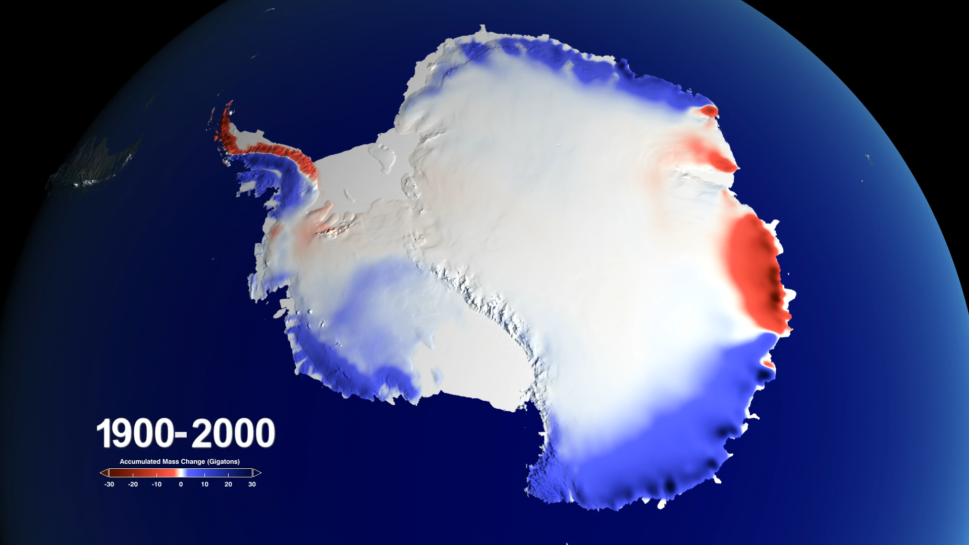
This data visualization shows accumulated mass change over Antarctica from 1900 to 2000. This visualization includes a colorbar and corresponding accumulation range.
Scientists have collected Ice core measurements across Antarctica for many years. Scientists at NASA/Goddard and the British Antarctic Survey have assembled over 50 of these ice core measurements and have analysized them to derive a map of the mass accumulation change throughout the 20th Century (1900-2000).
This data visualization shows accumulated mass change over Antarctica throughout the 20th Century. (No colorbar or corresponding dates are provided with this visualization.)
This animation contains the corresponding date overlay for the last year of accumulated mass change data depicted in the data visualization. This layer is intended for video editors who desire to recomposite the final visualization in a slightly different style.

Colorbar for accumulated mass change of Antarctic snow. Units are in Gigatons. Reds indicate areas of mass loss. Blues indicate areas of mass gain.
Credits
Please give credit for this item to:
NASA's Scientific Visualization Studio
-
Visualizer
- Alex Kekesi (Global Science and Technology, Inc.)
-
Producer
- LK Ward (USRA)
-
Writer
- Maria-Jose Vinas Garcia (Telophase)
-
Scientist
- Brooke Medley (NASA/GSFC)
-
Technical support
- Laurence Schuler (ADNET Systems, Inc.)
- Ian Jones (ADNET Systems, Inc.)
Release date
This page was originally published on Thursday, December 13, 2018.
This page was last updated on Wednesday, November 15, 2023 at 12:12 AM EST.
Datasets used in this visualization
-
Ice Cores (Antarctic Regional Snow Accumulation Composites over the Past 1000 Years)
ID: 1009
Note: While we identify the data sets used in these visualizations, we do not store any further details, nor the data sets themselves on our site.
Related
- ID: 13117