Seasonal Changes in Carbon Dioxide
Narrated visualization showing seasonal drawdown in carbon dioxide
This video is also available on our YouTube channel.
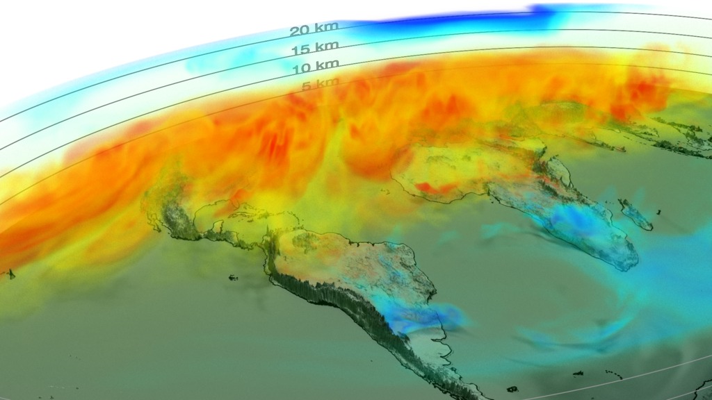
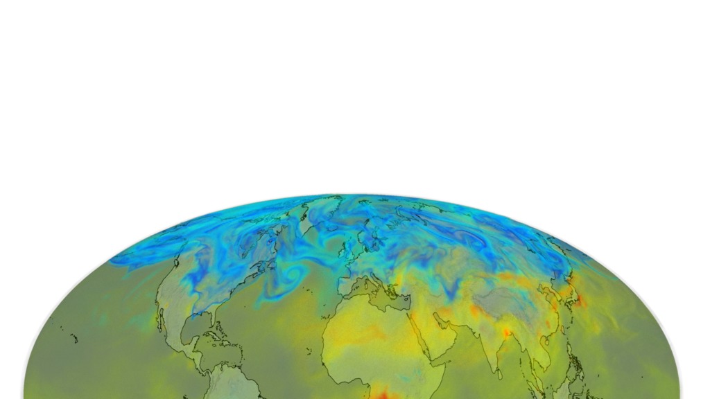
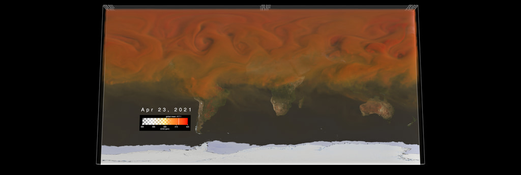
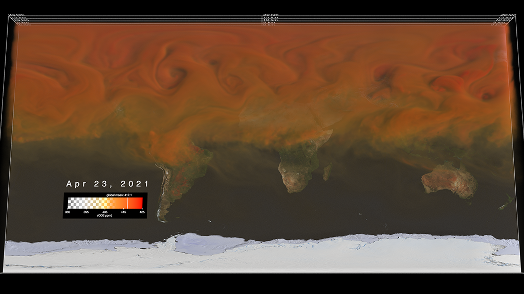
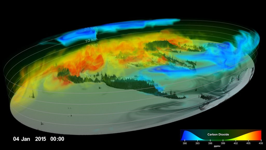
Carbon dioxide is the most important greenhouse gas released to the atmosphere through human activities. It is also influenced by natural exchange with the land and ocean. This visualization provides a high-resolution, three-dimensional view of global atmospheric carbon dioxide concentrations from September 1, 2014 to August 31, 2015. The visualization was created using output from the GEOS modeling system, developed and maintained by scientists at NASA. The height of Earth’s atmosphere and topography have been vertically exaggerated and appear approximately 400 times higher than normal to show the complexity of the atmospheric flow. Measurements of carbon dioxide from NASA’s second Orbiting Carbon Observatory (OCO-2) spacecraft are incorporated into the model every 6 hours to update, or “correct,” the model results, called data assimilation.
As the visualization shows, carbon dioxide in the atmosphere can be mixed and transported by winds in the blink of an eye. For several decades, scientists have measured carbon dioxide at remote surface locations and occasionally from aircraft. The OCO-2 mission represents an important advance in the ability to observe atmospheric carbon dioxide. OCO-2 collects high-precision, total column measurements of carbon dioxide (from the sensor to Earth’s surface) during daylight conditions. While surface, aircraft, and satellite observations all provide valuable information about carbon dioxide, these measurements do not tell us the amount of carbon dioxide at specific heights throughout the atmosphere or how it is moving across countries and continents. Numerical modeling and data assimilation capabilities allow scientists to combine different types of measurements (e.g., carbon dioxide and wind measurements) from various sources (e.g., satellites, aircraft, and ground-based observation sites) to study how carbon dioxide behaves in the atmosphere and how mountains and weather patterns influence the flow of atmospheric carbon dioxide. Scientists can also use model results to understand and predict where carbon dioxide is being emitted and removed from the atmosphere and how much is from natural processes and human activities.
Carbon dioxide variations are largely controlled by fossil fuel emissions and seasonal fluxes of carbon between the atmosphere and land biosphere. For example, dark red and orange shades represent regions where carbon dioxide concentrations are enhanced by carbon sources. During Northern Hemisphere fall and winter, when trees and plants begin to lose their leaves and decay, carbon dioxide is released in the atmosphere, mixing with emissions from human sources. This, combined with fewer trees and plants removing carbon dioxide from the atmosphere, allows concentrations to climb all winter, reaching a peak by early spring. During Northern Hemisphere spring and summer months, plants absorb a substantial amount of carbon dioxide through photosynthesis, thus removing it from the atmosphere and change the color to blue (low carbon dioxide concentrations). This three-dimensional view also shows the impact of fires in South America and Africa, which occur with a regular seasonal cycle. Carbon dioxide from fires can be transported over large distances, but the path is strongly influenced by large mountain ranges like the Andes. Near the top of the atmosphere, the blue color indicates air that last touched the Earth more than a year before. In this part of the atmosphere, called the stratosphere, carbon dioxide concentrations are lower because they haven’t been influenced by recent increases in emissions.
This version of the visualization was created specifically to support a series of papers in the journal Science and for submission to SIGGRAPH 2017's Computer Animation Festival.
This visualization won Science magazine's 2017 Data Stories contest in the "professional" category (see: http://www.sciencemag.org/projects/data-stories/winners/2017)
This visualization was shown at the SIGGRAPH 2017 Electronic Theater in Los Angeles, CA in July 2017 (see: http://s2017.siggraph.org/content/computer-animation-festival#etvrlistings)
Primary layer of the visualization showing carbon dioxide (without overlays like dates, color bars, etc.)

Dates layer with day, month, year, hours, and minute

Dates layer with months only
Layer with July 31 moving down so that March 1 can be revealed behind it

vertical exagerration text layer
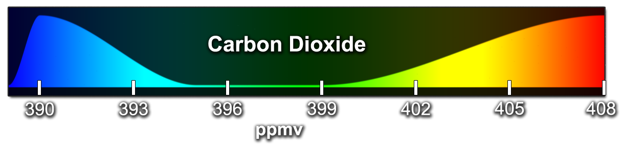
Color bar for volumetric carbon dioxide. Colors (ranging from blues to yellows to reds) correspond to the carbon dioxide levels from 390 to 508 parts per million. The curve in the color table is the relative transparency of each value. Values near 390 ppm and 408 ppm are more opaque and values from 396 ppm and 399 ppm are more transparent.
Credits
Please give credit for this item to:
NASA's Scientific Visualization Studio
-
Visualizers
- Greg Shirah (NASA/GSFC)
- Horace Mitchell (NASA/GSFC)
-
Technical support
- Laurence Schuler (ADNET Systems, Inc.)
- Ian Jones (ADNET Systems, Inc.)
-
Scientists
- Lesley Ott (NASA/GSFC)
- Steven Pawson (NASA/GSFC)
- Brad Weir (USRA)
- Annmarie Eldering (NASA/JPL CalTech)
-
Writer
- Heather Hanson (Global Science and Technology, Inc.)
-
Narrator
- Joy Ng (USRA)
-
Editor
- Stuart A. Snodgrass (KBR Wyle Services, LLC)
Release date
This page was originally published on Thursday, May 4, 2017.
This page was last updated on Wednesday, May 3, 2023 at 1:47 PM EDT.
Missions
This visualization is related to the following missions:Series
This visualization can be found in the following series:Datasets used in this visualization
-
GTOPO30 Topography and Bathymetry
ID: 274 -
GEOS Carbon Dioxide
ID: 962
Note: While we identify the data sets used in these visualizations, we do not store any further details, nor the data sets themselves on our site.
Related
- ID: 4983
 Visualization
 - ID: 4949
 Visualization
 - ID: 4514
 Visualization
Used as a Source In
- ID: 13781
![Music: A Curious Incident by Jay Price [PRS] and Paul Reeves [PRS]Complete transcript available.](/vis/a010000/a013700/a013781/CO20.jpg)