A newer version of this visualization is available.
GPM Captures Hurricane Matthew Before Haiti Landfall
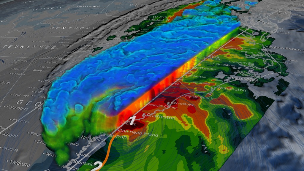
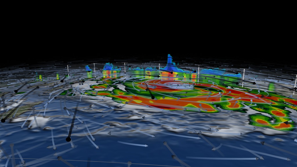
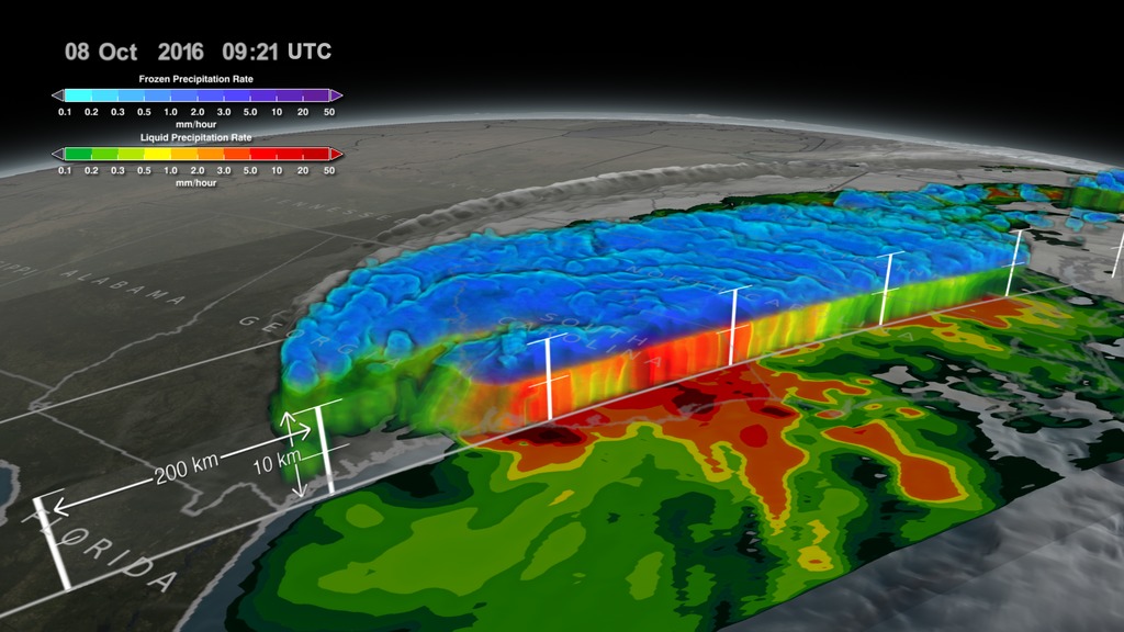
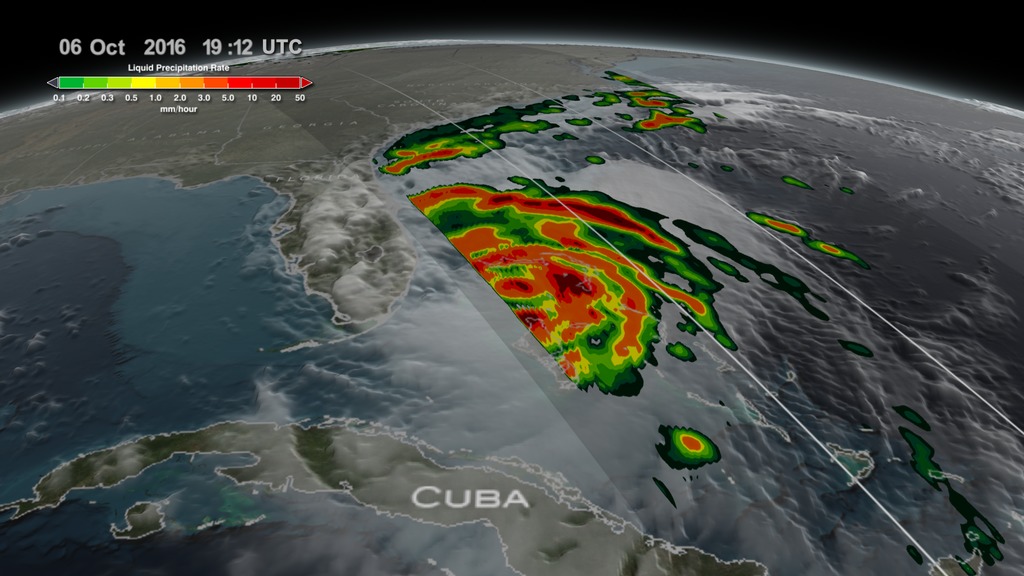
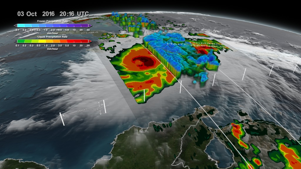
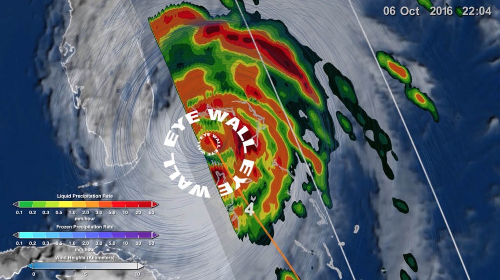
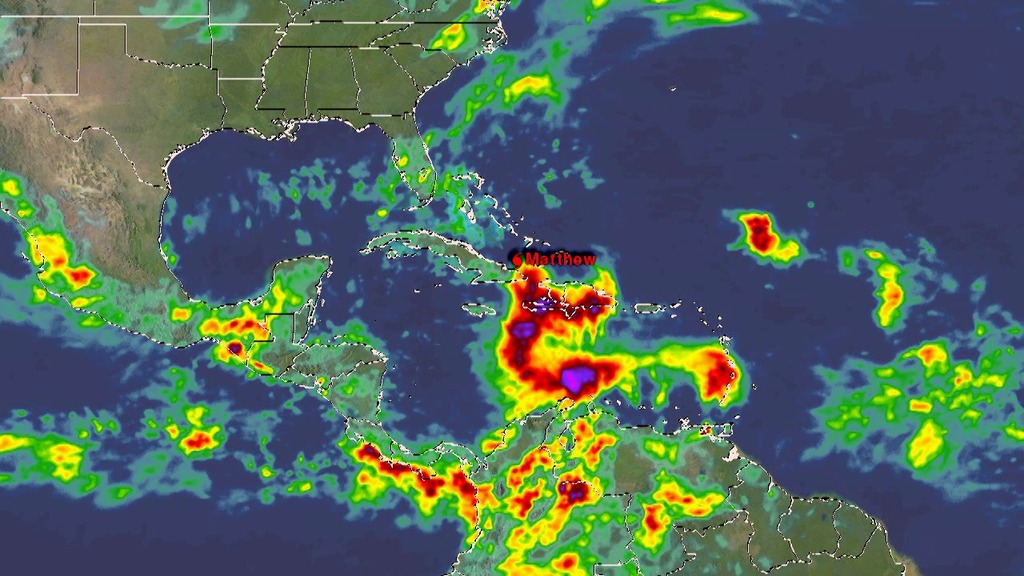
This animation starts with an overview of North America, Central America, and the Caribbean. As the camera slowly pushes in, Hurricane Matthew begins to form. By the morning of October 2nd, 2016 Matthew is a Category 4 Hurricane immediately south of Haiti and the Dominican Republic. Time then slows down to see GPM's GPROF swath reveal ground precipitation from the hurricane. Now, with the camera closer in the view rotates to reveal a curtain of 3-dimensional radar data from GPM's DPR instrument. DPR shows us the 3-D structure of the hurricane's precipitation rates. Areas in blue and purple are frozen precipitation, whereas areas in greens and reds are liquid precipitation.
On October 2, 2016 at approximately 4:50 a.m. EST (0950 UTC), NASA's Global Precipitation Measurement mission or GPM core observatory satellite flew over Hurricane Matthew. At that time, Matthew had maximum sustained winds of 150 mph making it a strong category 4 hurricane.
The GPM Core Observatory carries two instruments that show the location and intensity of rain and snow, which defines a crucial part of the storm structure – and how it will behave. The GPM Microwave Imager sees through the tops of clouds to observe how much and where precipitation occurs, and the Dual-frequency Precipitation Radar observes precise details of precipitation in 3-dimensions.
GPM data is part of the toolbox of satellite data used by forecasters and scientists to understand how storms behave. GPM is a joint mission between NASA and the Japan Aerospace Exploration Agency. Current and future data sets are available with free registration to users from NASA Goddard's Precipitation Processing Center website.

Color bar for frozen precipitation rates (ie, snow rates). Shades of cyan represent low amounts of frozen precipitation, whereas shades of purple represent high amounts of precipitation.
Color bar for liquid precipitation rates (ie, rain rates). Shades of green represent low amounts of liquid precipitation, whereas shades of red represent high amounts of precipitation.
Credits
Please give credit for this item to:
NASA's Scientific Visualization Studio Data provided by the joint NASA/JAXA GPM mission.
-
Animator
- Alex Kekesi (Global Science and Technology, Inc.)
-
Producer
- Ryan Fitzgibbons (USRA)
-
Scientists
- Gail Skofronick Jackson (NASA/GSFC)
- Dalia B Kirschbaum (NASA/GSFC)
- George Huffman (NASA/GSFC)
-
Technical support
- Laurence Schuler (ADNET Systems, Inc.)
- Ian Jones (ADNET Systems, Inc.)
Release date
This page was originally published on Tuesday, October 4, 2016.
This page was last updated on Tuesday, November 14, 2023 at 12:08 AM EST.
Missions
This visualization is related to the following missions:Series
This visualization can be found in the following series:Datasets used in this visualization
-
[GOES: IR4]
ID: 33 -
Rain Rates (Surface Precipitation) [GPM: GMI]
ID: 822Credit: Data provided by the joint NASA/JAXA GPM mission.
See all pages that use this dataset -
Volumetric Precipitation data (Ku) [GPM: DPR]
ID: 830Credit: Data provided by the joint NASA/JAXA GPM mission.
See all pages that use this dataset
Note: While we identify the data sets used in these visualizations, we do not store any further details, nor the data sets themselves on our site.
Related
- ID: 4575
 Visualization
 - ID: 12195
![Music credit: 'Cellular Signals' by Laurent Levesque [SACEM] from Killer TracksComplete transcript available.Watch this video on the NASA Goddard YouTube channel.](/vis/a010000/a012100/a012195/LARGE_MP4-12195_EPOCH_Hurricanes2_large.00151_print.jpg) Produced Video
Produced Video - ID: 4543
 Visualization
 - ID: 4548
 Visualization
Newer Versions
- ID: 4512
 Visualization
 - ID: 4511
 Visualization
 - ID: 4508
 Visualization
Used as a Source In
- ID: 12635
 Produced Video
 - ID: 12447
![LEAD: [Today, 12/15/2016] NASA launched eight small satellites to help hurricane forecasters give advanced warnings of hurricane strength.1. The group of small satellites, with 5-foot solar panels, will fly 300 miles above the Earth in a string 12 minutes apart.2. Because the system detects the relatively long wavelength of reflected signals from existing GPS satellites, it can measure surface winds underneath the torrential hurricane rains.TAG: Hurricane scientists expect the critical wind data will help them better forecast the intensification of hurricanes.](/vis/a010000/a012400/a012447/WC_PRORES_422-12447_cygnssonair_prores.00328_print.jpg)
- ID: 12391
 Produced Video
 - ID: 12389
 Produced Video