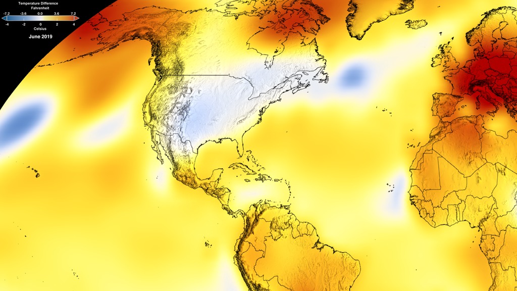
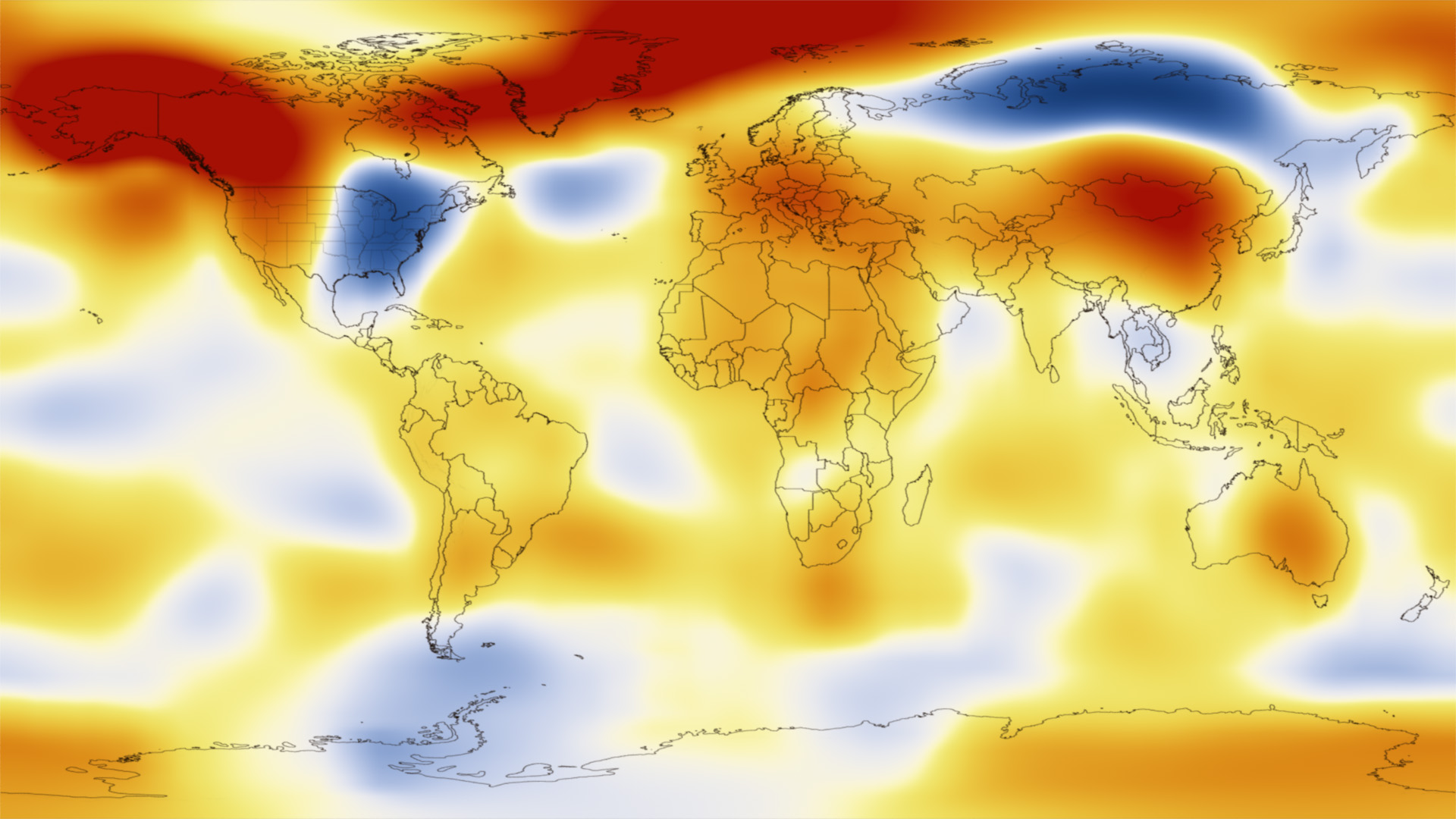
Global Temperature Anomalies from January 2014
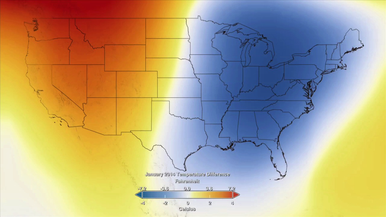
Residents of the eastern United States know that the temperature was colder then the average temperature. This visual of the GISTEMP anomalies for January of 2014 show the United States and then zooms out to show the global picture. Temperature anomalies indicate how much warmer or colder it is than normal for a particular place and time. For the GISS analysis, normal always means the average over the 30-year period 1951-1980 for that place and time of year. For more information on the GISTEMP, see the GISTEMP analysis website located at: http://data.giss.nasa.gov/gistemp/
Colder then normal temperatures were seen in January of 2014 in the Eastern United States but that much of the rest of the world saw warmer then normal temperatures during that same time period.

January Global Temperature Difference in both Celsius and Fahrenheit.
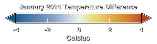
January Global Temperature Difference in Celsius.
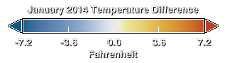
January Global Temperature Difference in degrees Fahrenheit.
January 2014 Global Temperature Anomaly of the United States without the colortable overlay.
Global Temperature Anomaly from January 2014.
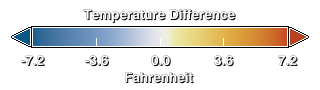
This movie shows both January and February data from 2014 in fahrenheit.
colorbar in fahrenheit
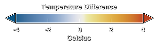
This movie shows January and February data with the colortable label in Celsius.
colorbar in fahrenheit
Credits
Please give credit for this item to:
NASA/Goddard Space Flight Center Scientific Visualization Studio
Data provided by Robert B. Schmunk (NASA/GSFC GISS)
-
Animator
- Lori Perkins (NASA/GSFC)
-
Producer
-
Scientists
- Gavin A. Schmidt (NASA/GSFC GISS)
- Robert B Schmunk (SIGMA Space Partners, LLC.)
- Reto A. Ruedy (SIGMA Space Partners, LLC.)
- Kwok-Wai Ken Lo (SIGMA Space Partners, LLC.)
- Makiko Sato (Columbia University, Center for Climate Systems Research)
-
Project support
- Robert B Schmunk (SIGMA Space Partners, LLC.)
-
Writer
- Patrick Lynch (Wyle Information Systems)
Release date
This page was originally published on Wednesday, March 19, 2014.
This page was last updated on Wednesday, May 3, 2023 at 1:51 PM EDT.
Series
This visualization can be found in the following series:Datasets used in this visualization
-
GISTEMP [GISS Surface Temperature Analysis (GISTEMP)]
ID: 585The GISS Surface Temperature Analysis version 4 (GISTEMP v4) is an estimate of global surface temperature change. Graphs and tables are updated around the middle of every month using current data files from NOAA GHCN v4 (meteorological stations) and ERSST v5 (ocean areas), combined as described in our publications Hansen et al. (2010) and Lenssen et al. (2019).
Credit: Lenssen, N., G. Schmidt, J. Hansen, M. Menne, A. Persin, R. Ruedy, and D. Zyss, 2019: Improvements in the GISTEMP uncertainty model. J. Geophys. Res. Atmos., 124, no. 12, 6307-6326, doi:10.1029/2018JD029522.
This dataset can be found at: https://data.giss.nasa.gov/gistemp/
See all pages that use this dataset
Note: While we identify the data sets used in these visualizations, we do not store any further details, nor the data sets themselves on our site.
Related
- ID: 4746
 Visualization
 - ID: 11536
 Produced Video
 - ID: 11507
 Produced Video