A newer version of this visualization is available.
Aquarius Sea Surface Salinity Flat Maps 2012
The Aquarius spacecraft is designed to measure global sea surface salinity. It is important to understand salinity, the amount of dissolved salts in water, because it will lead us to better understanding of the water cycle and can lead to improved climate models. Aquarius is a collaboration between NASA and the Space Agency of Argentina
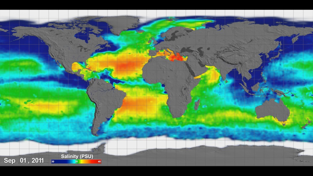
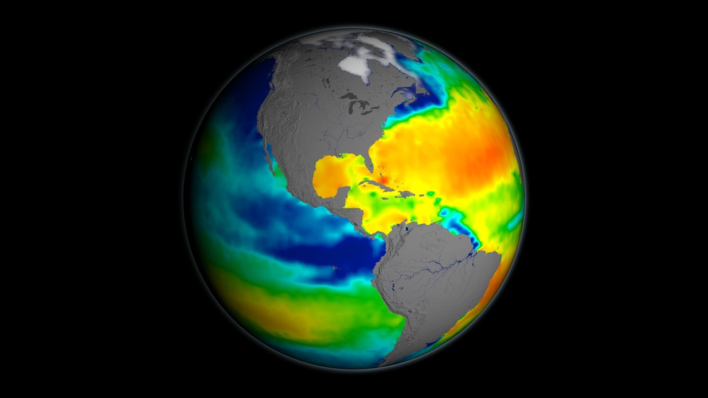
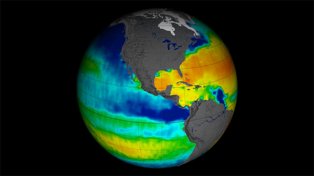
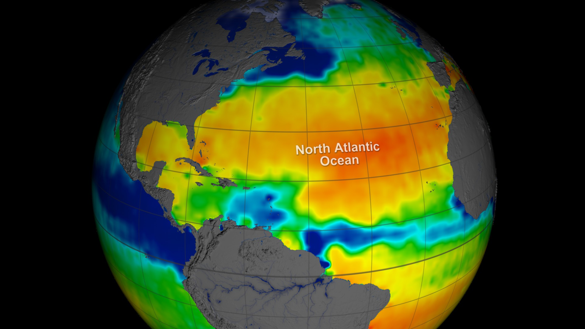
This visualization celebrates over a year of successful Aquarius observations. Sea surface salinity is shown on a flat map using a simple cartesian and extended Molleide projections. Versions are included with and without dates/color bars.
The range of time shown is December 2011 through Decemeber 2012. The data continuously loops through this range every 6 seconds. This visualization was generated based on version 2.0 of the Aquarius data products with all 3 scanning beams.
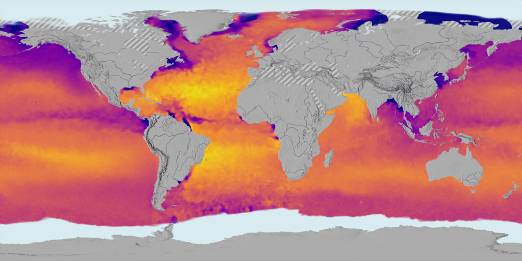
Flat map projection of Aquarius sea surface salinity
Flat map projection of Aquarius sea surface salinity data with dates and colorbar
Extended Mollweide projection of Aquarius sea surface salinity
Extended Mollweide projection of Aquarius sea surface salinity with dates and colorbar

Aquarius color bar showing salinity range from 30 to 40 PSU, going from blue to green to red.
For More Information
Credits
Please give credit for this item to:
NASA's Goddard Space Flight Center Scientific Visualization Studio
-
Animators
- Greg Shirah (NASA/GSFC)
- Horace Mitchell (NASA/GSFC)
-
Producer
- Kayvon Sharghi (USRA)
-
Scientists
- Gary Lagerloef (ESR)
- Gene Feldman (NASA/GSFC)
- Norman Kuring (NASA/GSFC)
Release date
This page was originally published on Thursday, February 28, 2013.
This page was last updated on Sunday, November 12, 2023 at 10:15 PM EST.
Missions
This visualization is related to the following missions:Series
This visualization can be found in the following series:Datasets used in this visualization
-
SSS (Sea Surface Salinity) [Aquarius: Microwave Radiometer]
ID: 774
Note: While we identify the data sets used in these visualizations, we do not store any further details, nor the data sets themselves on our site.
Related
- ID: 4233
 Visualization
 - ID: 4234
- ID: 11193
 Produced Video
 - ID: 4045
 Visualization
 - ID: 4046
 Visualization
Newer Versions
- ID: 5017
 Visualization