A newer version of this visualization is available.
Five-Year Global Temperature Anomalies from 1880 to 2012
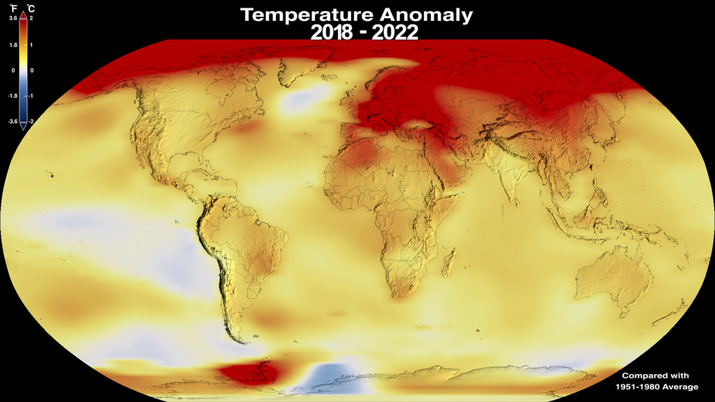
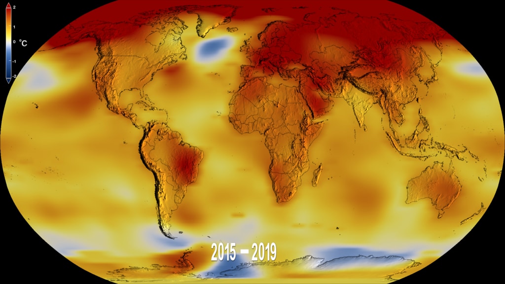
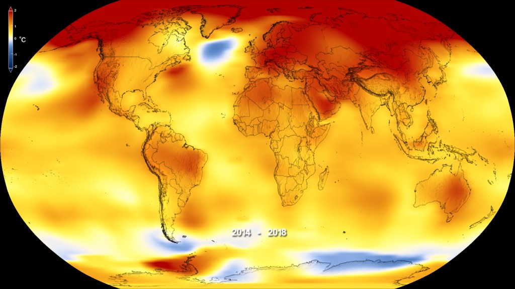
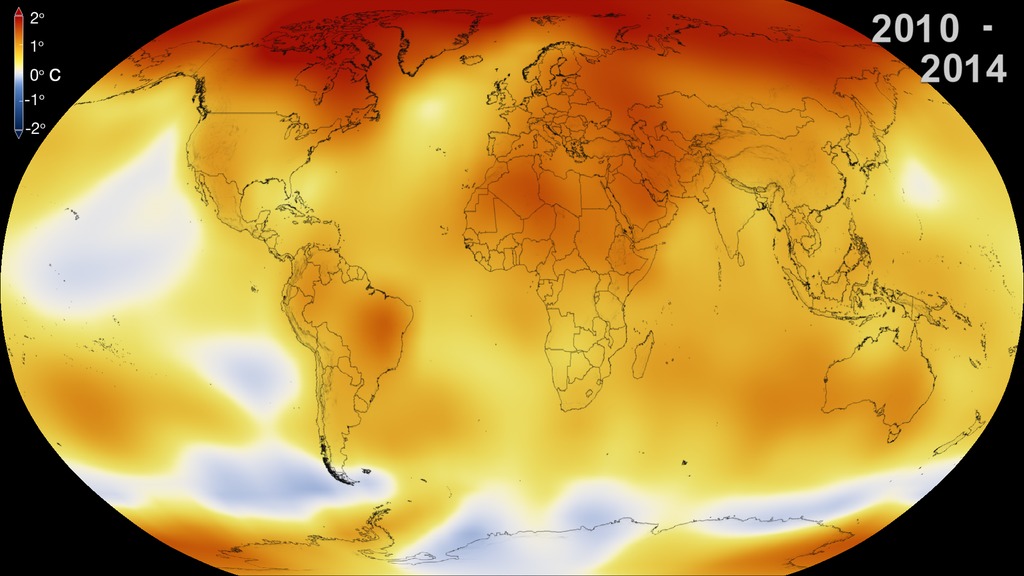
This color-coded map displays a progression of changing global surface temperatures anomalies from 1880 through 2012. Higher than normal temperatures are shown in red and lower then normal temperatures are shown in blue. Global surface temperature in 2012 was +0.55
This color-coded map displays a progression of changing global surface temperatures anomalies from 1880 through 2012. The final frame represents global temperature anomalies averaged from 2008 through 2012.
This visualization shows the same data as above with the corresponding date overlay applied. The final frame and the large still image represent global temperature anomalies averaged from 2008 through 2012.
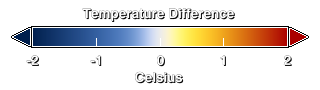
Temperture Difference colorbar
This visualization shows the data from 1880 through 2012 without any overlays applied.
This is the frame matched date overlay that corresponds to the data.
Abbreviated 13 second movie starting from 1950 through 2012 with dates and colorbar applied.
Abbreviated 13 second movie which starts in 1950 and runs through 2012 with dates, but no colorbar.
Abbreviated 13 second movie that starts with data from 1950 without dates or colorbar.

Global Temperature Anomalies averaged from 1890 to 1894.
Global Temperature Anomalies averaged from 1900 to 1904.
Global Temperature Anomalies averaged from 1900 to 1904.
Global Temperature Anomalies averaged from 1910 to 1914.
Global Temperature Anomalies averaged from 1920 to 1924.
Global Temperature Anomalies averaged from 1930 to 1934.
Global Temperature Anomalies averaged from 1940 to 1944.
Global Temperature Anomalies averaged from 1950 to 1954.
Global Temperature Anomalies averaged from 1960 to 1964.
Global Temperature Anomalies averaged from 1970 to 1974.
Global Temperature Anomalies averaged from 1980 to 1984.
Global Temperature Anomalies averaged from 1990 to 1994.
Global Temperature Anomalies averaged from 2000 to 2004.
This frame set is designed to be used on the Science On a Sphere display. It contains the five-year rolling averages that start with (1880 through 1884) and end with (2008 through 2012).
Credits
Please give credit for this item to:
NASA/Goddard Space Flight Center Scientific Visualization Studio
Data provided by Robert B. Schmunk (NASA/GSFC GISS)
-
Animator
- Lori Perkins (NASA/GSFC)
-
Producer
-
Scientists
- James Hansen (NASA/GSFC GISS)
- Robert B Schmunk (SIGMA Space Partners, LLC.)
- Reto A. Ruedy (SIGMA Space Partners, LLC.)
- Kwok-Wai Ken Lo (SIGMA Space Partners, LLC.)
- Makiko Sato (Columbia University, Center for Climate Systems Research)
-
Project support
- Robert B Schmunk (SIGMA Space Partners, LLC.)
-
Writer
- Patrick Lynch (Wyle Information Systems)
Release date
This page was originally published on Tuesday, January 15, 2013.
This page was last updated on Tuesday, November 14, 2023 at 12:03 AM EST.
Datasets used in this visualization
-
GISTEMP [GISS Surface Temperature Analysis (GISTEMP)]
ID: 585The GISS Surface Temperature Analysis version 4 (GISTEMP v4) is an estimate of global surface temperature change. Graphs and tables are updated around the middle of every month using current data files from NOAA GHCN v4 (meteorological stations) and ERSST v5 (ocean areas), combined as described in our publications Hansen et al. (2010) and Lenssen et al. (2019).
Credit: Lenssen, N., G. Schmidt, J. Hansen, M. Menne, A. Persin, R. Ruedy, and D. Zyss, 2019: Improvements in the GISTEMP uncertainty model. J. Geophys. Res. Atmos., 124, no. 12, 6307-6326, doi:10.1029/2018JD029522.
This dataset can be found at: https://data.giss.nasa.gov/gistemp/
See all pages that use this dataset
Note: While we identify the data sets used in these visualizations, we do not store any further details, nor the data sets themselves on our site.
Newer Versions
- ID: 5060
 Visualization
 - ID: 4964
 Visualization
 - ID: 4882
 Visualization
 - ID: 4787
 Visualization
 - ID: 4626
 Visualization
 - ID: 4252
 Visualization