Flat Map Ocean Current Flows with Sea Surface Temperatures (SST)
This visualization shows ocean current flows on a flat map of the world. This simple flat map (cylindrical equidistant projection) is designed to be easily wrapped to a sphere. The flows are colored by sea surface temperatures with blues being cooler waters and yellows/reds warmer waters. The time period for this visualization is 10 January 2005 through 2006. For each second the passes in the visualization, about 2.5 days pass.
This visualization was produced using model output from the joint MIT/JPL project: Estimating the Circulation and Climate of the Ocean, Phase II or ECCO2.. ECCO2 uses the MIT general circulation model (MITgcm) to synthesize satellite and in-situ data of the global ocean and sea-ice at resolutions that begin to resolve ocean eddies and other narrow current systems, which transport heat and carbon in the oceans.
This visualization was created in support of the 2011 UNESCO conference in Paris, France.
Global ocean flows on a flat map with colors representing sea surface temperature
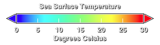
Color bar indicating sea surface temperature (SST). Red is high, blue is low

Ocean Current Flows with Sea Surface Temperatures tile a1
Ocean Current Flows with Sea Surface Temperatures tile a2
Ocean Current Flows with Sea Surface Temperatures tile a3
Ocean Current Flows with Sea Surface Temperatures tile b1
Ocean Current Flows with Sea Surface Temperatures tile b2
Ocean Current Flows with Sea Surface Temperatures tile b3
Ocean Current Flows with Sea Surface Temperatures tile c1
Ocean Current Flows with Sea Surface Temperatures tile c2
Ocean Current Flows with Sea Surface Temperatures tile c3
Credits
Please give credit for this item to:
NASA/Goddard Space Flight Center Scientific Visualization Studio
-
Animators
- Greg Shirah (NASA/GSFC)
- Horace Mitchell (NASA/GSFC)
-
Scientists
- Dimitris Menemenlis (NASA/JPL CalTech)
- Hong Zhang (UCLA)
-
Project support
- Eric Sokolowsky (Global Science and Technology, Inc.)
Release date
This page was originally published on Thursday, February 10, 2011.
This page was last updated on Sunday, November 12, 2023 at 10:02 PM EST.
Series
This visualization can be found in the following series:Datasets used in this visualization
-
ECCO2 (ECCO2 High Resolution Ocean and Sea Ice Model)
ID: 707
Note: While we identify the data sets used in these visualizations, we do not store any further details, nor the data sets themselves on our site.