A newer version of this visualization is available.
Five-Year Average Global Temperature Anomalies from 1881 to 2006
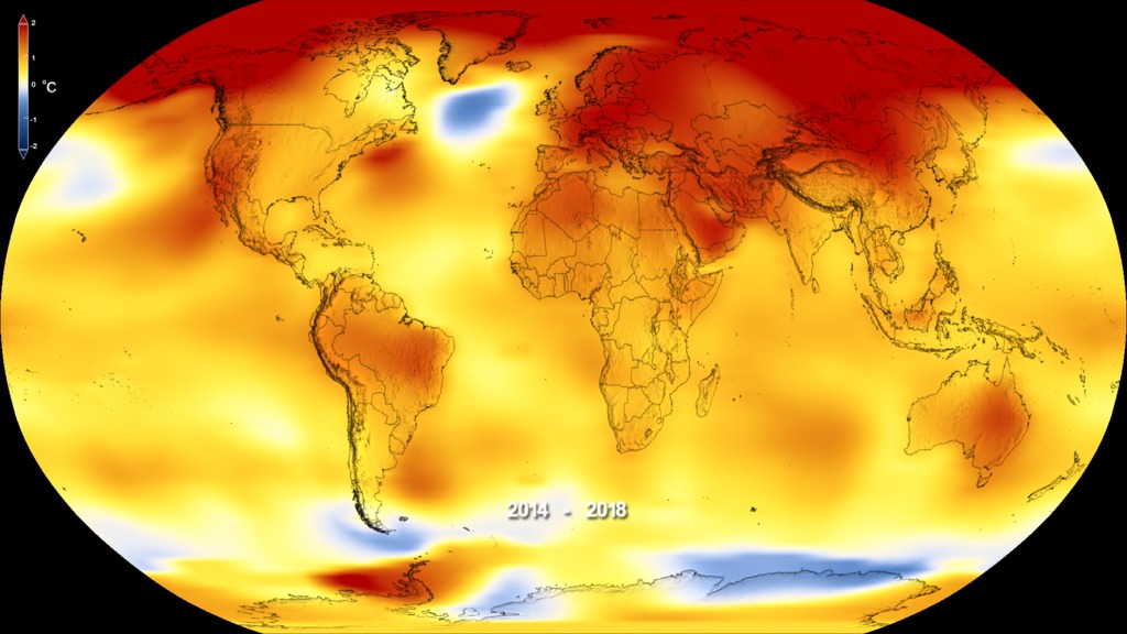
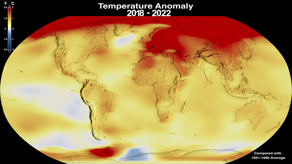
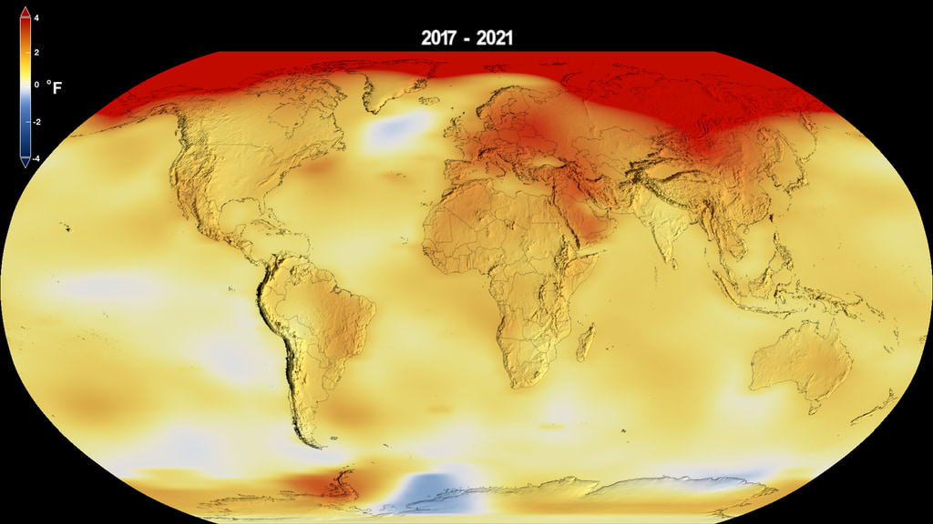
Because of a rapid warming trend over the past 30 years, the Earth is now reaching and passing through the warmest levels seen in the last 12,000 years. This color-coded map shows a progression of changing global surface temperatures from 1881 to 2006, the warmest ranked year on record.
Animation of global temperature anomalies from 1881 to 2006 taken as a five-year moving average. Dark blue indicates areas cooler than average. Dark red indicates areas warmer than average. This animation is annotated with the year that ends the five-year time span used in calculating the moving average.
Animation of global temperature anomalies from 1881 to 2006 taken as a five-year moving average. Dark blue indicates areas cooler than average. Dark red indicates areas warmer than average. This animation is not annotated.
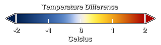
Temperature color bar

Print resolution still of global temperature anomalies averaged from 1881 to 1885.
Global Temperature Anomalies averaged from 1886 to 1890.
Global Temperature Anomalies averaged from 1896 to 1900.
Global Temperature Anomalies averaged from 1906 to 1910.
Global Temperature Anomalies averaged from 1916 to 1920.
Global Temperature Anomalies averaged from 1926 to 1930.
Global Temperature Anomalies averaged from 1936 to 1940.
Global Temperature Anomalies averaged from 1946 to 1950.
Global Temperature Anomalies averaged from 1956 to 1960.
Global Temperature Anomalies averaged from 1966 to 1970.
Global Temperature Anomalies averaged from 1976 to 1980.
Global Temperature Anomalies averaged from 1986 to 1990.
Global Temperature Anomalies averaged from 1996 to 2000.
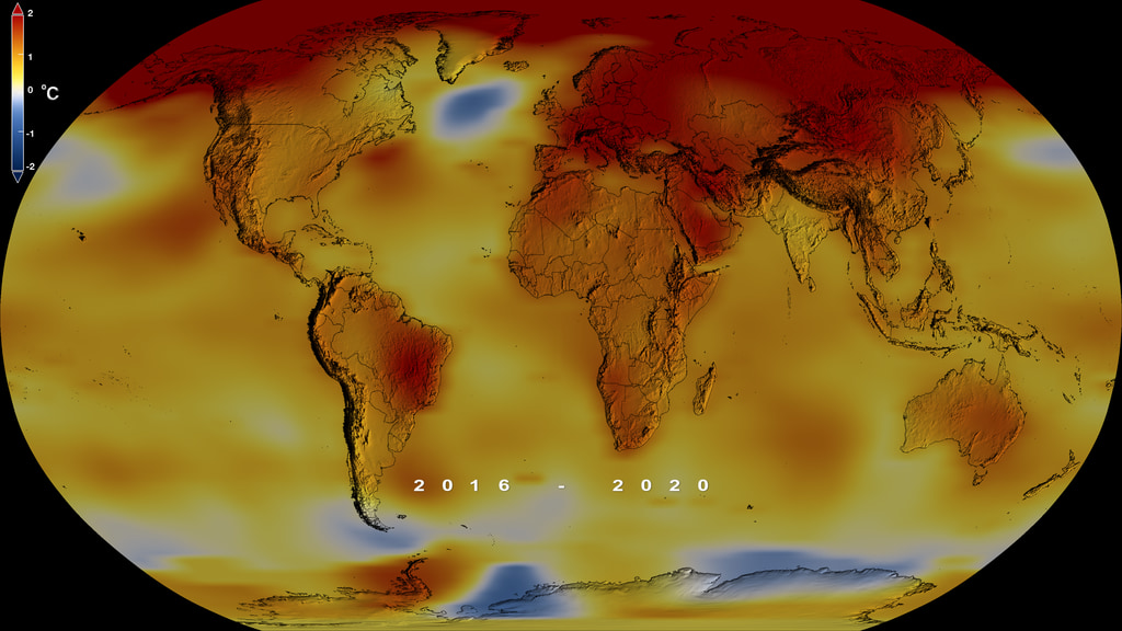
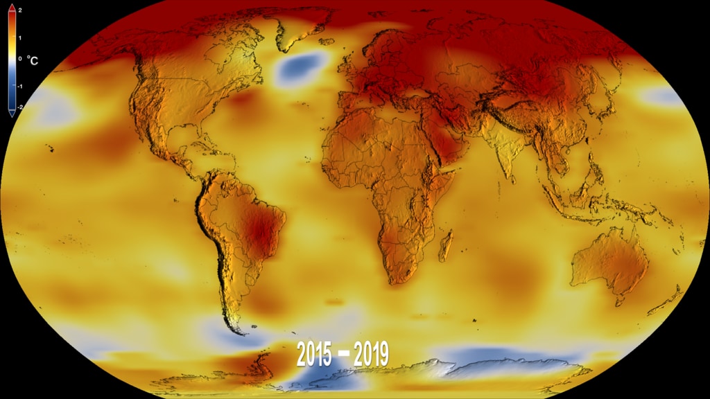
Global temperature anomalies averaged from 2002 to 2006.
For More Information
Credits
Please give credit for this item to:
NASA/Goddard Space Flight Center Scientific Visualization Studio
Data provided by Robert B. Schmunk (NASA/GSFC GISS)
-
Animators
- Alex Kekesi (Global Science and Technology, Inc.)
- Lori Perkins (NASA/GSFC)
-
Scientists
- James Hansen (NASA/GSFC GISS)
- Makiko Sato (NASA/GSFC GISS)
- Reto A. Ruedy (NASA/GSFC GISS)
- Ken Lo (NASA/GSFC GISS)
- David Lea (University of California, Santa Barbara)
- Martin Medina-Elizade (University of California, Santa Barbara)
Release date
This page was originally published on Monday, September 25, 2006.
This page was last updated on Wednesday, May 3, 2023 at 1:55 PM EDT.
Series
This visualization can be found in the following series:Datasets used in this visualization
-
GISTEMP [GISS Surface Temperature Analysis (GISTEMP)]
ID: 585The GISS Surface Temperature Analysis version 4 (GISTEMP v4) is an estimate of global surface temperature change. Graphs and tables are updated around the middle of every month using current data files from NOAA GHCN v4 (meteorological stations) and ERSST v5 (ocean areas), combined as described in our publications Hansen et al. (2010) and Lenssen et al. (2019).
Credit: Lenssen, N., G. Schmidt, J. Hansen, M. Menne, A. Persin, R. Ruedy, and D. Zyss, 2019: Improvements in the GISTEMP uncertainty model. J. Geophys. Res. Atmos., 124, no. 12, 6307-6326, doi:10.1029/2018JD029522.
This dataset can be found at: https://data.giss.nasa.gov/gistemp/
See all pages that use this dataset
Note: While we identify the data sets used in these visualizations, we do not store any further details, nor the data sets themselves on our site.
Related
- ID: 4626
 Visualization
Newer Versions
- ID: 5060
 Visualization
 - ID: 4964
 Visualization
 - ID: 4882
 Visualization
 - ID: 4787
 Visualization