SVS Demo Reel 2020
This is the SVS Demo Reel submitted to SIGGRAPH 2021.
Coming soon to our YouTube channel.
Music Credit:
"Always A Way" by Stefan Rodescu [SACEM], Yannick Kalfayan [SACEM], Universal Production Music
Credits
Please give credit for this item to:
NASA's Scientific Visualization Studio
Music Credit:
"Always A Way" by Stefan Rodescu [SACEM], Yannick Kalfayan [SACEM], Universal Production Music
-
Producer
- Rebecca Roth (InuTeq)
-
Visualizers
- Lori Perkins (NASA/GSFC)
- Greg Shirah (NASA/GSFC)
- Alex Kekesi (Global Science and Technology, Inc.)
- Ernie Wright (USRA)
- Trent L. Schindler (USRA)
- Helen-Nicole Kostis (USRA)
- Cindy Starr (Global Science and Technology, Inc.)
- Kel Elkins (USRA)
- Horace Mitchell (NASA/GSFC)
- Tom Bridgman (Global Science and Technology, Inc.)
-
Technical support
- Leann Johnson (Global Science and Technology, Inc.)
Release date
This page was originally published on Thursday, February 18, 2021.
This page was last updated on Wednesday, May 3, 2023 at 1:44 PM EDT.
Related
- ID: 4742
 Visualization
Sources
- ID: 5060
 Visualization
 - ID: 4964
 Visualization
 - ID: 4885
- ID: 4882
 Visualization
 - ID: 4880
 Visualization
 - ID: 4859
 Visualization
 - ID: 13778
 Produced Video
 - ID: 4872
- ID: 4821
 Visualization
 - ID: 4862
 Visualization
 - ID: 4863
 Visualization
 - ID: 13716
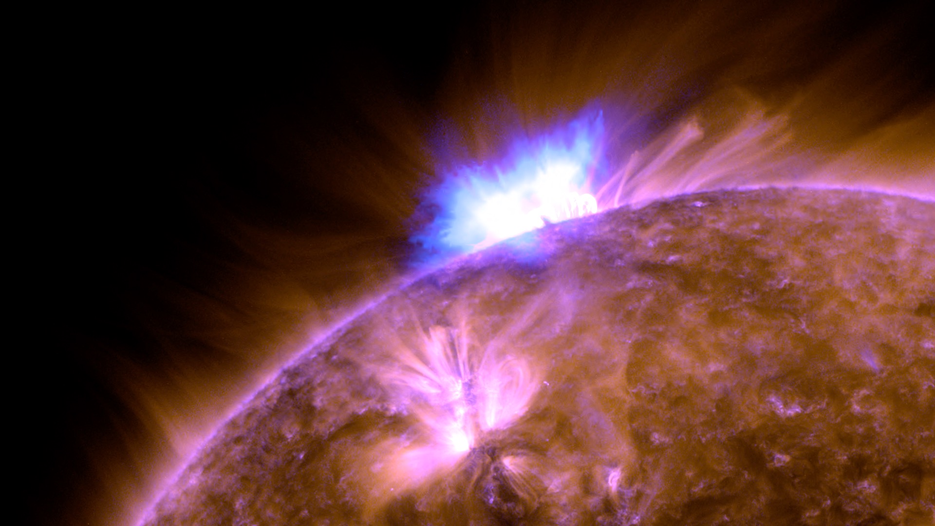
![VIDEO IN ENGLISH Watch this video on the NASA Goddard YouTube channel.The Sun is stirring from its latest slumber. As sunspots and flares, signs of a new solar cycle, bubble from the Sun’s surface, scientists are anticipating a flurry of solar activity over the next few years. Roughly every 11 years, at the height of this cycle, the Sun’s magnetic poles flip—on Earth, that’d be like the North and South Poles’ swapping places every decade—and the Sun transitions from sluggish to active and stormy. At its quietest, the Sun is at solar minimum; during solar maximum, the Sun blazes with bright flares and solar eruptions. In this video, view the Sun's disk from our space telescopes as it transitions from minimum to maximum in the solar cycle.Music credit: "Observance" by Andrew Michael Britton [PRS], David Stephen Goldsmith [PRS] from Universal Production Music](/vis/a010000/a013700/a013716/13716_SolarCycleFromSpace_YouTube.01410_print.jpg) Produced Video
Produced Video - ID: 4822
 Visualization
 - ID: 4823
 Visualization
 - ID: 4834
- ID: 4840
 Visualization
 - ID: 4770
 Visualization
 - ID: 4730
 Visualization
 - ID: 4810
- ID: 13586
 Produced Video
 - ID: 4798
 Visualization
 - ID: 4802

- ID: 4809
- ID: 4813
 Visualization
 - ID: 4815
 Visualization
 - ID: 4818
 Visualization
 - ID: 4819
 Visualization
 - ID: 4817
 Visualization
 - ID: 4791
 Visualization
 - ID: 4777
 Visualization