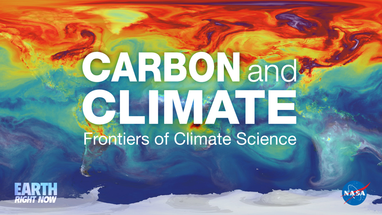
NASA Finds 2020 Tied for Hottest Year on Record
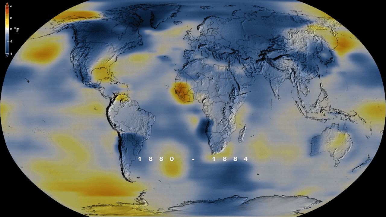
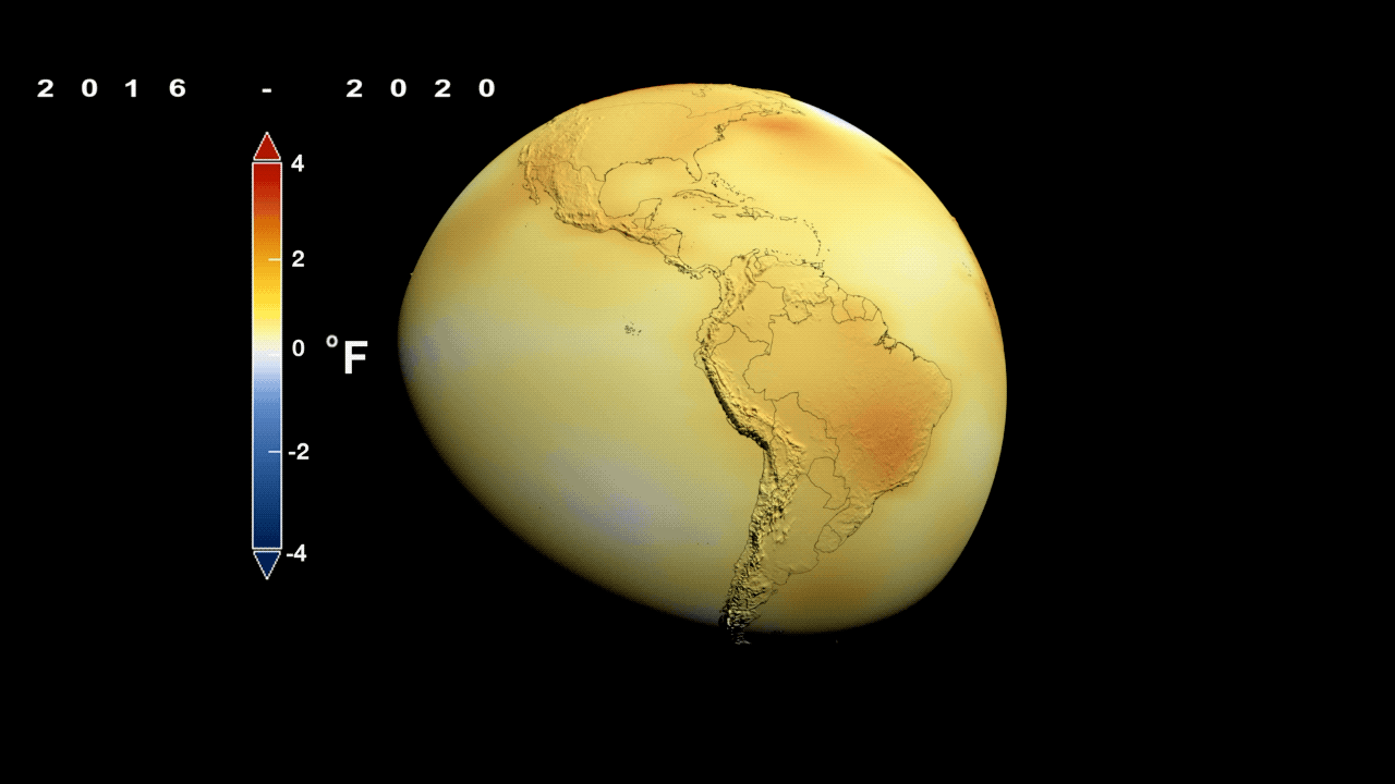
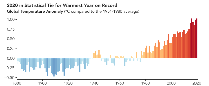
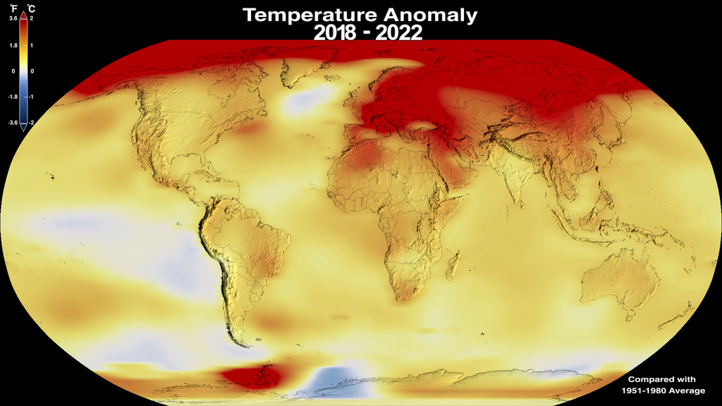
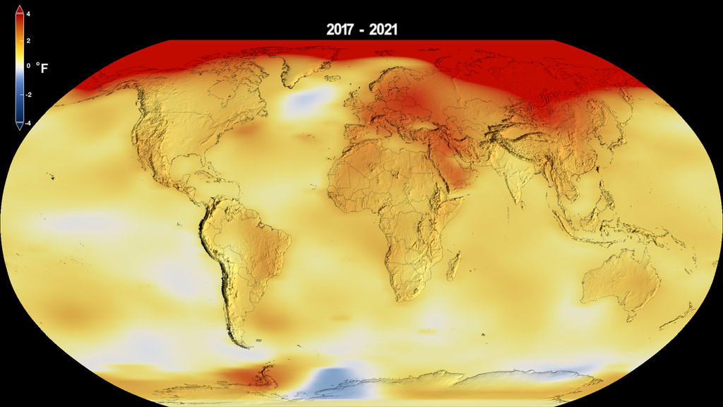
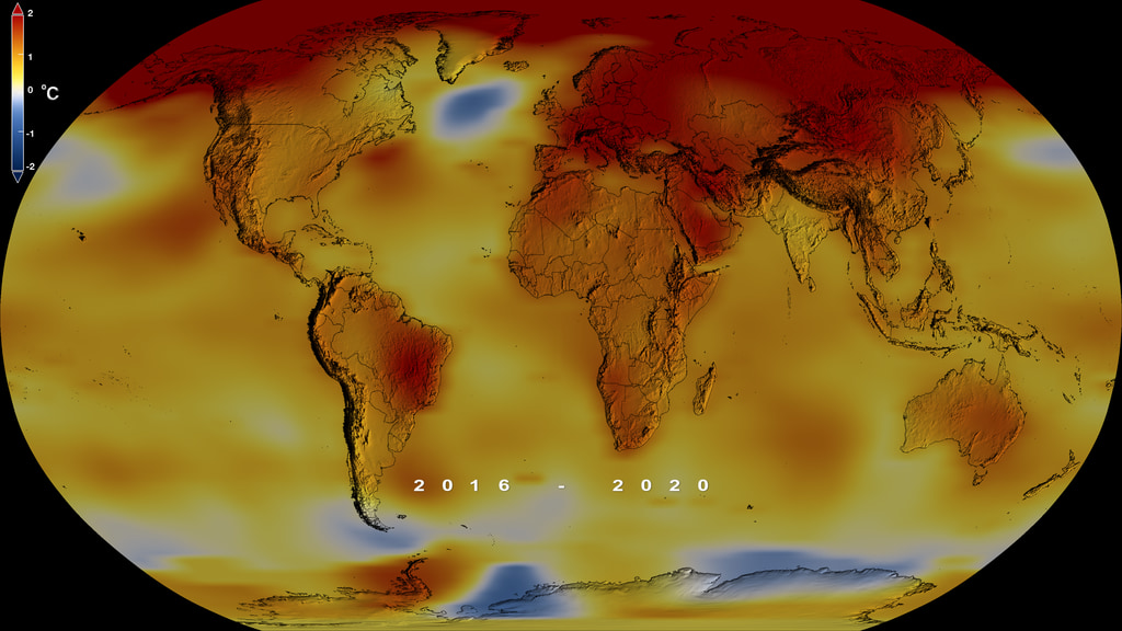
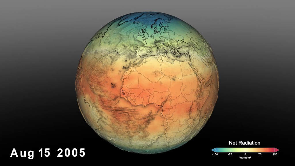
Globally, 2020 was the hottest year on record, effectively tying 2016, the previous record. Overall, Earth’s average temperature has risen more than 2 degrees Fahrenheit since the 1880s.
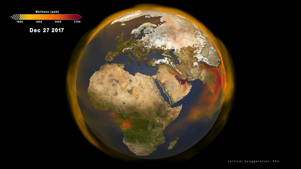
Temperatures are increasing due to human activities, specifically emissions of greenhouse gases, like carbon dioxide and methane.
Music: Organic Machine by Bernhard Hering [GEMA] and Matthias Kruger [GEMA]
Complete transcript available.
Universal Production Music: "A City Asleep Instrumental," "Inducing Waves Main Track," "Getting Bad Instrumental," "It's Decision Time Underscore," "In Doubt Instrumental."
This video can be freely shared and downloaded. While the video in its entirety can be shared without permission, some individual imagery provided by pond5.com and Artbeats is obtained through permission and may not be excised or remixed in other products. Specific details on stock footage may be found here. For more information on NASA’s media guidelines, visit https://www.nasa.gov/multimedia/guidelines/index.html.
Complete transcript available.
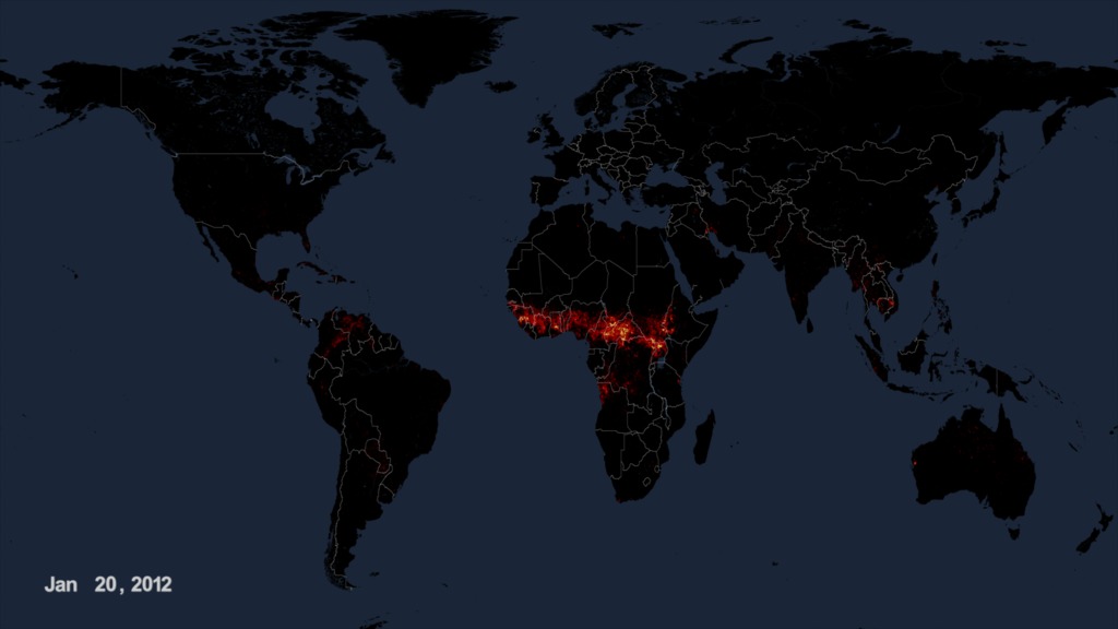
This data visualization of black carbon from the GEOS forward processinf (GEOS-FP) model shows the abundande and direction of black carbon from New South Wales (NSW) and Queensland blowing through the atmosphere from November 1-18.
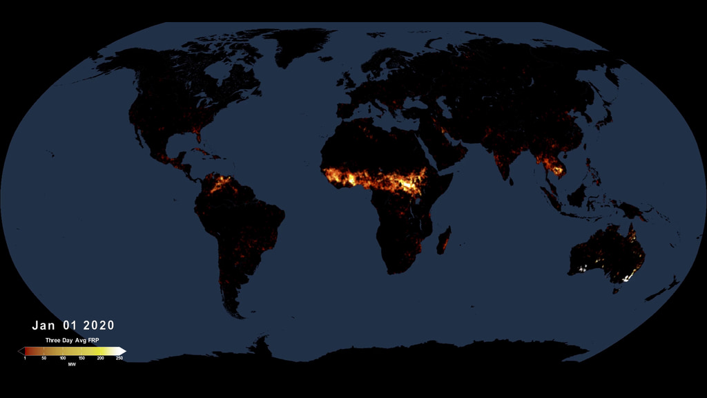
The summer of 2020 was marked by extremefires in Siberia and the Western United States. Series of extensive and powerful wildfires charred vast swaths of forest and shrubland and altered the composition of the atmosphere in the Northern Hemisphere.
We study Earth and how it’s changing from the ground, the sky, and space.
Using data from sensors all around the planet, we calculate the global average temperature, working with our partners at NOAA.
Music: Organic Machine by Bernhard Hering [GEMA] and Matthias Kruger [GEMA]
Complete transcript available.

NASA Earth Observatory images by Joshua Stevens, based on data from the NASA Goddard Institute for Space Studies/Gavin Schmidt
NASA Earth Observatory images by Joshua Stevens, based on data from the NASA Goddard Institute for Space Studies/Gavin Schmidt
NASA Earth Observatory images by Joshua Stevens, based on data from the NASA Goddard Institute for Space Studies/Gavin Schmidt
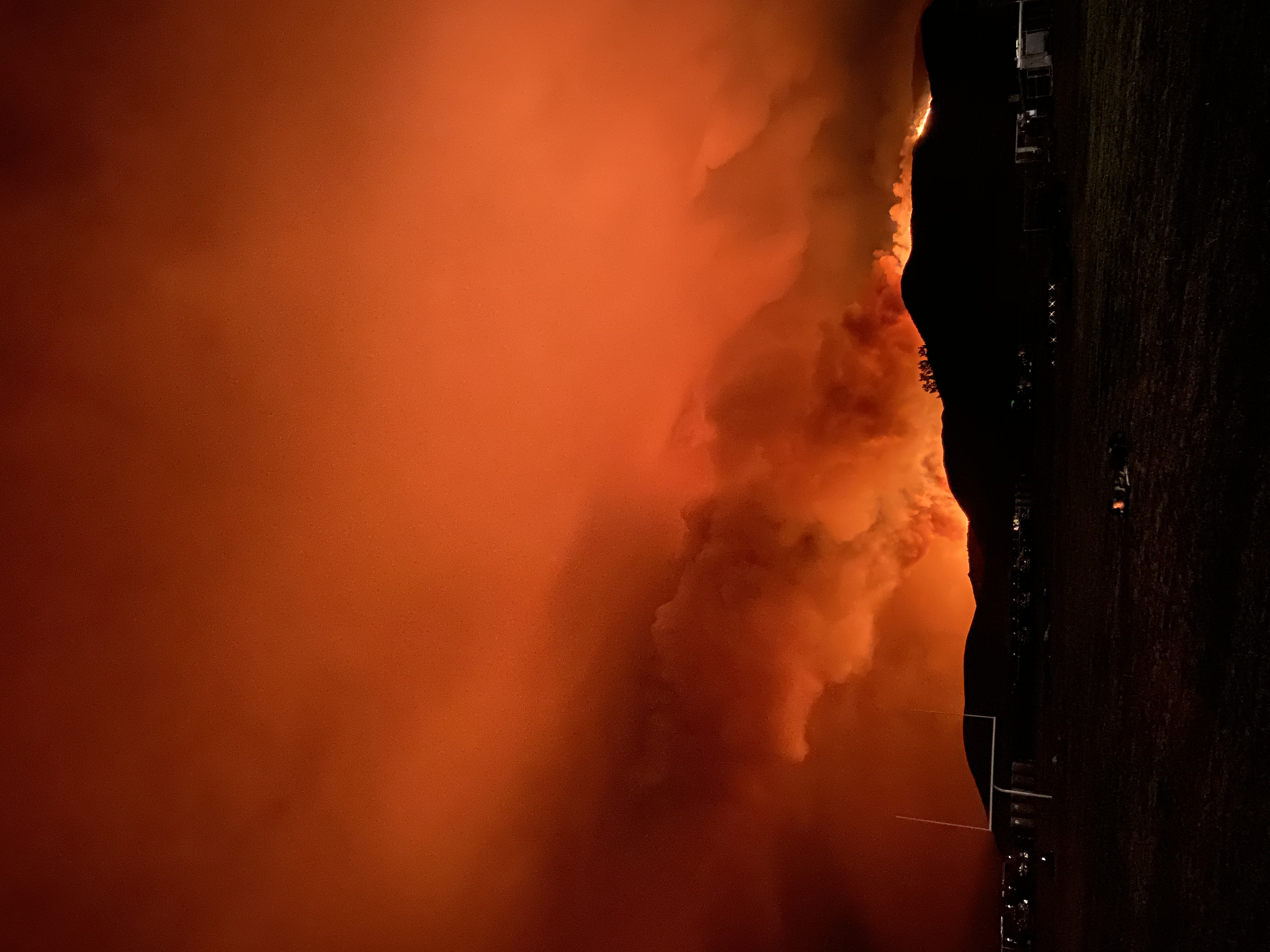
National Interagency Fire Center image of Loyalton Fire in August 2020
Credits
Please give credit for this item to:
NASA's Goddard Space Flight Center
-
Producers
- Kathryn Mersmann (USRA)
- Katie Jepson (USRA)
- Jefferson Beck (USRA)
- Kathleen Gaeta (GSFC Interns)
-
Writers
- Jessica Merzdorf (Telophase)
- Sofie L. Bates (Intern)
-
Public affairs officers
- Peter H. Jacobs (NASA/GSFC)
- Jacob Richmond (NASA/GSFC)
-
Scientists
- Gavin A. Schmidt (NASA/GSFC GISS)
- Lesley Ott (NASA/GSFC)
-
Visualizers
- Lori Perkins (NASA/GSFC)
- Trent L. Schindler (USRA)
-
Data visualizer
- Joshua Stevens (SSAI)
Release date
This page was originally published on Thursday, January 14, 2021.
This page was last updated on Wednesday, May 3, 2023 at 1:44 PM EDT.
Series
This visualization can be found in the following series:Related
- ID: 13825
![Music: Amazing Discoveries by Damien Deshayes [SACEM]Complete transcript available.](/vis/a010000/a013800/a013825/Screen_Shot_2021-03-29_at_2.25.23_PM_print.jpg)
- ID: 13791
 Produced Video
 - ID: 13516
![Music: Avalanches by Chris Constantinou [PRS] and Paul Frazer [PRS]Complete transcript available.](/vis/a010000/a013500/a013516/2019Temp.png) Produced Video
Produced Video - ID: 12044
 Produced Video
Alternate Versions
- ID: 4806
 Visualization
 - ID: 11937
 Produced Video
Sources
- ID: 5060
 Visualization
 - ID: 4964
 Visualization
 - ID: 4899
 Visualization
 - ID: 4882
 Visualization
 - ID: 4860
 Visualization
 - ID: 31142
 Hyperwall Visual
 - ID: 31139
 Hyperwall Visual
 - ID: 4809
- ID: 4815
 Visualization
 - ID: 4817
 Visualization
 - ID: 4789
 Visualization
 - ID: 4741
 Visualization