NASA Studies How COVID-19 Shutdowns Affect Emissions
Music: "Lab Analysis" from Universal Production Music
Complete transcript available.
Coming soon to our YouTube channel.
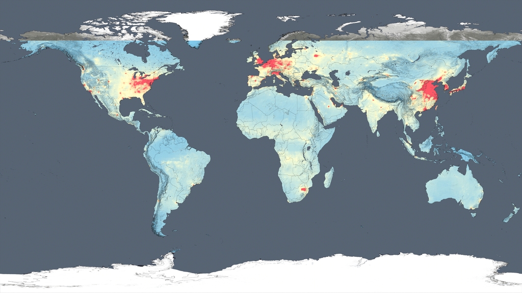
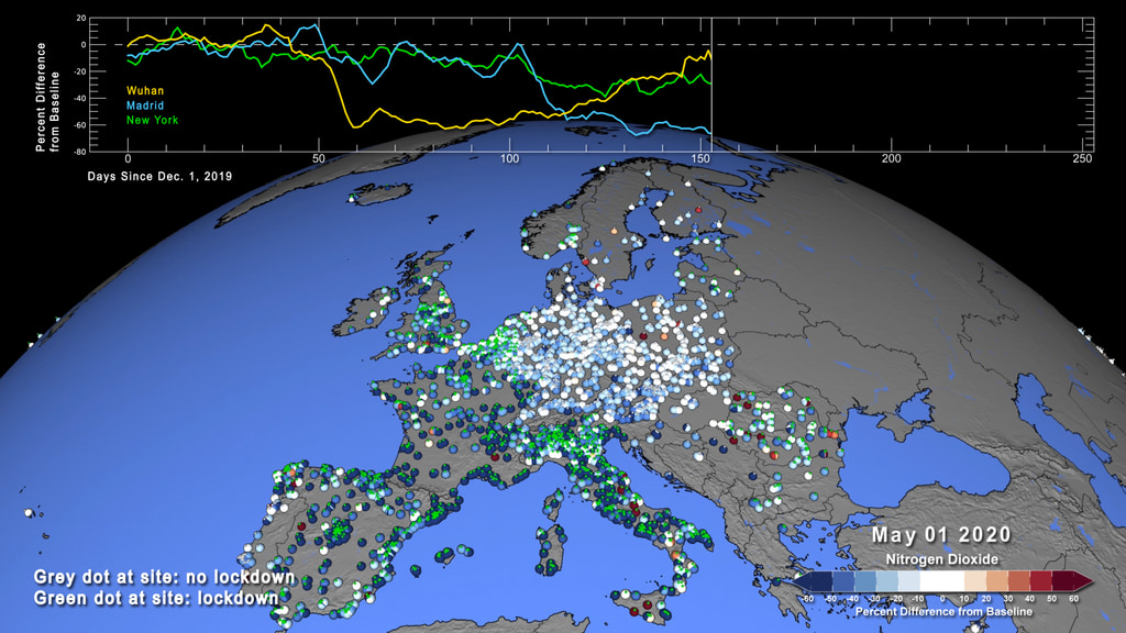
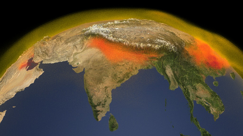
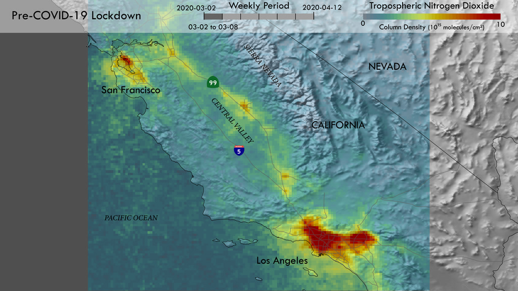
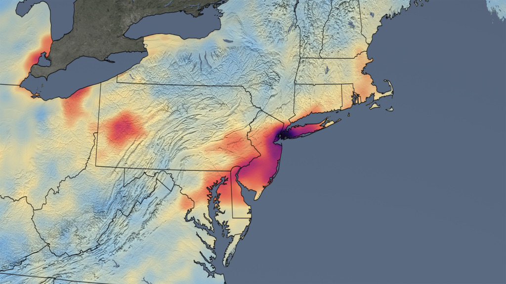
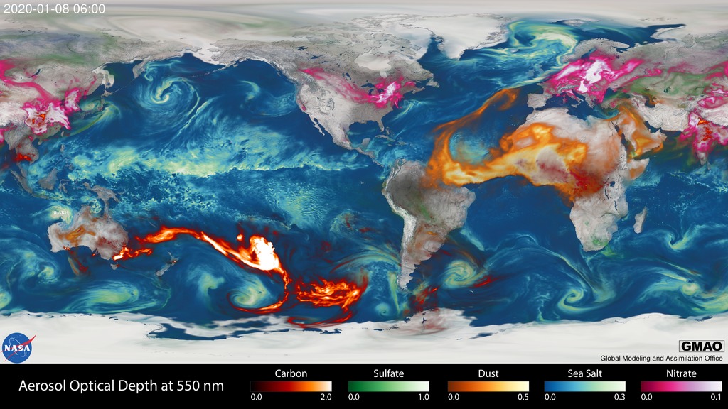
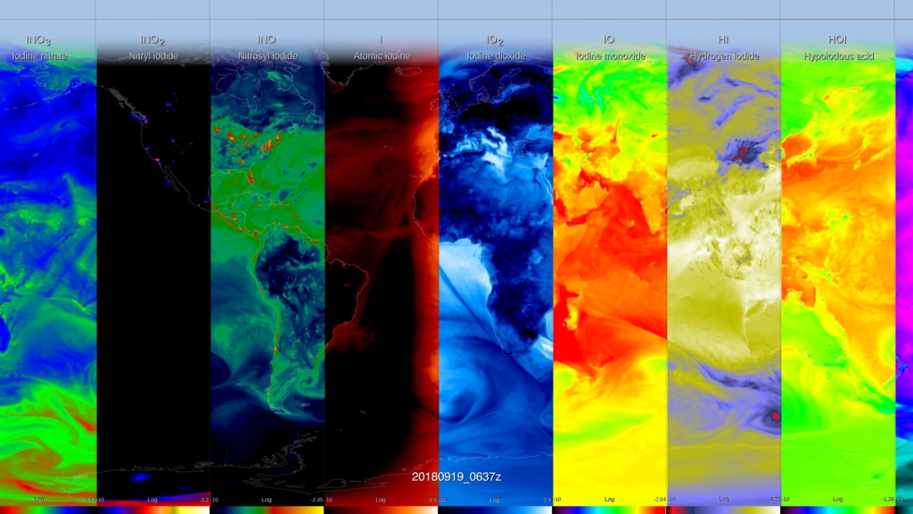
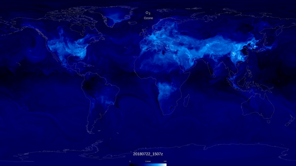
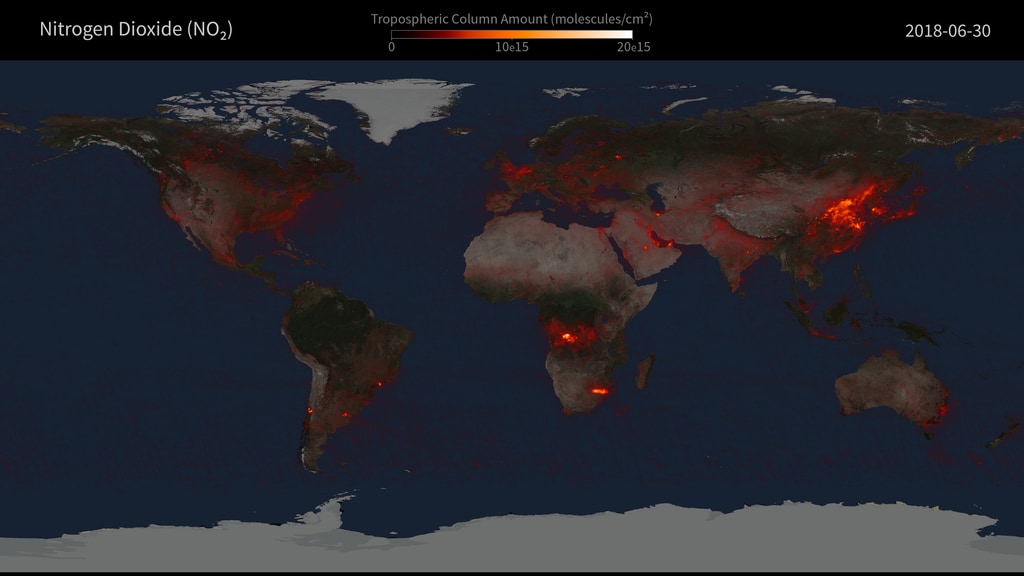
Pandemic-related shutdowns have affected how people act, so scientists began monitoring how that’s affected the planet— specifically nitrogen dioxide emissions. How does COVID-19 pollution patterns play into NASA computer models? NASA’s GEOS atmospheric composition model shows us the answer.
Credits
Please give credit for this item to:
NASA's Goddard Space Flight Center
-
Producer
- Kathleen Gaeta (GSFC Interns)
-
Visualizer
- Trent L. Schindler (USRA)
-
Scientists
- Christoph A. Keller (USRA)
- William Putman (NASA/GSFC)
- Aaron Naeger (UAH)
-
Writer
- Lara Streiff (GSFC Interns)
-
Data visualizers
- Greg Shirah (NASA/GSFC)
- Cindy Starr (Global Science and Technology, Inc.)
Release date
This page was originally published on Tuesday, November 17, 2020.
This page was last updated on Wednesday, May 3, 2023 at 1:44 PM EDT.
Series
This visualization can be found in the following series:Sources
- ID: 4872
- ID: 4799
 Visualization
 - ID: 4820
 Visualization
 - ID: 31144
- ID: 4810
- ID: 4819
 Visualization
 - ID: 31100
 Hyperwall Visual
 - ID: 4754
- ID: 4764
 Visualization
 - ID: 30986
 Hyperwall Visual
 - ID: 4412