2019 Was the Second Hottest Year on Record
- Visualizations by:
- Lori Perkins
- Written by:
- Maria-Jose Vinas Garcia
- Scientific consulting by:
- Gavin A. Schmidt
- Produced by:
- Kathryn Mersmann
- View full credits
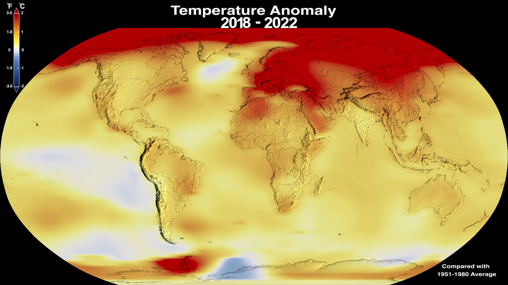
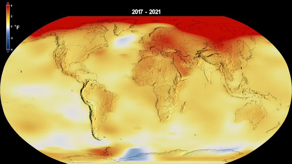
Global temperatures in 2019 were 2 degrees Fahrenheit (1.1 degrees Celsius) warmer than the late 19th Century, according to scientists at NASA’s Goddard Institute for Space Studies (GISS) in New York. 2019's temperatures were second only to those of 2016 and continued the planet's long-term warming trend: the six warmest years on the instrumental record have been the six last years.
Movies
- 13516_2019Temp.webm (960x540) [22.0 MB]
- FACEBOOK_720_13516_2019Temp_facebook_720.mp4 (1280x720) [77.4 MB]
- 13516_2019Temp.mov (1920x1080) [764.1 MB]
- 13516_2019Temp.mp4 (1920x1080) [86.2 MB]
Captions
- 2019Temp.en_US.srt [1.1 KB]
- 2019Temp.en_US.vtt [1.1 KB]
Images
- 2019Temp_print.jpg (1024x576) [114.4 KB]
- 2019Temp.png (1776x999) [2.2 MB]
- 2019Temp_thm.png (80x40) [7.0 KB]
- 2019Temp_searchweb.png (320x180) [85.4 KB]
Music: Avalanches by Chris Constantinou [PRS] and Paul Frazer [PRS]
Complete transcript available.
Movies
- 13516_2019Temp_SPANISH.webm (960x540) [20.9 MB]
- FACEBOOK_720_13516_2019Temp_SPANISH_facebook_720.mp4 (1280x720) [75.5 MB]
- 13516_2019Temp_SPANISH.mov (1920x1080) [775.3 MB]
- YOUTUBE_1080_13516_2019Temp_SPANISH_youtube_1080.mp4 (1920x1080) [108.9 MB]
Captions
- Temp2019Es.es_LA.srt [1.3 KB]
- Temp2019Es.es_LA.vtt [1.3 KB]
Images
- 2019Temp_2_print.jpg (1024x576) [114.4 KB]
- 2019Temp_2.png (1776x999) [2.2 MB]
Video translated into Spanish
Complete transcript available.

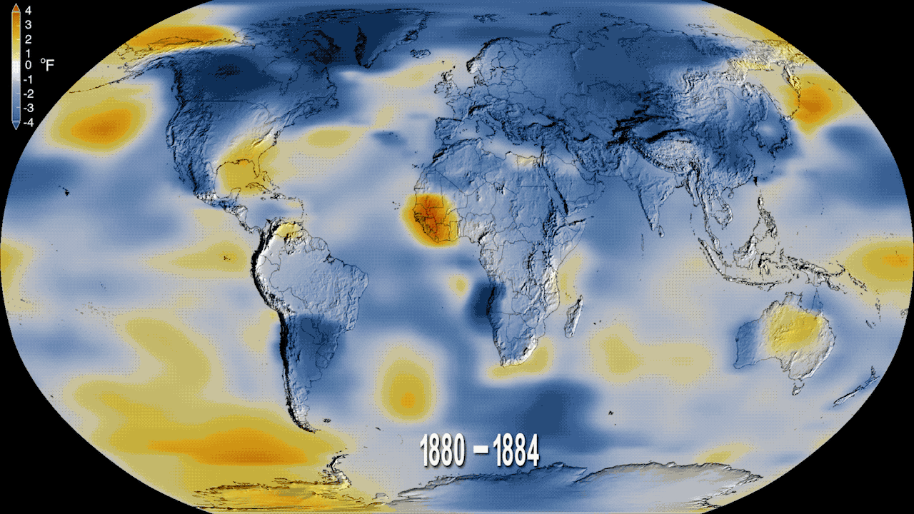
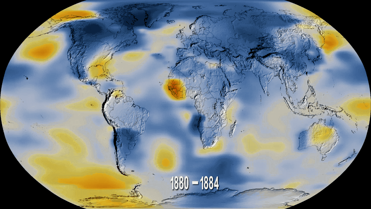
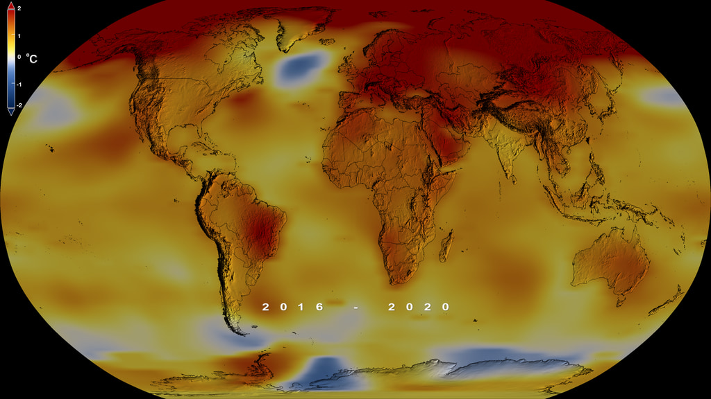
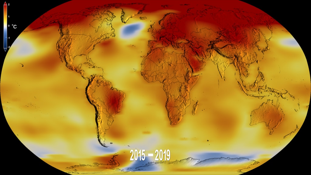
Earth’s long-term warming trend can be seen in this visualization of NASA’s global temperature record, which shows how the planet’s temperatures are changing over time, compared to a baseline average from 1951 to 1980. The record is shown as a running five-year average.

Zoom into the U.S.
Audio from telecon with Gavin Schmidt and Deke Arndt
Credits
Please give credit for this item to:
NASA's Goddard Space Flight Center
Visualizer
- Lori Perkins (NASA/GSFC) [Lead]
Writer
- Maria-Jose Vinas Garcia (Telophase) [Lead]
Scientist
- Gavin A. Schmidt (NASA/GSFC GISS) [Lead]
Producer
- Kathryn Mersmann (KBRwyle) [Lead]
Technical support
- Aaron E. Lepsch (ADNET)
Series
This visualization can be found in the following series:Related pages
NASA Finds 2020 Tied for Hottest Year on Record
Jan. 14th, 2021
Read moreMusic: Organic Machine by Bernhard Hering [GEMA] and Matthias Kruger [GEMA]Complete transcript available. Universal Production Music: "A City Asleep Instrumental," "Inducing Waves Main Track," "Getting Bad Instrumental," "It's Decision Time Underscore," "In Doubt Instrumental." This video can be freely shared and downloaded. While the video in its entirety can be shared without permission, some individual imagery provided by pond5.com and Artbeats is obtained through permission and may not be excised or remixed in other products. Specific details on stock footage may be found here. For more information on NASA’s media guidelines, visit https://www.nasa.gov/multimedia/guidelines/index.html.Complete transcript available. This data visualization of black carbon from the GEOS forward processinf (GEOS-FP) model shows the abundande and direction of black carbon from New South Wales (NSW) and Queensland blowing through the atmosphere from November 1-18. The summer of 2020 was marked by extremefires in Siberia and the Western United States. Series of extensive and powerful wildfires charred vast swaths of forest and shrubland and altered the composition of the atmosphere in the Northern Hemisphere. We study Earth and how it’s changing from the ground, the sky, and space. Using data from sensors all around the planet, we calculate the global average temperature, working with our partners at NOAA. Music: Organic Machine by Bernhard Hering [GEMA] and Matthias Kruger [GEMA]Complete transcript available. NASA Earth Observatory images by Joshua Stevens, based on data from the NASA Goddard Institute for Space Studies/Gavin Schmidt NASA Earth Observatory images by Joshua Stevens, based on data from the NASA Goddard Institute for Space Studies/Gavin Schmidt NASA Earth Observatory images by Joshua Stevens, based on data from the NASA Goddard Institute for Space Studies/Gavin Schmidt National Interagency Fire Center image of Loyalton Fire in August 2020 Globally, 2020 was the hottest year on record, effectively tying 2016, the previous record. Overall, Earth’s average temperature has risen more than 2 degrees Fahrenheit since the 1880s. Temperatures are increasing due to human activities, specifically emissions of greenhouse gases, like carbon dioxide and methane. Related pages
2018 Was the Fourth Hottest Year on Record
Feb. 6th, 2019
Read moreMusic: Sculpture by Axel Coon [GEMA], Ralf Goebel [GEMA]Complete transcript available. This color-coded map shows global surface temperature anomalies. Higher than normal temperatures are shown in red and lower than normal temperatures are shown in blue. 2018 was the fourth warmest year on record, part of a decades-long warming trend. In 2018, the temperature was 1.5 degrees Fahrenheit warmer than the average from 1951 to 1980. The measurement is a global average, so some places felt record high temperatures, while others were near average or even cooler. This animated figure shows the seasonal cycle in global temperature anomalies for every month since 1880. Each line shows how much the global monthly temperature was above or below the annual global mean from 1980–2015. The column on the right lists each year when a new global temperature record was set. These seasonal anomalies are drawn from the Modern-Era Retrospective analysis for Research and Applications, version 2 (MERRA-2) model run by NASA’s Global Modeling and Assimilation Office.Credit; NASA Earth Observatory/Joshua Stevens This line plot shows yearly temperature anomalies from 1880 to 2018, with respect to the 1951-1980 mean, as recorded by NASA, NOAA, the Japan Meteorological Agency, the Berkeley Earth research group, and the Met Office Hadley Centre (UK). Though there are minor variations from year to year, all five temperature records show peaks and valleys in sync with each other. All show rapid warming in the past few decades, and all show the past decade has been the warmest.Credit: NASA Earth Observatory/Joshua Stevens 2018 was the fourth hottest year in the modern record, part of a decades-long trend of warming. The record dates back to 1880, when it became possible to collect consistent, reliable temperatures around the planet. NASA and NOAA work together to track the temperatures, part of ongoing research into our warming planet. Related pages
Global Temperature Anomalies from 1880 to 2022
Jan. 12th, 2023
Read moreThis color-coded map in Robinson projection displays a progression of changing global surface temperature anomalies. Normal temperatures are shown in white. Higher than normal temperatures are shown in red and lower than normal temperatures are shown in blue. Normal temperatures are calculated over the 30 year baseline period 1951-1980. The final frame represents the 5 year global temperature anomalies from 2018-2022. This data visualization shows the 2022 global surface temperature anomaly compared with the 1951-1980 average. This data visualization shows only the 2022 global surface temperature anomalies on a rotating globe to highlight the La Niña. 2022 was one of the warmest on record despite a third consecutive year of La Niña conditions in the tropical Pacific Ocean. NASA scientists estimate that La Niña’s cooling influence may have lowered global temperatures about 0.11 degrees Fahrenheit from what the average would have been under more typical ocean conditions. Colortable is both degrees fahrenheit and degrees celsius. This image is the single year 2022 GISS temperature anomaly as compared with the 1951-1980 average. This version does not have any titles or text overlays, except for the corresponding colorbar. This frame sequence of color-coded global temperature anomalies in robinson projection display a progression of changing global surface temperatures anomalies in even degrees Fahrenheit. The first frame in this sequence represents the data from 1880-1884. The second frame represents 1881-1885, ...and the last frame represents 2018-2022. Higher than normal temperatures are shown in red and lower than normal are shown in blue. Normal temperatures are the average over the 30 year baseline period 1951-1980. This sequence of images are the corresponding date overlays for the 5 year rolling averages used in the first visualization on this page. This frame sequence of color-coded global temperature anomalies in degrees celsius is designed to be displayed on the Science on a Sphere projection system. Each image represents a unique 5 year rolling time period with no fades between datasets. Frame 1884 represents data from 1880-1884, frame 1885 represents data from 1881-1885,... frame 2022 represents data from 2018-2022. Higher than normal temperatures are shown in red and lower than normal are shown in blue. Normal temperatures are the average over the 30 year baseline period 1951-1980. This is the colorbar for the Science on a Sphere frameset above. It is in degrees celsius.
Global Temperature Anomalies from 1880 to 2021
Jan. 13th, 2022
Read moreThis color-coded map in Robinson projection displays a progression of changing global surface temperature anomalies. Normal temperatures are shown in white. Higher than normal temperatures are shown in red and lower than normal temperatures are shown in blue. Normal temperatures are calculated over the 30 year baseline period 1951-1980. The final frame represents the 5 year global temperature anomalies from 2017-2021. Scale in degrees Fahrenheit. This data visualization shows the 2021 global surface temperature anomalies on a rotating globe to highlight the La Niña. La Niña has developed and is expected to last into early 2022. Despite the cooling influence of this naturally occurring climate phenomenon, temperatures in many parts of the world are above average. The year 2000 also saw a La Niña event of similar strength to that in 2021, but 2021 global temperatures was more than 0.75 degrees Fahrenheit hotter than 2000. This color-coded map in Robinson projection displays a progression of changing global surface temperature anomalies. Normal temperatures are shown in white. Higher than normal temperatures are shown in red and lower than normal temperatures are shown in blue. Normal temperatures are calculated over the 30 year baseline period 1951-1980. The final frame represents the 5 year global temperature anomalies from 2017-2021. Scale in degrees Celsius. This frame sequence is the corresponding date range for each frame in the sequence. Degrees Fahrenheit Colorbar Degrees Celsius Colorbar This frame sequence of color-coded global temperature anomalies in robinson projection display a progression of changing global surface temperatures anomalies in Fahrenheit. The first frame in this sequence represents the data from 1880-1884. The second frame represents 1881-1885, ...and the last frame represents 2017-2021. Higher than normal temperatures are shown in red and lower than normal are shown in blue. Normal temperatures are the average over the 30 year baseline period 1951-1980. This frame sequence of color-coded global temperature anomalies in degrees celsius is designed to be displayed on the Science on a Sphere projection system. Each image represents a unique 5 year rolling time period with no fades between datasets. Frame 1884 represents data from 1880-1884, frame 1885 represents data from 1881-1885,... frame 2021 represents data from 2017-2021. Higher than normal temperatures are shown in red and lower than normal are shown in blue. Normal temperatures are the average over the 30 year baseline period 1951-1980. This is the colorbar for the Science on a Sphere frameset above. It is in degrees celsius. Earth’s global average surface temperature in 2021 tied with 2018 as the sixth warmest on record, according to independent analyses done by NASA and NOAA. Continuing the planet’s long-term warming trend, global temperatures in 2021 were 1.5 degrees Fahrenheit (or 0.85 degrees Celsius) above the average for NASA’s baseline period, according to scientists at NASA’s Goddard Institute for Space Studies (GISS) in New York.Collectively, the past eight years are the top eight warmest years since modern record keeping began in 1880. This annual temperature data makes up the global temperature record – and it’s how scientists know that the planet is warming.GISS is a NASA laboratory managed by the Earth Sciences Division of the agency’s Goddard Space Flight Center in Greenbelt, Maryland. The laboratory is affiliated with Columbia University’s Earth Institute and School of Engineering and Applied Science in New York.For more information about NASA’s Earth science missions, visit: https://www.nasa.gov/earth Related pages
Global Temperature Anomalies from 1880 to 2020
Jan. 14th, 2021
Read moreThis color-coded map in Robinson projection displays a progression of changing global surface temperature anomalies. Normal temperatures are the average over the 30 year baseline period 1951-1980. Higher than normal temperatures are shown in red and lower than normal temperatures are shown in blue. The final frame represents the 5 year global temperature anomalies from 2016-2020. Scale in degrees Celsius. This color-coded map in Robinson projection displays a progression of changing global surface temperature anomalies. Normal temperatures are the average over the 30 year baseline period 1951-1980. Higher than normal temperatures are shown in red and lower than normal temperatures are shown in blue. The final frame represents the 5 year global temperature anomalies from 2016-2020. Scale in degrees Fahrenheit. This data visualization places the most recent time step, 2016-2020, of our global surface temperature anomalies on a rotating globe. Normal temperatures are the average over the 30 year baseline period 1951-1980. Higher than normal temperatures are shown in red and lower than normal temperatures are shown in blue. Scale is in degrees Fahrenheit. THe Earth's topography is exaggerated by 10x. This frame sequence is the corresponding date range for each frame in the sequence. This 136 frame sequence of color-coded global temperature anomalies in robinson projection display a progression of changing global surface temperatures anomalies in Fahrenheit. The first frame in this sequence represents the data from 1880-1884. The second frame represents 1881-1885, ...and the last frame represents 2016-2020. Higher than normal temperatures are shown in red and lower than normal are shown in blue. Normal temperatures are the average over the 30 year baseline period 1951-1980. Degrees Fahrenheit Colorbar Degrees Celsius Colorbar This frame sequence of color-coded global temperature anomalies in degrees celsius is designed to be displayed on the Science on a Sphere projection system. Each image represents a unique 5 year rolling time period with no fades between datasets. Frame 1884 represents data from 1880-1884, frame 1885 represents data from 1881-1885,... frame 2020 represents data from 2016-2020. Higher than normal temperatures are shown in red and lower than normal are shown in blue. Normal temperatures are the average over the 30 year baseline period 1951-1980. Degrees Celsius horizontal colorbar 2020 Tied for Warmest Year on Record, NASA Analysis ShowsEarth’s global average surface temperature in 2020 tied with 2016 as the warmest year on record, according to an analysis by NASA. Continuing the planet’s long-term warming trend, the year’s globally averaged temperature was 1.84 degrees Fahrenheit (1.02 degrees Celsius) warmer than the baseline 1951-1980 mean, according to scientists at NASA’s Goddard Institute for Space Studies (GISS) in New York. 2020 edged out 2016 by a very small amount, within the margin of error of the analysis, making the years effectively tied for the warmest year on record.“The last seven years have been the warmest seven years on record, typifying the ongoing and dramatic warming trend,” said GISS Director Gavin Schmidt. “Whether one year is a record or not is not really that important – the important things are long-term trends. With these trends, and as the human impact on the climate increases, we have to expect that records will continue to be broken.”A Warming, Changing WorldTracking global temperature trends provides a critical indicator of the impact of human activities – specifically, greenhouse gas emissions – on our planet. Earth's average temperature has risen more than 2 degrees Fahrenheit (1.2 degrees Celsius) since the late 19th century. Rising temperatures are causing phenomena such as loss of sea ice and ice sheet mass, sea level rise, longer and more intense heat waves, and shifts in plant and animal habitats. Understanding such long-term climate trends is essential for the safety and quality of human life, allowing humans to adapt to the changing environment in ways such as planting different crops, managing our water resources and preparing for extreme weather events.Land, Sea, Air and SpaceNASA’s analysis incorporates surface temperature measurements from more than 26,000 weather stations and thousands of ship- and buoy-based observations of sea surface temperatures. These raw measurements are analyzed using an algorithm that considers the varied spacing of temperature stations around the globe and urban heating effects that could skew the conclusions if not taken into account. The result of these calculations is an estimate of the global average temperature difference from a baseline period of 1951 to 1980.NASA measures Earth's vital signs from land, air, and space with a fleet of satellites, as well as airborne and ground-based observation campaigns. The satellite surface temperature record from the Atmospheric Infrared Sounder (AIRS) instrument aboard NASA’s Aura satellite confirms the GISTEMP results of the past seven years being the warmest on record. Satellite measurements of air temperature, sea surface temperature, and sea levels, as well as other space-based observations, also reflect a warming, changing world. The agency develops new ways to observe and study Earth's interconnected natural systems with long-term data records and computer analysis tools to better see how our planet is changing. NASA shares this unique knowledge with the global community and works with institutions in the United States and around the world that contribute to understanding and protecting our home planet. NASA’s full surface temperature data set – and the complete methodology used to make the temperature calculation – are available at: https://data.giss.nasa.gov/gistempGISS is a NASA laboratory managed by the Earth Sciences Division of the agency’s Goddard Space Flight Center in Greenbelt, Maryland. The laboratory is affiliated with Columbia University’s Earth Institute and School of Engineering and Applied Science in New York.For more information about NASA’s Earth science missions, visit: https://www.nasa.gov/earth Related pages
Global Temperature Anomalies from 1880 to 2019
Jan. 15th, 2020
Read moreThis color-coded map in Robinson projection displays a progression of changing global surface temperature anomalies. Normal temperatures are the average over the 30 year baseline period 1951-1980. Higher than normal temperatures are shown in red and lower than normal temperatures are shown in blue. The final frame represents the 5 year global temperature anomalies from 2015-2019. Scale in degrees Celsius. This color-coded map in Robinson projection displays a progression of changing global surface temperature anomalies. Normal temperatures are the average over the 30 year baseline period 1951-1980. Higher than normal temperatures are shown in red and lower than normal temperatures are shown in blue. The final frame represents the 5 year global temperature anomalies from 2015-2019. Scale in degrees Fahrenheit. Degrees Celsius Colorbar Degrees Fahrenheit Colorbar Date Sequence This data visualization places the most recent time step, 2015-2019, of our global surface temperature anomalies on a rotating globe. Normal temperatures are the average over the 30 year baseline period 1951-1980. Higher than normal temperatures are shown in red and lower than normal temperatures are shown in blue. Scale is in degrees Fahrenheit. This frame sequence of color-coded global temperature anomalies in robinson projection display a progression of changing global surface temperatures anomalies in Fahrenheit. Each image represents a unique 5 year rolling time period with no fades between datasets. The frame number of each frame is the last year for that frame's time period. Higher than normal temperatures are shown in red and lower than normal are shown in blue. Normal temperatures are the average over the 30 year baseline period 1951-1980. This frame sequence of color-coded global temperature anomalies in degrees celsius is designed to be displayed on the Science on a Sphere projection system. Each image represents a unique 5 year rolling time period with no fades between datasets. Frame 1884 represents data from 1880-1884, frame 1885 represents data from 1881-1885,... frame 2019 represents data from 2015-2019. Higher than normal temperatures are shown in red and lower than normal are shown in blue. Normal temperatures are the average over the 30 year baseline period 1951-1980. NASA, NOAA Analyses Reveal 2019 Second Warmest Year on RecordAccording to independent analyses by NASA and the National Oceanic and Atmospheric Administration (NOAA), Earth's global surface temperatures in 2019 were the second warmest since modern recordkeeping began in 1880.Globally, 2019 temperatures were second only to those of 2016 and continued the planet's long-term warming trend: the past five years have been the warmest of the last 140 years. This past year, they were 1.8 degrees Fahrenheit (0.98 degrees Celsius) warmer than the 1951 to 1980 mean, according to scientists at NASA’s Goddard Institute for Space Studies (GISS) in New York. “The decade that just ended is clearly the warmest decade on record,” said GISS Director Gavin Schmidt. “Every decade since the 1960s clearly has been warmer than the one before.”Since the 1880s, the average global surface temperature has risen and the average temperature is now more than 2 degrees Fahrenheit (a bit more than 1 degree Celsius) above that of the late 19th century. For reference, the last Ice Age was about 10 degrees Fahrenheit colder than pre-industrial temperatures.Using climate models and statistical analysis of global temperature data, scientists have concluded that this increase mostly has been driven by increased emissions into the atmosphere of carbon dioxide and other greenhouse gases produced by human activities.“We crossed over into more than 2 degrees Fahrenheit warming territory in 2015 and we are unlikely to go back. This shows that what’s happening is persistent, not a fluke due to some weather phenomenon: we know that the long-term trends are being driven by the increasing levels of greenhouse gases in the atmosphere,” Schmidt said.Because weather station locations and measurement practices change over time, the interpretation of specific year-to-year global mean temperature differences has some uncertainties. Taking this into account, NASA estimates that 2019’s global mean change is accurate to within 0.1 degrees Fahrenheit, with a 95% certainty level.Weather dynamics often affect regional temperatures, so not every region on Earth experienced similar amounts of warming. NOAA found the 2019 annual mean temperature for the contiguous 48 United States was the 34th warmest on record, giving it a “warmer than average” classification. The Arctic region has warmed slightly more than three times faster than the rest of the world since 1970.Rising temperatures in the atmosphere and ocean are contributing to the continued mass loss from Greenland and Antarctica and to increases in some extreme events, such as heat waves, wildfires, intense precipitation.NASA’s temperature analyses incorporate surface temperature measurements from more than 20,000 weather stations, ship- and buoy-based observations of sea surface temperatures, and temperature measurements from Antarctic research stations.These in situ measurements are analyzed using an algorithm that considers the varied spacing of temperature stations around the globe and urban heat island effects that could skew the conclusions. These calculations produce the global average temperature deviations from the baseline period of 1951 to 1980.NOAA scientists used much of the same raw temperature data, but with a different interpolation into the Earth’s polar and other data-poor regions. NOAA’s analysis found 2019 global temperatures were 1.7 degrees Fahrenheit (0.95 degrees Celsius) above the 20th century average.NASA’s full 2019 surface temperature data set and the complete methodology used for the temperature calculation and its uncertainties are available at:https://data.giss.nasa.gov/gistempGISS is a laboratory within the Earth Sciences Division of NASA’s Goddard Space Flight Center in Greenbelt, Maryland. The laboratory is affiliated with Columbia University’s Earth Institute and School of Engineering and Applied Science in New York.NASA uses the unique vantage point of space to better understand Earth as an interconnected system. The agency also uses airborne and ground-based measurements, and develops new ways to observe and study Earth with long-term data records and computer analysis tools to better see how our planet is changing. NASA shares this knowledge with the global community and works with institutions in the United States and around the world that contribute to understanding and protecting our home planet.For more information about NASA’s Earth science activities, visit:https://www.nasa.gov/earthThe slides for the Jan. 15 news conference are available at:https://www.ncdc.noaa.gov/sotc/briefings/20200115.pdfNOAA’s Global Report is available at:https://www.ncdc.noaa.gov/sotc/global/201913 Related pages