A 3D Look at the 2015 El Niño
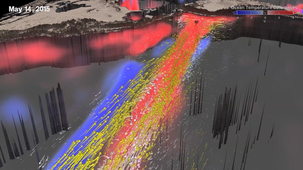
Scientists at NASA's Goddard Space Flight Center have combined ocean measurements with cutting-edge supercomputer simulations to analyze the 2015-2016 El Niño in three dimensions. This visualization looks at the top 225 meters of the ocean, showing warmer than normal water in red, colder than normal water in blue. In the second half, current information is included, with east-flowing currents in yellow and west-flowing currents in white.
Music: Bourrée from Handel's Water Music
Watch this video on the NASA Goddard YouTube channel.
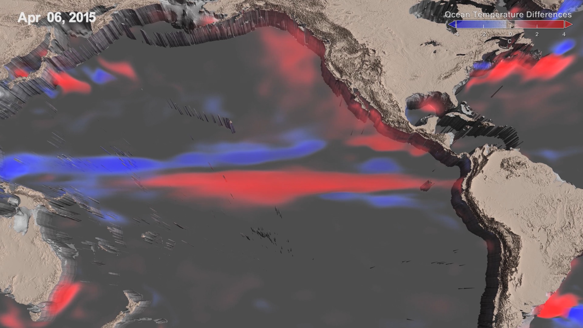
El Niño is a recurring climate pattern characterized by warmer than usual ocean temperatures in the equatorial Pacific. Two back-to-back 3-D visualizations track the changes in ocean temperatures and currents, respectively, throughout the life cycle of the 2015-2016 El Niño event, chronicling its inception in early 2015 to its dissipation by April 2016. Blue regions represent colder and red regions warmer temperatures when compared with normal conditions.
Under normal conditions, equatorial trade winds in the Pacific Ocean blow from east to west, causing warm water to pile up in the Western Pacific, while also causing an upwelling—the rise of deep, cool water to the surface—in the Eastern Pacific. During an El Niño, trade winds weaken or, as with this latest event, sometimes reverse course and blow from west to east. As a result, the warm surface water sloshes east along the equator from the Western Pacific and temporarily predominates in the Central and Eastern Pacific Ocean. At that same time, cooler water slowly migrates westward just off the equator in the Western Pacific.The first visualization shows the 2015-2016 El Niño through changes in sea surface temperature as warmer water moves east across the Pacific Ocean. The Eastern Pacific Ocean undergoes the most warming from July 2015 to January 2016. In the west, just to the north of the equator, cooler waters hit the western boundary and reflect along the equator and then head east starting in February 2016. Just as the warming waves traveled east earlier in the video, these cool waters make their way to the central Pacific, terminating the warming event there.
Hand-in-hand with an El Niño’s changing sea surface temperatures are the wind-driven ocean currents that move the waters along the equator across the Pacific Ocean. The second visualization depicts these currents, which here comprise the ocean’s surface to a depth of 225 meters: Yellow arrows illustrate eastward currents and white arrows are westward currents. The El Niño-inducing westerlies—winds coming from the west that blow east—cause the eastward currents to occur in pulses. A good example of one of these pulses can be seen hitting the South American coast on May 15, 2015. By the end of February 2016 trade winds return, as evidenced by the return of westward currents and cool water along the equator, signaling the dissipation of the El Niño. These visualizations are derived from NASA Goddard’s Global Modeling and Assimilation Office, using Modern-Era Retrospective Analysis for Research and Applications (MERRA) dataset, which comprises an optimal combination of observations and ocean and atmospheric models. For more information, see https://gmao.gsfc.nasa.gov/reanalysis/MERRA/.
Credits
Please give credit for this item to:
NASA's Goddard Space Flight Center
-
Producer
- Matthew R. Radcliff (USRA)
-
Technical support
- Aaron E. Lepsch (ADNET Systems, Inc.)
-
Scientists
- Robin Kovach (SSAI)
- Steven Pawson (NASA/GSFC)
-
Writer
- Samson K. Reiny (Wyle Information Systems)
-
Animator
- Lori Perkins (NASA/GSFC)
-
Narrator
- Kasha Patel (Wyle Information Systems)
Release date
This page was originally published on Friday, May 26, 2017.
This page was last updated on Wednesday, May 3, 2023 at 1:47 PM EDT.
Series
This visualization can be found in the following series:Sources
- ID: 4544
Used as a Source In
- ID: 13348
![Complete transcript available.Music Credits: "Battle For Our Future" and "Wonderful Orbit" by Tom Furse Fairfax Cowan [PRS], "Transitions" by Ben Niblett [PRS] and Jon Cotton [PRS], "Emerging Discovery by "Rik Carter [PRS] from Killer Tracks](/vis/a010000/a013300/a013348/13348_DailyCycleOfRain_YouTube.00561_print.jpg) Produced Video
Produced Video - ID: 12718
 Produced Video