Untitled
- Visualizations by:
- Trent L. Schindler
- Written by:
- Ellen T. Gray
- View full credits

New NASA satellite maps show the human impact on global air quality.
Movies
- 12096-1920viz-MASTER_high.webm (960x540) [12.4 MB]
- 12096-1920viz-MASTER_high.mp4 (960x540) [18.9 MB]
Images
- pf-aura-1024.jpg (1024x576) [151.1 KB]
- pf-aura-1024_print.jpg (1024x576) [159.7 KB]
- pf-aura-1280.jpg (1280x720) [200.1 KB]
- pf-aura-1920.jpg (1920x1080) [295.1 KB]
Files
- a012076_iPad_movie_12096-1920viz-MASTER/12096-1920viz-MASTER.m3u8 [1.4 KB]
Explore how air pollution has changed over the last 10 years in different regions of the world in this video.

This map shows changes in NO2 levels over Europe from 2005-2014. The decreases (blue) are due to emission control regulations.

This map shows changes in NO2 levels over China from 2005-2014. The increases (red) are due to a rise in coal use for power generation.

This map shows changes in NO2 levels over the Middle East from 2005-2014. The decreases (blue) in Syria are tied to the country's civil war.
For More Information
See NASA.gov
Credits
Please give credit for this item to:
NASA's Goddard Space Flight Center
Animator
- Trent L. Schindler (USRA) [Lead]
Writer
- Ellen T. Gray (NASA/HQ) [Lead]
Video editor
- Sophia Roberts (AIMM)
Scientist
- Bryan Duncan (NASA/GSFC)
Interviewee
- Bryan Duncan (NASA/GSFC)
Producers
- Kayvon Sharghi (USRA)
- Sophia Roberts (AIMM)
Videographers
- John Caldwell (AIMM)
- Rob Andreoli (AIMM)
Related pages
NASA Images Show Human Fingerprint on Global Air Quality – Release Materials
Dec. 17th, 2015
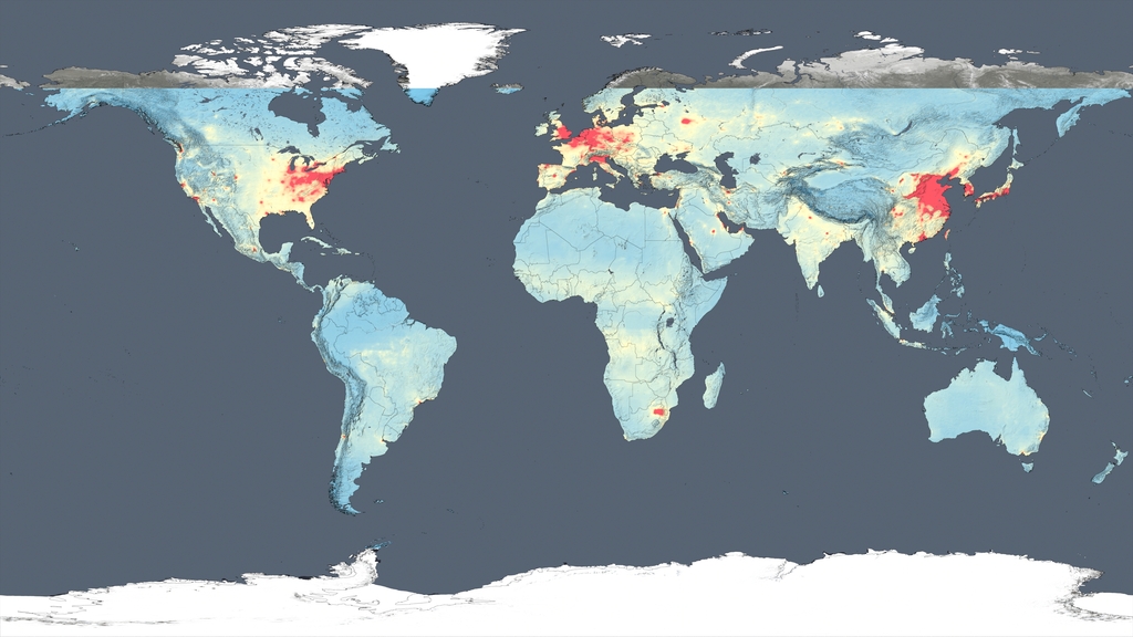
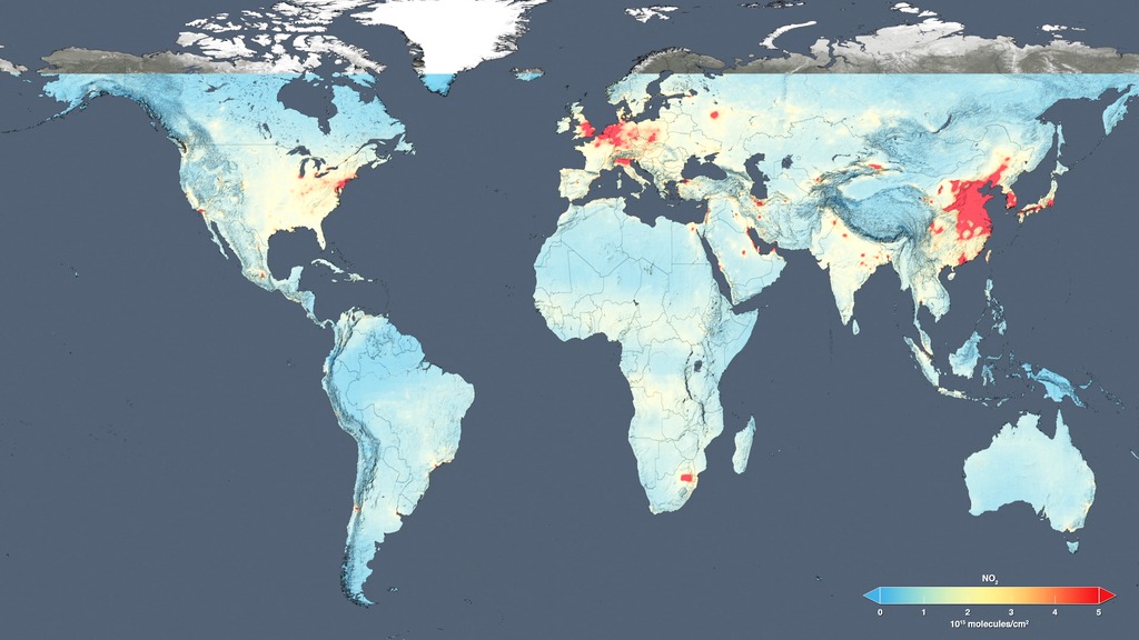
Read moreThis video provides an overview of the study findings. An HD version of this video is available here: Human Fingerprint on Global Air Quality This global map shows the concentration of nitrogen dioxide in the atmosphere as detected by the Ozone Monitoring Instrument aboard the Aura satellite, averaged over 2005. This global map shows the concentration of nitrogen dioxide in the troposphere as detected by the Ozone Monitoring Instrument aboard the Aura satellite, averaged over 2014. Color bar for absolute nitrogen dioxide concentrations global images. Nitrogen dioxide concentrations across the United States, averaged over 2005. Nitrogen dioxide concentrations across the United States, averaged over 2014. Color bar for absolute nitrogen dioxide concentrations across the United Sates. The trend map of the United States shows the large decreases in nitrogen dioxide concentrations from 2005 to 2014. Only decreases are highlighted in this map. Color bar for the trend in nitrogen dioxide concentrations changes across the United Sates. The trend map of Europe shows the change in nitrogen dioxide concentrations from 2005 to 2014. Color bar for the trend in nitrogen dioxide concentrations changes across Europe. The trend map of East Asia shows the change in nitrogen dioxide concentrations from 2005 to 2014. Color bar for the trend in nitrogen dioxide concentrations changes across East Asia. The trend map of the Middle East shows the change in nitrogen dioxide concentrations from 2005 to 2014. Color bar for the trend in nitrogen dioxide concentrations changes across the Middle East. The trend map of the Persian Gulf shows the change in nitrogen dioxide concentrations from 2005 to 2014. Color bar for the trend in nitrogen dioxide concentrations changes across the Persian Gulf. Nitrogen dioxide concentrations in South Africa, averaged over 2014. Color bar for absolute nitrogen dioxide concentrations across in South Africa. The trend map of South Africa shows the change in nitrogen dioxide concentrations from 2005 to 2014. Color bar for the trend in nitrogen dioxide concentrations changes in South Africa. The trend map for North Dakota shows the percent change in nitrogen dioxide concentrations from 2005 to 2014. Color bar for the trend in nitrogen dioxide percent changes in North Dakota. The trend map for Texas shows the percent change in nitrogen dioxide concentrations from 2005 to 2014. Color bar for the trend in nitrogen dioxide percent changes in North Dakota. Globe background layer Europe background layer East asia background layer Middle east background layer Persian gulf background layer S Africa background layer N Dakota background layer Texas background layer Using new, high-resolution global satellite maps of air quality indicators, NASA scientists tracked air pollution trends over the last decade in various regions and 195 cities around the globe. According to recent NASA research findings, the United States, Europe and Japan have improved air quality thanks to emission control regulations, while China, India and the Middle East, with their fast-growing economies and expanding industry, have seen more air pollution. Scientists examined observations made from 2005 to 2014 by the Ozone Monitoring Instrument aboard NASA's Aura satellite. One of the atmospheric gases the instrument detects is nitrogen dioxide, a yellow-brown gas that is a common emission from cars, power plants and industrial activity. Nitrogen dioxide can quickly transform into ground-level ozone, a major respiratory pollutant in urban smog. Nitrogen dioxide hotspots, used as an indicator of general air quality, occur over most major cities in developed and developing nations.The following visualizations include two types of data. The absolute concentrations show the concentration of tropospheric nitrogen dioxide, with blue and green colors denoting lower concentrations and orange and red areas indicating higher concentrations. The second type of data is the trend data from 2005 to 2014, which shows the observed change in concentration over the ten-year period. Blue indicated an observed decrease in nitrogen dioxide, and orange indicates an observed increase. Please note that the range on the color bars (text is in white) changes from location to location in order to highlight features seen in the different geographic regions. Related pages
NASA Images Show Human Fingerprint on Global Air Quality – Release Materials
Dec. 14th, 2015
Read moreThis video provides an overview of the study findings. An HD version of this video is available here: Human Fingerprint on Global Air Quality Using new, high-resolution global satellite maps of air quality indicators, NASA scientists tracked air pollution trends over the last decade in various regions and 195 cities around the globe. According to recent NASA research findings, the United States, Europe and Japan have improved air quality thanks to emission control regulations, while China, India and the Middle East, with their fast-growing economies and expanding industry, have seen more air pollution. Scientists examined observations made from 2005 to 2014 by the Ozone Monitoring Instrument aboard NASA's Aura satellite. One of the atmospheric gases the instrument detects is nitrogen dioxide, a yellow-brown gas that is a common emission from cars, power plants and industrial activity. Nitrogen dioxide can quickly transform into ground-level ozone, a major respiratory pollutant in urban smog. Nitrogen dioxide hotspots, used as an indicator of general air quality, occur over most major cities in developed and developing nations.The following visualizations include two types of data. The absolute concentrations show the concentration of tropospheric nitrogen dioxide, with blue and green colors denoting lower concentrations and orange and red areas indicating higher concentrations. The second type of data is the trend data from 2005 to 2014, which shows the observed change in concentration over the ten-year period. Blue indicated an observed decrease in nitrogen dioxide, and orange indicates an observed increase. Please note that the range on the color bars (text is in white) changes from location to location in order to highlight features seen in the different geographic regions. Related pages
Human Fingerprint on Global Air Quality
Dec. 14th, 2015
Read moreFor complete transcript, click here. Using new, high-resolution global satellite maps of air quality indicators, NASA scientists tracked air pollution trends over the last decade in various regions and 195 cities around the globe. The United States, Europe and Japan have improved air quality thanks to emission control regulations, while China, India and the Middle East, with their fast-growing economies and expanding industry, have seen more air pollution.Scientist Bryan Duncan and his team examined observations made from 2005 to 2014 by the Ozone Monitoring Instrument aboard NASA's Aura satellite. One of the atmospheric gases the instrument detects is nitrogen dioxide, a yellow-brown gas that is a common emission from cars, power plants and industrial activity. Nitrogen dioxide can quickly transform into ground-level ozone, a major respiratory pollutant in urban smog. Nitrogen dioxide hotspots, used as an indicator of general air quality, occur over most major cities in developed and developing nations. Related pages
US Air Quality
June 22nd, 2014
Read moreNitrogen dioxide levels for the continental United States. Nitrogen dioxide levels over Northeast United States. Nitrogen dioxide levels over the northeastern corridor. Nitrogen dioxide levels over Ohio and the surrounding states. Nitrogen dioxide color bar Anyone living in the U.S. for the past decade may have noticed a change in the air. The change is apparent in NASA satellite images that demonstrate the country's reduction of air pollution, or more specifically, nitrogen dioxide.Nitrogen dioxide can impact the respiratory system, and it also contributes to the formation of other pollutants including ground-level ozone and particulates. The gas is produced primarily during the combustion of gasoline in vehicle engines and coal in power plants. Air pollution has decreased even though population and the number of cars on the roads have increased. The shift is the result of regulations, technology improvements and economic changes, scientists say.This visualization shows tropospheric column concentrations of nitrogen dioxide as detected by the Ozone Monitoring Instrument on NASA's Aura satellite, averaged yearly from 2005-2011. Blue and green denote lower concentrations and orange and red areas denote higher concentrations, ranging from 1e+15 to 5e+15 molecules per square centimeter, respectively. For More InformationSee [NASA.gov](https://www.nasa.gov/content/goddard/new-nasa-images-highlight-us-air-quality-improvement/) Related pages