Van Gogh Sun
A crucial, and often underappreciated, facet of science lies in deciding how to turn the raw numbers of data into useful, understandable information — often through graphs and images. Such visualization techniques are needed for everything from making a map of planetary orbits based on nightly measurements of where they are in the sky to colorizing normally invisible light such as X-rays to produce "images" of the sun.
More information, of course, requires more complex visualizations and occasionally such images are not just informative, but beautiful too.
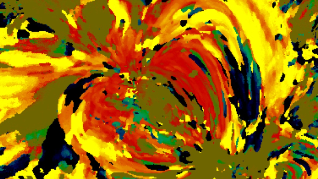
Such is the case with a new technique created by Nicholeen Viall, a solar scientist at NASA's Goddard Space Flight Center in Greenbelt, Md. She creates images of the sun reminiscent of Van Gogh, with broad strokes of bright color splashed across a yellow background. But it's science, not art. The color of each pixel contains a wealth of information about the 12-hour history of cooling and heating at that particular spot on the sun. That heat history holds clues to the mechanisms that drive the temperature and movements of the sun's atmosphere, or corona.
To look at the corona from a fresh perspective, Viall created a new kind of picture, making use of the high resolution provided by NASA's Solar Dynamics Observatory (SDO). SDO's Atmospheric Imaging Assembly (AIA) provides images of the sun in 10 different wavelengths, each approximately corresponding to a single temperature of material. Therefore, when one looks at the wavelength of 171 angstroms, for example, one sees all the material in the sun's atmosphere that is a million degrees Kelvin. By looking at an area of the sun in different wavelengths, one can get a sense of how different swaths of material change temperature. If an area seems bright in a wavelength that shows a hotter temperature an hour before it becomes bright in a wavelength that shows a cooler temperature, one can gather information about how that region has changed over time.
Viall's images show a wealth of reds, oranges, and yellow, meaning that over a 12-hour period the material appear to be cooling. Obviously there must have been heating in the process as well, since the corona isn't on a one-way temperature slide down to zero degrees. Any kind of steady heating throughout the corona would have shown up in Viall's images, so she concludes that the heating must be quick and impulsive — so fast that it doesn't show up in her images. This lends credence to those theories that say numerous nanobursts of energy help heat the corona.

Combination of the source SDO AIA 171 image and the temperature change map made using 211 and 171 angstrom light.
Time lag temperature map made from SDO AIA data over a 12-hour span. 335 angstrom and 171 angstrom wavelength ultraviolet light.
Credit: NASA/SDO AIA/Viall
Time lag temperature map made from SDO AIA data over a 12-hour span. 211 angstrom and 193 angstrom wavelength ultraviolet light.
Credit: NASA/SDO AIA/Viall
Time lag temperature map made from SDO AIA data over a 12-hour span. 211 angstrom and 171 angstrom wavelength ultraviolet light.
Credit: NASA/SDO AIA/Viall
Time lag temperature map made from SDO AIA data over a 12-hour span. 335 angstrom and 193 angstrom wavelength ultraviolet light.
Credit: NASA/SDO AIA/Viall
Time lag temperature map made from SDO AIA data over a 12-hour span. 211 angstrom and 131 angstrom wavelength ultraviolet light.
Credit: NASA/SDO AIA/Viall
Time lag temperature map made from SDO AIA data over a 12-hour span. 193 angstrom and 171 angstrom wavelength ultraviolet light.
Credit: NASA/SDO AIA/Viall
For More Information
Credits
Please give credit for this item to:
NASA/Goddard Space Flight Center/SDO. However, individual images should be credited as indicated above.
-
Animator
- Scott Wiessinger (USRA)
-
Video editor
- Scott Wiessinger (USRA)
-
Narrators
- Scott Wiessinger (USRA)
- Nicholeen Viall (NASA/GSFC)
-
Producer
- Scott Wiessinger (USRA)
-
Scientist
- Nicholeen Viall (NASA/GSFC)
-
Writers
- Scott Wiessinger (USRA)
- Karen Fox (ADNET Systems, Inc.)
Release date
This page was originally published on Thursday, July 19, 2012.
This page was last updated on Wednesday, May 3, 2023 at 1:52 PM EDT.
Missions
This visualization is related to the following missions:Series
This visualization can be found in the following series:Tapes
This visualization originally appeared on the following tapes:-
Impressionist Sun
(ID: 2012068)
Thursday, July 12, 2012 at 4:00AM
Produced by - Robert Crippen (NASA)
Papers used in this visualization
Datasets used in this visualization
-
[SDO]
ID: 168This dataset can be found at: http://sdo.gsfc.nasa.gov/
See all pages that use this dataset -
AIA 211 (211 Filter) [SDO: AIA]
ID: 678This dataset can be found at: http://jsoc.stanford.edu/
See all pages that use this dataset -
AIA 193 (193 Filter) [SDO: AIA]
ID: 679This dataset can be found at: http://jsoc.stanford.edu/
See all pages that use this dataset -
AIA 171 (171 Filter) [SDO: AIA]
ID: 680This dataset can be found at: http://jsoc.stanford.edu/
See all pages that use this dataset -
AIA 131 (131 Filter) [SDO: AIA]
ID: 730This dataset can be found at: http://jsoc.stanford.edu/
See all pages that use this dataset
Note: While we identify the data sets used in these visualizations, we do not store any further details, nor the data sets themselves on our site.
Related
- ID: 11062
 Produced Video
Sources
- ID: 3965
 Visualization