Space Weather to the Edge of the Solar System
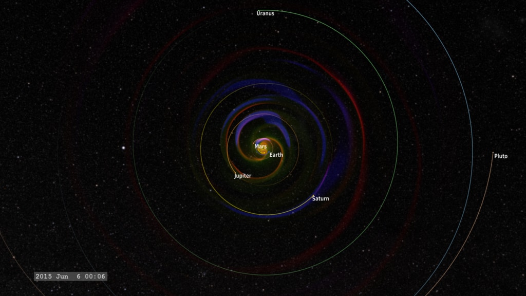
Cropped view of the Enlil model from early 2015 to just after the New Horizons flyby of Pluto.
Everyone likes to check the weather in a far away destination before they travel there. This is especially true for spaceflight, where the destination may be where no one has gone before.
The mission of New Horizons to Pluto provided an opportunity to test our current space weather models, pushing them to the limit. This visualization presents the results from an Enlil model run, just one of the many space weather models being tested through the Community-Coordinated Modeling Center (CCMC) at NASA's Goddard Space Flight Center as part of the "New Horizons Flyby Modeling Challenge".
This visualization presents a slice of the data through the ecliptic plane, the plane in which the planets of our solar system orbit. Because Pluto is a bit above this plane, the orbit is projected into the ecliptic plane of the data, as is the trajectory of the New Horizons probe.
Three different variables are presented from the model - temperature, density, and pressure gradient, simultaneously, using the red, green and blue color channels of the color image. The density of the solar wind (green) flowing outward from the sun decreases as it spreads out. The temperature stays roughly constant as the solar wind material spreads through the solar system. We see the Parker spiral imprinted on the outflow from the spinning sun, much like the outflow from a spinning water sprinkler. We also see the strong density gradients (blue) created by coronal mass ejections and other shocks, propagating outward from the sun in the solar wind.
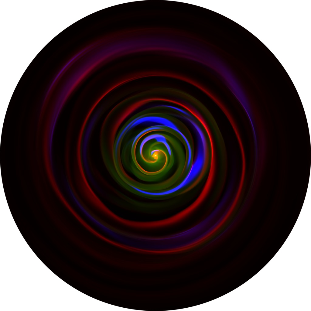
We can observe regions of interesting interactions when the three primary colors of the basic variables combine to enhance the color, represented in the tricolor diagram below. White represents a hot, dense shock, while cyan (blue-green) represents a dense shock (usually visible close to the sun), magenta (purple) represents a hot, low-density shock, while yellow indicates hot and dense material, again usually close to the sun.

Color bar representing changes in plasma density, in atomic mass units (AMU) per cubic centimeter. This is roughly equal to the number of hydrogen ions per cubic centimeter.
Color bar representing the plasma temperature.
Color bar representing the pressure gradient (how fast the pressure changes). High values indicate a shock wave.
Tri-color diagram illustrating how colors from the three different measurements (density, temperature, pressure gradient) combine to highlight different characteristics of the plasma flow.
Raw image layers of the Enlil model run and spacecraft and planetary positions from early 2015 to just after the New Horizons flyby of Pluto.
Cropped view of the Enlil model from early 2015 to just after the New Horizons flyby of Pluto. This version shows the STEREO spacecraft which were out of communication during much of this time frame.
For More Information
Credits
Please give credit for this item to:
NASA's Goddard Space Flight Center Scientific Visualization Studio, the Space Weather Research Center (SWRC) and the Community-Coordinated Modeling Center (CCMC), Enlil and Dusan Odstrcil (GMU).
-
Visualizer
- Tom Bridgman (Global Science and Technology, Inc.)
-
Scientist
- M. Leila Mays (Catholic University of America)
-
Producer
- Genna Duberstein (USRA)
-
Writer
- Karen Fox (ADNET Systems, Inc.)
Release date
This page was originally published on Tuesday, December 8, 2015.
This page was last updated on Tuesday, November 14, 2023 at 12:07 AM EST.
Datasets used in this visualization
-
Enlil Heliospheric Model (Enlil Heliospheric Model)
ID: 685MHD solar wind simulation
See all pages that use this dataset -
SPICE Ephemerides (SPICE Ephemerides)
ID: 755Satellite and planetary ephemerides
See all pages that use this dataset
Note: While we identify the data sets used in these visualizations, we do not store any further details, nor the data sets themselves on our site.
Related
- ID: 4680